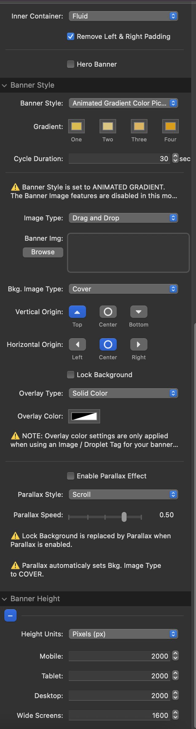
I have one page using the banner stack that seems to be good in all orientations except for phone in portrait mode. It almost fits all the content in except for what is at the very bottom. Switching to “view height” does make everything show on the phone but now there is a ton of space above and below the content from within the banner.
My questions is I am not sure what Height Unit I should be using and for what reason. Do I just switch to “view height” and put in significantly smaller numbers? This setting seems to center the content vertically. I was wondering why that happens?
EDIT: There are a number of other pages with banners that are not quite working right so fixing this one page should probably solve all the others as well. I just realized that I didn’t understand the banner stack as well as I thought I did.