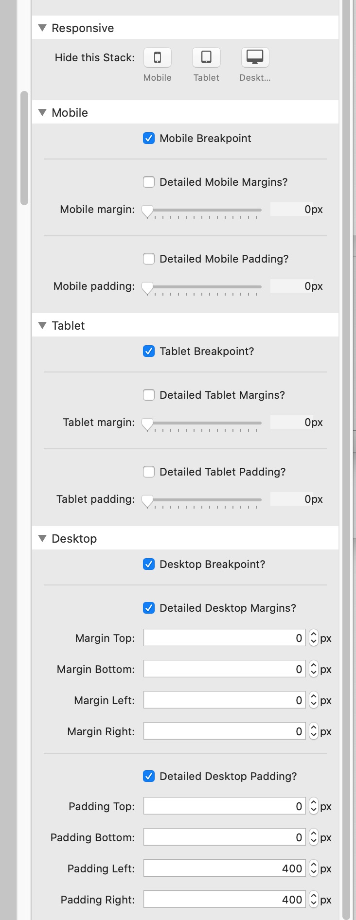
Trying to figure out what I’m getting wrong - I have set break points on a margins stack to control margins / padding. My iPad when on the site looks fine in portrait mode but when turned to landscape it seems to pick up the desktop breakpoint instead of the iPad break points make the screen unreadable as it’s too compressed.
Breakpoints are based on the width of the browser or device display at a given moment. This is why when you grab the corner of the browser window on your Mac and make the page smaller that you start seeing the Tablet or Mobile breakpoints. This is the basis of how responsive design works. So for instance your tablet likely has a large enough screen then when turned sideways triggers the desktop breakpoint. Some mobile devices, like they larger iPhones, can even trigger the tablet breakpoint when in landscape mode.
Responsive breakpoints are all about width values and not specific devices. The breakpoints are generally labeled as Mobile, Tablet and Desktop to convey the general understanding of where those breakpoints will trigger. You could call them iPhone, iPad, Mac, or Small, Medium and Large. Whatever you like, but they trigger based off of screen width.
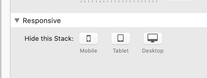
That is a feature built in to Stacks itself and not Foundry. And yes, it also hides items based on responsive widths. It has slightly different width triggers from Foundry as well.
If you want to hide content at certain widths while using Foundry, use the Visibility stack. This way the showing/hiding match the widths Foundry uses for it’s breakpoints.