I really like the way Columnist from Weaver Space splits up text like a newspaper column. I was wondering if there is a way to use Foundry’s Typeface stack to apply a different font? Foundation has it’s own typeface functions but most of them sound like they are focused on applying type across the whole site which is not what I am doing. Joe Workman was saying something about there might be a way to do this by adjusting the class? That is why we decided I should ask the question in these forums.
Sounds like you’re trying to do something unusual. I’ve just tried it, and Columnist just used the self-hosted Typeface fonts I have assigned for Header and Body Text.
If you’re wanting something different, I think you may need to juggle the font assignments in Control Center.
Hard to say for sure from your post - perhaps some more specific detail would help.
If this approach is too unusual I suppose I can get Foundation and set the type with that. I just don’t know much about it or if it is for applying a font only on one page at a time. I should have also mentioned I am using Google Fonts. This is the Columnist page if it matters to see it.
My understanding of Control Center is that it is mostly for setting type that goes across several pages? Since the type on nearly every page I can think of is set with the Typeface Stack I suppose it’s effect wouldn’t even show up on the other pages since the Typeface Stack overrides Control Center. I didn’t think about that before. That might be the simplest, most straightforward approach to just set control center with the type I want for page that uses the Columnist Stack. I think I’ll give that a try, thanks.
I’d strongly recommend watching the video on Typeface in the documentation pages. That’ll explain very clearly how Typeface and Control Center work together to assign specific typeface numbers, and how they relate to Header and Body Text. I was clueless on fonts before I watched it.
No reason why you couldn’t have different settings per page, if you’re looking for different fonts within Columnist. Depends what else is on that page - might just need some lateral thinking, setting other stacks (Paragraph, etc) to use different fonts based on typeface number assignments, rather than “use Control Center”. It’s not something I’ve done - I tend to go with no more than 3 fonts across a site (and one of those is a script font for signatures), otherwise it can look messy, and not be great for UX.
FWIW, having tried Foundation, it’s anything but straightforward, and Joe’s support tends to be what to do, rather than HOW to do it, as you’ve already discovered. It certainly wasn’t for me.
First, don’t do something as drastic as buying and learning a new framework just to get the font in the Columnist stack to use the font you want. This can be done using Foundry.
I’ll second Adam’s (@jacksona) recommendation about re-watching the documentation videos on Typeface and Control Center. As he mentions, the two work together to set the default font setting for a page.
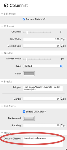
If you don’t want to change the settings in Control Center for the pages you’re using Columnist or find it too difficult to do, then simply add a custom class to the Columnist stack. If you want Columnist to use the font you defined as Typeface 1, just add the class foundry-typeface-one in it’s settings under “class”. If you assigned it to a different number, just adjust the class name accordingly.
The website isn’t so much like a brand site where I am carrying a company’s identity from page to page. A typeface and style that fits the subject matter on one page wouldn’t work on the next. I’ll look over the typeface video again even though it has probably only been a couple months since I last viewed it but I think I am less sure about how control center works. When you say lateral thinking do you mean place the Columnist stack inside a paragraph stack? I didn’t know that was possible? But I can try.
I haven’t worked with classes before, I don’t think. When you talk about “Typeface 1” are you referring to using Control Center or the Typeface stack? Or are you saying I need neither and can do it all with the Columnist Stack?
Putting it all together, here’s the process. It’s easier than I realised:
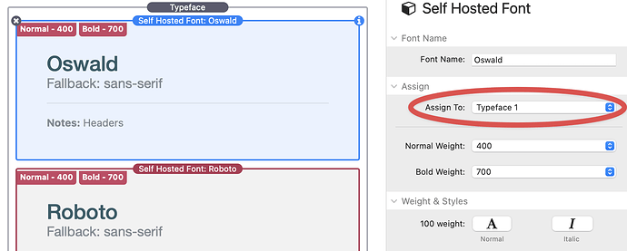
- In Typeface, assign the font (mine’s self-hosted - Adam’s documentation video walks you through the entire process - but Google Fonts will work) to ‘Typeface x’:
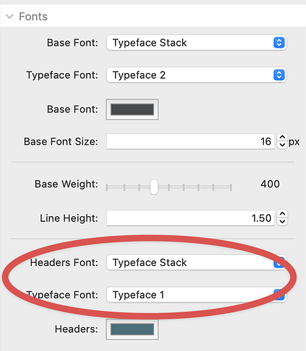
(Note: In Control Center, you can, if desired, then assign ‘Typeface x’ to Headers and Body Text):
- In Columnist, add the class, per @DLH’s post (Note, I’ve used Typeface 1, but you can use any of the 15 assignments):
- Result:
Hope this helps!
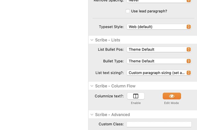
If I understand you correctly, you can just use the free stack from Big White Duck called Scribe. This has a column feature built right in.
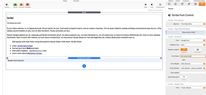
To use a different font in Scribe you’d use the Font Control child stack, as pre this image…
To set up the column flow option you’d just apply it with the options at the bottom of the main stack settings…
Adam’s post should get you to where you need to go. Basically, you use Typeface to load a custom font for use on a page. All it’s doing is telling the browser to load that font. Control Center (and many other Foundry stacks) allow you to then choose one of the fonts loaded by Typeface as the font used for specific types of content, like headings, paragraphs, etc. This is why Adam said to watch both videos.
Since Columnist isn’t a Foundry stack, it doesn’t have a built-in way to select a font loaded by Typeface. By adding the CSS I posted, you are basically doing the same thing that selecting “Typeface 1” in a paragraph stack does. It’s just applying it to all content in the Columnist stack.
I’ve use Scribe (as mentioned by @TemplateRepo to do these types of columns. Just be careful if you use the method outlined by him. If you are using the font outside of Scribe and define it in Typeface and then use a font child sack in Scribe to use it in it, you will likely be loading the font twice (and causing the user to download twice as much as necessary).
If you’ve already loaded the font, you simply select “Don’t Load” in Scribe.
Thanks everyone! I’ll take a look at all this info again when I get back to the office next week.
Wow! That was a really easy fix! I just got back from vacation and had a chance to try it out. It think it looks much better then that basic Arial or whatever the default was.
Is there anything I can do to also adjust line spacing and size of the text? When I choose a bigger number it makes the type bolder but I would be interested in adjusting the type size since it still looks a touch small.
I can look up how to do it on CSS myself too. There is probably a good YouTube video on editing text with CSS. I don’t have a lot of experience with that language but it might be a good time to learn a little more as I’m wrapping up this website.
If you get stuck, just post a link to a page and explain what you’re trying to modify. I’m sure one of us can point you in the correct direction.
Okay thanks! I think the body text isn’t a bad size but if it were a couple point sizes larger may help for people on high density screens which makes the text smaller. The page I am referring is just the same one as before.
Hi Kip,
for me the size on your website is fine (and my eyes aren’t what they used to be). Coming from a graphical background, I would try to augment the linespace to create a bit more ‘air’ in the body text. Also highlight some words by making them bold can help a reader to go faster trough your text.
Hans
First, I agree with @Panans about the font size. I think the current size is large enough. The font also has a fairly large x-height (height of the lower letters) which makes fonts easier to read. As he mentioned you could add a little line-height to space it out a bit.
I also don’t particularly like solid black text especially on white background. I find the contrast a bit harsh. I also think that the font and/or weight you chose is a bit heavy. I’d prefer a thinner and/or lighter, less bold font.
If you want to stay with the font, I’d start with the following CSS and adjust to your taste.
.columnist.text p {
    color: #4f4f4f;
    line-height: 1.7rem;
}
I was kind of okay with the size but it was hard to tell if it was that or the line spacing. It didn’t help that I had some eye problems this last month and had to go to the doctor. That is probably throwing off my judgement too. Now that I know how to control the spacing it might likely look right after that gets adjusted. I think there is something about the thin columns that just needs a bit more spacing.
I watched the Control Center video again and that was helpful. Especially that part about how you can choose different colored text whether you are in light or dark mode. Interesting idea about making the more important text bold.
@DLH Yeah I think in my attempt to make the text bigger I accidentally made it a bit heavier weight. (500 instead of the default 400.) Being that the ascender and descender on this type is small may be why I’m curious what it would look like if it is a touch larger. Also it isn’t like print where there is a limited amount of space on the page.
I always have my computers in dark mode since I find the white background overpowering on modern screens with brightness turned up. I’ve thought that I wish there was a way to easily see a preview between dark mode and bright mode other then having to check and uncheck the dark mode box and maybe there is an easy way to do that. I doesn’t appear to be an option under “Simulate.”
Thanks for the CSS I’ll look at that. I am not necessarily set on the type but I just wanted to play with it before I abandoned it.

