My name is Oscar, living in The Netherlands, and since today a new member of this community. This is my first post. Happy to meet you all
Yesterday I bought the Capsule stack and run into two things I could not get done. Probably it isn’t possible yet. That’s why I have two feature requests; please forgive me if this has come up before in other posts.
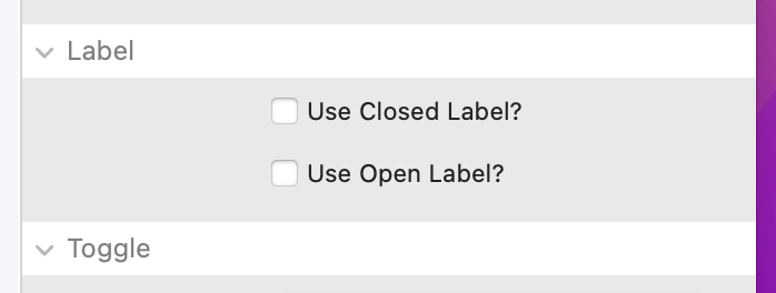
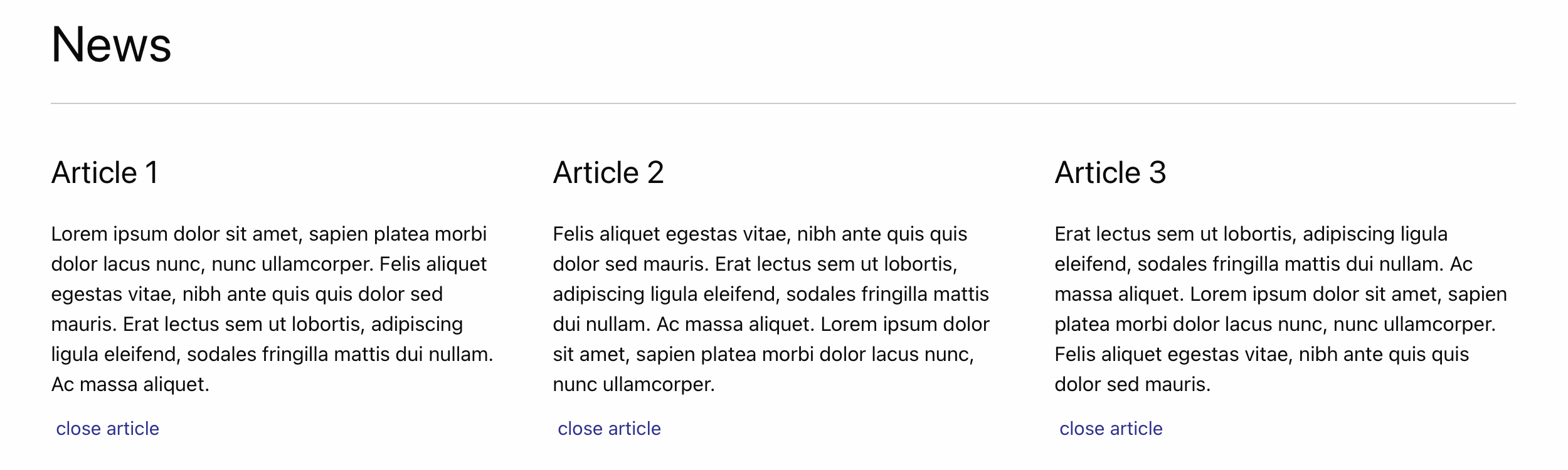
Use label: 2 different labels for ‘open’ and ‘close’ condition instead of only one
It would be nice if two labels could be specified. One for when the capsule content is closed, like for example ‘Read more…’ or ‘Read article’.
When the capsule content is opened it would be nice to have a label like ‘Close’ or ‘Close article’ instead of currently ‘Read more…’ (‘Read article’) because the same label is used regardless of condition.
Hide toggle if content is empty
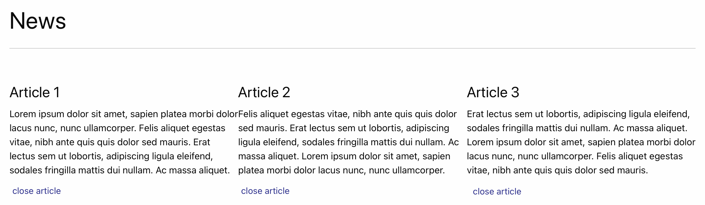
Example: my client, who manages the content himself via CMS, wants to have option to place up to 10 separate articles. He do not want the articles to start open. It’s up to the webpage visitor to open and close only the articles of interest to him/her.
I can built such with 10 separate capsule content and toggle stacks. My client places the capsule content via CMS (I use EasyCMS of Joe Workman, which works great!).
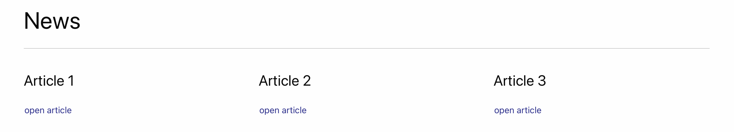
One time my client has 10 articles ands needs all the capsules, the other time he has less articles so some capsules stay empty. My client has no option to hide the unused capsule content and toggles, because as far as I can see Rapidweaver is the only choice to do so (don’t publish this stack > republish). So client has to give me a call to hide the toggles of the unused content capsules. Not very convenient.
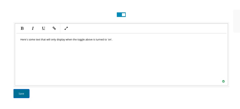
It would be nice when capsule content is empty, the toggle is hidden.
Now, if there is no content, the toggle will still be displayed (icon, image, label).
Would something like this be possible to add to the stack? Or am I doing something wrong?
You’ll be glad to know this is already a feature. It was requested long ago by @webinjection if memory serves me correctly. It was a supplemental update to Capsule, so you’ll want to update Capsule in the Stacks Library to make sure you’re on the latest version. When you do you’ll find this set of preferences in the Capsule Toggle settings:
This isn’t something I’m likely to add, unfortunately. It is a very niche thing and it isn’t really how Capsule was designed to work. Sorry, I know that’s not what you’d like to hear.
I was under the impression that the Capsule stack downloaded yesterday after purchase is the most recent version
I will do the stack update tomorrow. Great to hear that my first feature request has already been resolved!
Of course I regret that my second request cannot be realized. I will investigate whether another stack is available for this, if not there is no other option than to hide/unhide the unused/used capsules via Rapidweaver when necessary.
Today I updated the capsule stack and now indeed I can specify labels for open and close. Very nice. One last question though:
If I use text labels like “Read article” and “Close article” in my project, I don’t really need an icon. Is it possible to have the text to be the toggle itself?
If not, it would be great if a paid upgrade of the Capsule stack, or a second Capsule stack for textual toggles instead of icon / image would be available.
Capsules main purpose was to use imagery for toggling content. That said, just use a 1 x 1 px transparent gif or something similar for you toggle images.
@Oscar, add this to the pages CSS area to hide the icons. It should just affect the capsule icons, but make sure you look to make sure it doesn’t accidentally hide any other icons. I don’t know if that CSS class is used for anything else.
/* Hide Icons for Elixir Graphics - Capsule Toggles */
.elixir_trigger i {
    display:none;
}
Hi Oscar,
Welcome from beautiful Eindhoven
I’m sure that you’ll be happy with all the tech solutions and great support you’ll get from Elixer.
Cheers from a happy user,
Peter
@PeterFuhren Hi Peter,
Thank you for your nice welcome!
I am certainly very happy with the help I have already received on my feature requests
In addition to the Capsule stack, I also bought Foundry (plus add-ons) to get started as an alternative to Foundation 6, which I’ve been working with for a while. I like it and it has a ton of possibilities, but has quite a steep learning curve for me as a designer. So I need something in addition to being able to create websites in less time. I’m hopeful that Foundry is the answer to that.
By the way, nice to hear you’re from Eindhoven. It’s the great city I was born
Hi Oscar, regarding your initial question about hiding the toggle if content is empty, have you looked at using the Toggle stacks that are part of EasyCMS? You can place these around Adam’s stacks and use them to show/hide content depending on whether the client has added any or not.
I’ve made a simple example where it’s possible to simple hide the entire Capsule stack when it doesn’t contain content, just by turning the EasyCMS Toggle stack off. It may also be possible to still display an empty Capsule stack as well but I haven’t tried that.
Have a look because I think this could be a solution for you.
Late to reply to this topic but one of the greatest things about Capsule compared to a typical accordion is that because they are separated elements, you have complete control over where the toggle goes compared to where the content goes. Being able to position content exactly where you want, separate from the toggle itself makes this a very flexible option. Hope you were able to get it to work for your needs.
Due to personal circumstances I’ve been offline for a while and wasn’t able to work on web design.
Not very smart of me to overlook the EasyCMS toggle option .
I’m going to dive into that and let you know if that’s the solution I’m looking for. Your suggestion looks very promising, many thanks for your help!
Due to personal circumstances I’ve been offline for a while and wasn’t able to work on web design.
I completely agree with your view on the advantages of the Capsule stack over a typical accordion. In my current project, the content and toggle do not have to be placed separately from each other, but there will be cases for sure where those benefits of the Capsule stack will come in handy.
I’m on my way to the solution, but not quite there yet
I have been offline for a while due to personal circumstances, my apologies for my late feedback.
I’ve tested your code on a simple webpage by adding it in the website settings > code, as well as in the html of just the web page alone. Both options result in the toggle icon being hidden
The only thing I couldn’t find a solution for yet is the fact that the toggle label doesn’t line up nicely with the headline and open/closed article. Where the icon was first visible is now empty space (white space) which hinders that the toggle label lines up nicely.
This is also the case with Adam’s solution to use a 1x1 px transparent image instead of an icon.
I wanted to rule out Foundation 6 could have something to do with it and made a single webpage with a blank theme, but even then the label does not line up properly. Padding and margins are zero everywhere.
Nevertheless, your suggestion helped me a step further, thanks again!
I added the code and the result is that the Capsule toggle label now lines up perfectly with the title if toggle status is closed. However, if toggle status is open, the label does not align properly yet. Probably the solution is around the corner?
Maybe code that does the opposite of .toggle_open?
I’ve tried replacing .toggle_open with .toggle_closed (and .toggle_close), but without success. Being a designer I’m unfamiliar with this unfortunately
Oscar, sorry but I don’t own the Capsule stack, so I’m working off the samples on the product page. They aren’t not laid out in columns where I can compare the alignment. This is why we usually ask for a link to a live page when asking for help with custom CSS.
With that said, I think this will take care if it. Complete code.
/* Hide Icons for Elixir Graphics - Capsule Toggles */
.elixir_trigger i {
    display: none;
}
/* Remove Left Spacing with Hidden for Elixir Graphics - Capsule Toggles */
.toggle_open, .toggle_closed {
    padding-left: 0 !important;
}
.trigger_label {
    margin-left: 0 !important;
}
Thanks Don; unfortunately the result is the same as without the .toggle_closed addition.
If you want I can publish the webpage and give you a link. However, I certainly don’t want to ask too much of you, I’m already happy how you’ve helped me so far!
 .
.