Hi all,
I’m struggling to work out why the 4 column stack is not displaying correctly on a iPhone 6Plus but is correctly on a iPhone 6.
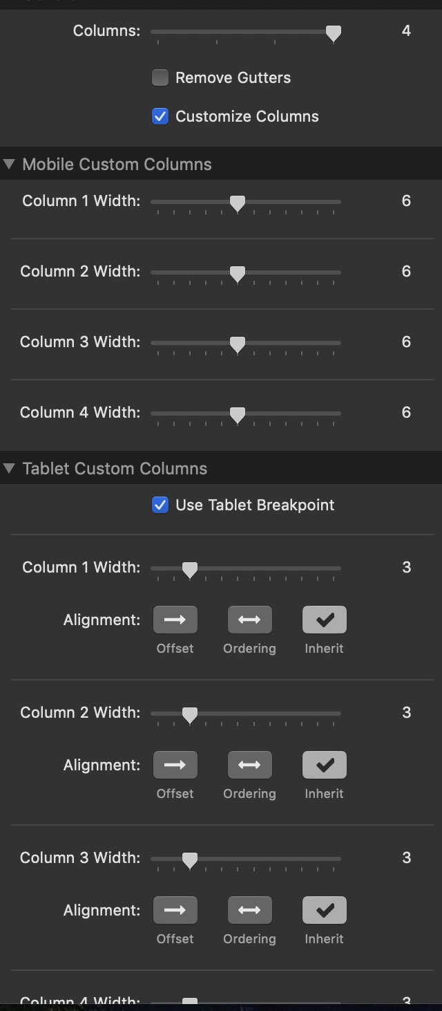
it is a Foundry Column stack set to 4 columns and set to 6 width columns on Mobile and 3 width on Tablet and Desktop.
So on Mobile size screens I have 2 rows and on Tablet and Desktop all 4 in one row.
Link to page https://ambercare.rapidwebsites.net
I have Advanced > Equal Height Columns ticked.

This is on my iPhone 6 Plus - Family Support is not lined up correctly.
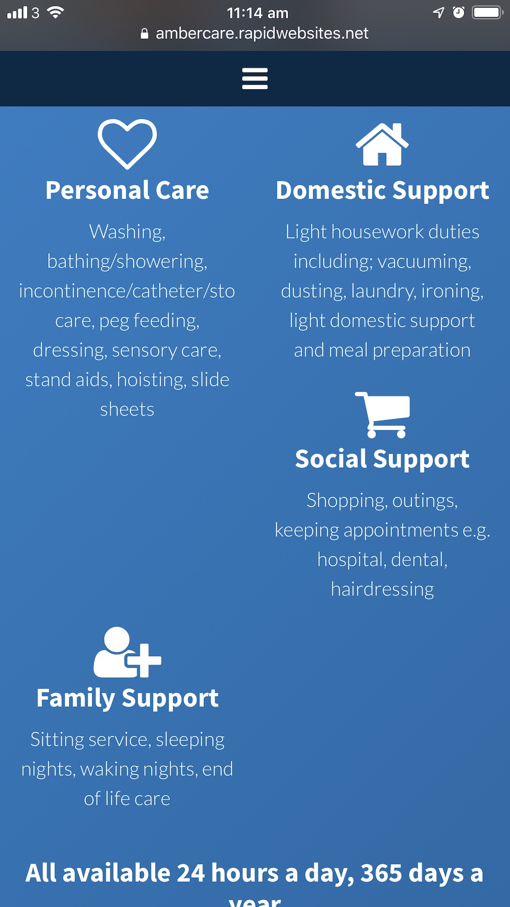
On my wife’s iPhone 6 and RW Preview and Simulate - it lines up correctly.

Is it possible for someone to check on their phone screen and let me know how it looks for you.
I can not work out why on iPhone 6Plus it looks off - tested on both Safari and Chrome both mobile browsers show Family Support out of line.
Any suggestions please.
Thanks
Scott