I agree : F3 is more complicated and not for everyone. My feeling is that I iss for the more experienced user. But it has some great new features and possibilities, so I’ll give it a try.
I have just to find out how some things work in F3.
I agree : F3 is more complicated and not for everyone. My feeling is that I iss for the more experienced user. But it has some great new features and possibilities, so I’ll give it a try.
I have just to find out how some things work in F3.
If you find out how to do something as simple as underline a bit of text in a paragraph let me know…ive spent 3 hours trying so im back to F2
use this code : <ins>text</ins>. Should work.
THATS THE WHOLE POINT…WHY TYPE IN CODE WHEN IN f2 I HIHGLIGHTED THE TEXT AND HIT THE UNDERLINE BUTTON…WAY EASIER
Good morning @bartvosters –
Foundry 3’s Navigation Bar does not have the more complicated Zones on the Foundry 2 Navigation Bar Pro. The Navigation Bar is a more traditional navigation tool. I found users had lots of support questions for the Navigation Bar Pro and its varying zones, so I thought it best to use a more traditional straightforward approach, at least to start with.
Hey there @Godber100 & @bartvosters –
I think as you explore Foundry 3 you’ll find it is no more complicated than Foundry 2, it is just a different approach. It still is drag-and-drop based through out and has even added more Easy Presets for Padding & Margins, Max-Widths, Column Layout and more.
So are the original Foundry 2 tools. That is because this is a completely new product. Foundry 3 doesn’t require you to buy extra add-on packs to supplement the main tools as I’ve baked many of the Potion and Thunder add-on features into the new tools.
As for Paragraph from your your other post @Godber100 –
The reason Paragraph uses Markdown now is that it provide semantic proper code for your site. The Styled Text Engine that powers the previous version produced OK code, but it was was not as semantic.
I am sorry that Stacks does not have a button in the Markdown Editor for Underlining text. That is not under my control however. I don’t write the Stacks plugin. If you’d like to see Isaiah add that to Stacks I’d encourage you to ask him to add Underline as an option for the Markdown editing dialogue window.
As I’ve said elsewhere on the forum the Markdown based Paragraph brings with it additional things it can do as well. Everything in life is a give and take. You have to be open to growth and change to see the added benefits.
As for what you perceive as a missing Banner tool.
I’ve covered this in one of my many blog posts over the last week or so leading up to the Foundry 3 release. Have a quick read about of this post in particular, as I even talk specifically about the Banner, Backdrop and Jumbotron tools:
After reading that you’ll see that I’ve combined the things you were using three different tools for into one.
Give the brilliant tutorial video by Ryan from RapidWeaver Classroom on the Getting Started page labeled “Creating your First Site” a watch. I think you’ll see Foundry 3 is just as easy to use as before, it is just a bit different. If you embrace those differences I think you’ll see you can do more with Foundry 3 as well as this modular approach as it is far more versatile.
Thanks for your answer Adam. I’ll find another solution. No problem.
But F3 is really a great tool and much more powerful than F2. The approach is different, but I like it a lot.
So thanks for all your great work to give us this powerful tools so we can create great website without any knowledge of coding è ![]()
being unable to do a simple thing like underline text and having to write code to do it is a rather large step back
As I said above:
If you’re underlining text so often that this creates a strain on your workflow I do apologize. But I feel that properly semantic code if much more important. Again though I don’t have control over if there is an Underline button in the Markdown dialogue. You’d need to take that up with Isaiah.
I’m always open to change and improvement. I’ve even got notes in my todo list about exploring possible other navigation styles / functionality. Like I said though I just wanted to start with something familiar but powerful that met vast majority of people’s needs.
Thanks for the kind words!
I see where you’re coming from. Whilst it might be more difficult for you, if you invest a little time to grasp the basics of HTLM and CSS our how to use classes, you’ll find it much more versatile. And it’ll help you in the long run. But hey, if you’re more comfy with F2, it’s still there ![]()
The tutorial videos from RW classroom were very helpful to me. Next week Will watch your videos and documentation. Them start to exercise. I look forward to it.
Nice to hear! Ryan put a lot of work into those! He’s such a good teacher. Far better than me. Check out all the included Starter Kits and the Maker template pack too. You can learn a lot there as well.
Yeah, just checking out the Maker template pack. That’s a really good one.
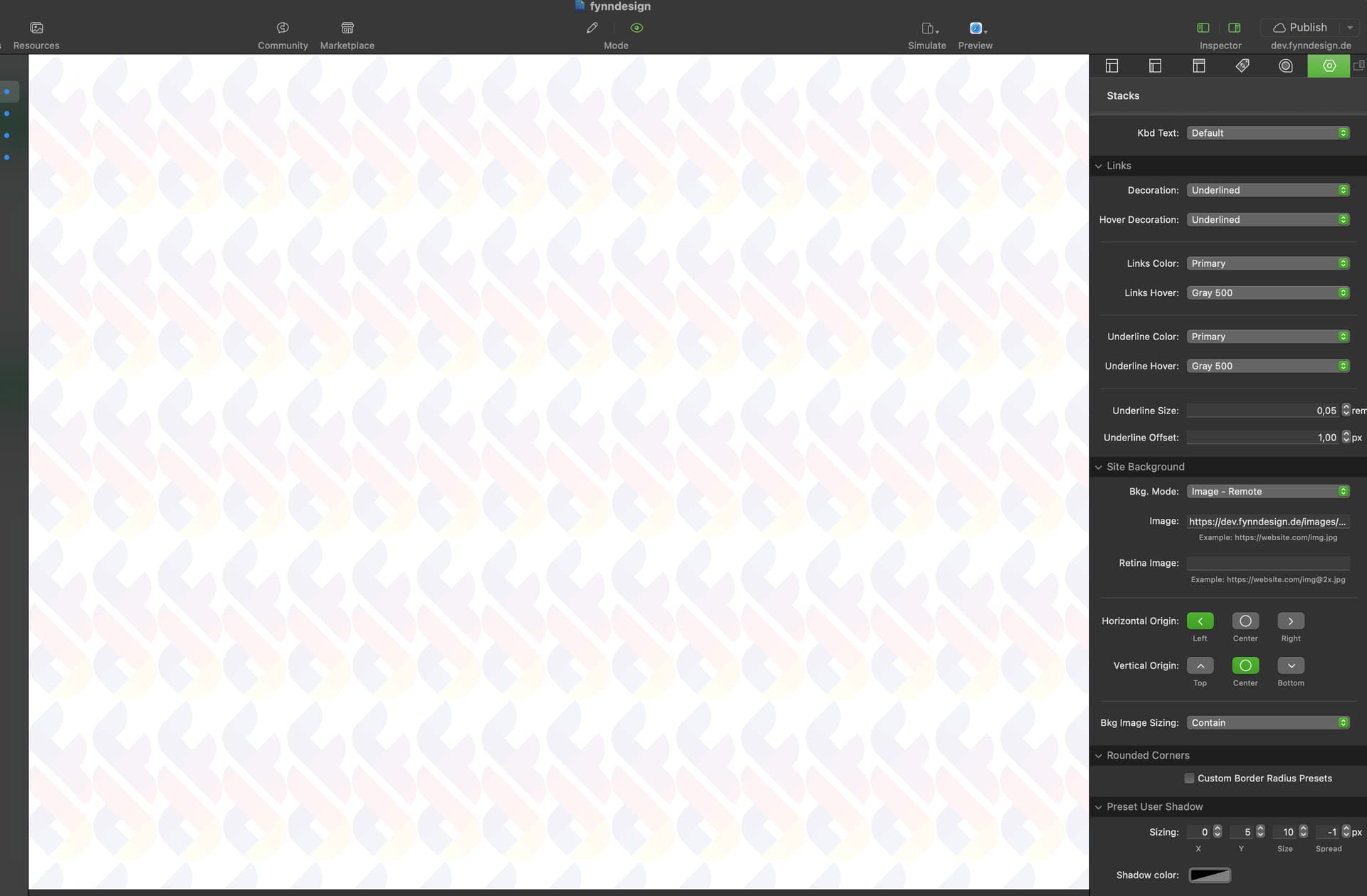
Right, I tried to set my logo png file as a background image in the control center. Set it to be positioned left center and image sizing to contain. What I get is a tiny logo, tiled repeatedly along the x and y axis:
I believe you want Cover though correct, not Contain? If not provide me a project file and your image and I’ll look at it tomorrow when I’m back to work. Heading off for family time right now.
Actually neither of it. I’m using the following css code to make it work:
body {
	background-image: url("%resource(images/fynndesign-bg.png)%")!important;
	background-size: auto 140%!important;
	background-repeat: no-repeat!important;
	background-attachment: fixed!important;
	background-position: left center!important;
}
I don’t seem to get this to work with just the Control Center and / or Blacksmith. I don’t mind using custom css to make this happen. Just … without all the !important (which I prefer to avoid if possible) it won’t show the logo at all. Even if I set the body background in the control center to custom and an apply a transparent background color. Which I don’t want. I want #F7F4F3 as the background color and my logo as described.
Here’s the project file:
https://dev.fynndesign.de/fynndesign.rwc.zip.
Oh, and one thing I do wonder… the navigation logo can be set to a custom width, but not height. Google Page Speed insights of course moans about that because of the auto for the height. I personally would’ve preferred to set the height for the logo, not the width ![]()
Thanks for checking,
Fynn
This is too much to take in from my phone. I’ll have to look at this tomorrow when I’m home.
Oh sure. I didn’t even expect you to answer before tomorrow, because of family time. I know how important that is. So, by all means, take your time.
Oh, and when you take a look at it, I noticed that the mobile menu looks odd - it reserves the space for the dropdown items that appear when hovering over the parent dropdown menu. Going to read through the documentation for the Navigation again though, might have missed something.
And even though I put the same custom class (.bg-blur) in the dropdown custom classes field, as I did in the navigation bar itself, the dropdown menus don’t get blurred.
Hope that helps.
Cheers,
Fynn