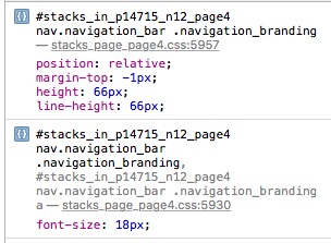
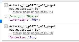
I notice that the Nav Bar branding text and nav item text don’t line up vertically. On investigation the line height of the branding text is 66px and the nav text is 70px when both text is set to 18px and Nav Bar height set to 70px and I can also see that there is padding added. Can they be lined up?
Have you tried setting them to equal heights? This is what setting them both to 80px looks like, for example, on the desktop:
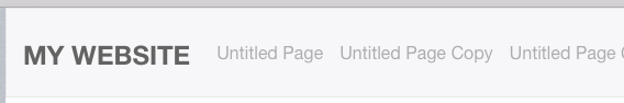
They have offset line heights to make things line up as they should. It was done purposefully. Using the same line-height for both results in a mismatched alignment between the branding and the navigation items, as shown above.
I assume you mean the Nav Bar heights and if so then yes all 3 heights are the same. Branding and Nav item are same size text for all 3 sizes too.
In the end I created a Logo with the branding text in the image that I could centre vertically.
I am referring to the line-heights for these elements, yes. Currently the offset allows things to line up as they should with various elements in the navigation bar. If you’re seeing a visual misalignment, please send me a ZIP file containing the project file with details on what elements are not aligned to your eye and I will take a look.
With working on fixing the Form Pro bug currently, this is not a priority for the day though.
No problem. This is just an observation and I have found a way around it by not using the Branding text. Thanks
If it is a problem I would obviously like to have a look at it.