Got the site redesign working on desktop and now have a few questions about my mobile pages

I am really glad to get everything moved over to Foundry from a Rapidweaver theme! Running through the whole site on my phone I can now click between each page. Before I did the re-design there were some areas I couldn’t get to using the navigation bar. There is one page that mostly stopped working though.

  1. This page has an accordion menu that shows up on the desktop but not on the phone. Before the Foundry re-write the accordion showed up just fine on the phone as well. It is really about the only step backwards from the original site.

  2. I re-designed the homepage using “sections” where I cut up one page of text with several paragraphs into multiple sections with one or two paragraphs per section. When I tested it on my phone I was a little surprised that it doesn’t seem to hold two paragraphs very well. I can go to one paragraph per section and add more sections but I just thought I would ask if that is the best option to go with. When I view it form my iPhone 7 the animation of the section rocks back and forth so you can’t really view the two paragraph section. What I mean by that is you go to section two it goes to the end of the section, when you try to go to the top of section two it scrolls past the top of that section all the way up to section one again! So it’s basically unreadable on a phone of my size at this point.

  3. The biggest aspect of the text which needs to be changed is the margins for the desktop was setup so to add negative space so that the pages don’t look to crowded. I wanted different spacing for the small phone screen of course but don’t know how to do that. The video file trailer icons at the bottom of the page are especially small.

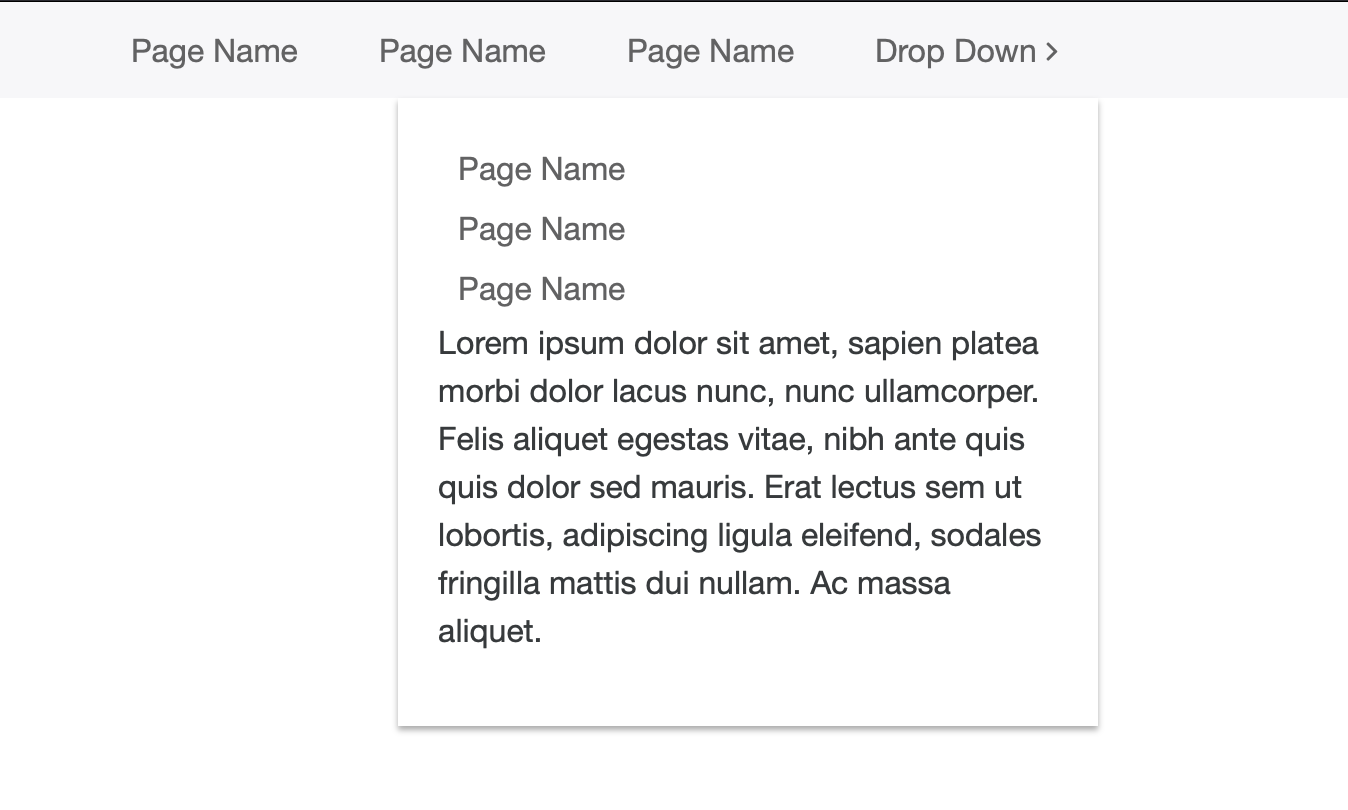
  4. The body text in the MegaMenu is double spaced. I think it is done that way so that people won’t accidentally click the wrong link if the link area were too close. Which makes sense but it just makes the body space text really far apart. If there is a way to change that on mobile that would be nice. If not maybe I can live with it. There is quite a bit of body in some menus that I will have to find a way to cut back on in later updates.

So I think the main thing is to get the type working on the phone and then mobile should be mostly up and running. Thanks for everyone’s help getting the first phase of the website re-written!

  1. I can’t tell how you have this setup. On a narrow display, you really want the “Top Ten Album List” area and the accordion area to stack. Right now the accordion still stays to the right of the album list. While there are several ways to set this up, I’d start with a Columns stack set to 2 columns.

  2. Sections is a nice stack, but it’s designed to be used when you have a very small amount of content in each section. As you found, when you have too much content, it doesn’t work very well. You could change it so you have only one paragraph per section, but that might break up your content too much. It may be better to just use a more typical scrolling page design for this content.

  3. I don’t follow what you mean by “add negative space so the pages don’t look too crowded”. The Margins stack allows you to set your margins for each of the three break points, so you have have different margins for mobile, tablet and desktop. The video trailers should probably be in a Columns stack set to 3 columns on desktop and single columns on mobile.

  4. I’ll let Adam respond to this.

  1. There currently isn’t a column just a card deck and accordion. I just did it this way because I wasn’t sure how to set it up for phone. The way it worked before I think the sidebar was set to go under the accordion when viewed on mobile. Wouldn’t the column force the two to be side by side even when it is on the phone?

  2. Okay, that’s fine I can limit each section to one paragraph. There is only about five paragraphs in total. I decided to give this way a try since I have a hard time seeing someone scrolling through about five paragraphs of plain text on the subject matter. Was hoping to get something a bit more visually interesting as well. This page was the last one I worked on so I haven’t had as much time to make revisions to it and make it work quite the way I wanted it. I just think it’s somewhere on the right path.

  3. You mean put a margin stack around the floating stack? I just saw the margins option under the paragraph stack and started setting that. It looks like when you set the margins there it applies across all the different devices. I didn’t realize you need to use the margin stack to get the different breakpoints.

  1. I could not tell by looking at just the generated code that you were using the Card Deck stack. My guess is that when it tries to rearrange the content for mobile, it doesn’t like that a lot of the accordion content is hidden. Adam will know better what’s going on with it. That said, the Columns stack can set how wide the columns are at each break point. So, you can have each “column” take up either an entire row or a part or each row. You can have the columns be 50/50, 25/75, etc. by specifying how many of the 12 units each column should take up. They need to add to 12. Setting a column to be 12 units wide will place it on it’s own row at that break point. Setting the columns units to 6 and 6 will give you 50/50 columns.

  2. It’s a design choice for you to make.

  3. Yes, you want to put the paragraphs inside a Margins stack. The margin and padding sections of the Paragraph are just default capabilities of all stack and are not specific to Foundry. Actually, all the sections at the top though the HTML section are not Foundry specific. Using the Margins stack gives you more control.

You’re going to have to provide me with a sample of your problem as it is likely related to your project and settings. Straight out of the box Mega Menu’s drop zones within the Drop Down menus work just fine:

This is what I am getting on my phone. It’s only on phone. I haven’t run it on a tablet yet so it might be happening there. The desktop is fine. I don’t remember changing the text in any way.

As I said in my post…

You can create a simple sample project showing the problem, or provide me your full project file. Whatever works best for you. Put that project in a ZIP file and use WeTransfer to make a download link of that ZIP file. Post the download link here or send it in a direct message.

When I have that in hand I can then look at the problem.

Okay, I can send the link to that in a bit.

Received your project file. I’ll try and have a look at this today.

Looks like the drop zone is inheriting some of the mobile styling. I’ll need to set an internal override in the main Foundry Control Center stack’s code to make the drop zone match the base font’s line height. This will be in the next Foundry update.

1 Like

Okay great, will look forward to the fix. I’ll most likely redo the menu in the next month too. I’m thinking about entering in the CSS code so that the color of the menu comes across on the phone as well.

@DLH The margins and accordion look like they are mostly coming together now. Next I’ll try to get the homepage working a little better on the phone too.