Hi friends. How does one create vertical lines to separate items in a three column layout that will then responsively push those lines to horizontal?
Using Foundry.
Hi friends. How does one create vertical lines to separate items in a three column layout that will then responsively push those lines to horizontal?
Using Foundry.
I’m not sure this is possible with a native Foundry stack without using some custom CSS. And even then it’s going to be a bit messy.
I know of a few Grid stacks that will do this out of the box, but they are all paid-for, and I’ve not used them for years so no idea if still supported.
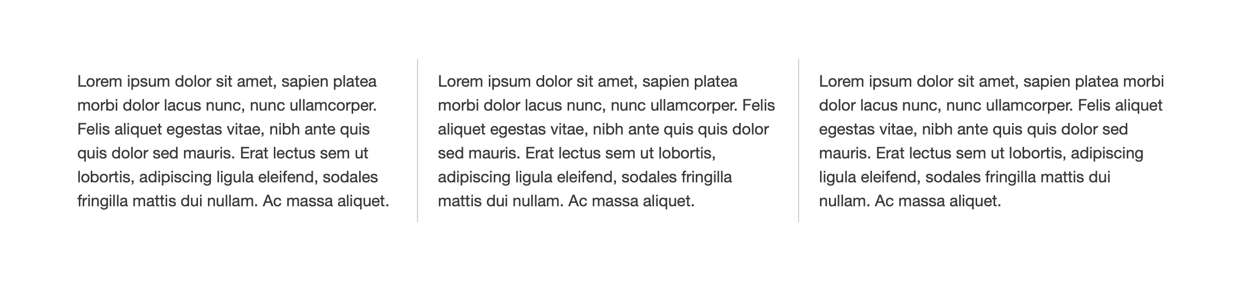
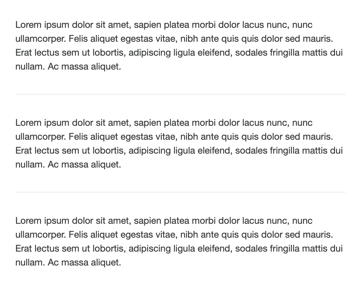
But… it can be partially done using a free stack from Big White Duck called Sidebar, which comes with the Blueprint set of stacks. But Sidebar dividers only works at desktop, not when it stacks.
Thius is easy is easy to overcome with some custom CSS, but if you want to do it using Foundry stacks instead (overcoming the lack of a divider when stacked) it’s easy using the native Divider and Visibilty stack.
Here’s a simple demo: https://www.dropbox.com/t/ciIAz2LpTnT2UTA7
Obviously you need to get Blueprint: BluePrint Stacks for RapidWeaver
Once you have it, and open that demo project you might get a bit confused as it’s got a Sidebar stack within a Sidebar stack. Tjis is because Sidebar only does two columns, not three. So you set the outer one at 66/33%, then in the 66% column add another Sidebar at 50/50%.
It’s a bit confusing to look at, but it all works!
This is super helpful. Thank you very much!
This topic was automatically closed 24 hours after the last reply. New replies are no longer allowed.