What is the difference between setting a max width in a container and setting the pixel width under margins?
I’d always use the Container stack if I want to control the width of a section of the web page.
I use the Margins stack if I want to control margins and padding and have them change at different break points.
If you’re still talking about the above example, I’d stick it in a Container stack and limit the width.
4 Likes
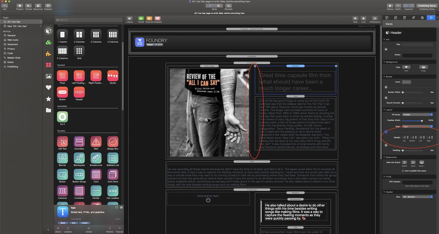
Would you use both the container and margins together on the same page at least some of the time? Or generally pick between one or the other? This page is pretty straight forward but I plan on doing more with the other pages. This is one reason I wanted to start with a page that is pretty basic. Get some of the core features down first.
I might test out some of the typography features too. I’m curious for that quote near the middle of the page is there a way to get rid of that dash at the end? It was intended for listing the name of the person making the quote but it this cause it is just a call-out of my own text so that line and dash doesn’t really need to be there.
You can mix and match a lot of things. That said, for what you described, it is probably (99% chance I’d guess) going to be the Container stack that you need. There’s videos on most of the tutorial pages, including on the Container page and the Margins page, which may give you a better idea of how to use them.
Like the two stacks I mentioned above, the Blockquote stack also has a documentation page. Head on over there and checkout the Cite Person and Cite Source options. If you turn those off then I suspect that will get you to where you’re wanting to go.
1 Like
It’s interesting there is a card block-quote too. I was thinking about using that outer area for some other pages. I can see that the container stack be probably be all I need for the spacing here. When I click on the text block I get all the margin options I need enabling me to space the text so it doesn’t run right across the top of the page and down the side of the image.
I can see I also need to add a section for links as that doesn’t get included when I add pages (like the default RW themes do.) Thought about doing something like Megamenu but I hope that solution isn’t a lot of work. Might temporally start with a simpler linking solution but I love the way menus can add some description text and section areas!
This is a child stack for the Card stack. If you’re seeing this in your Stacks library you need to read this thread:
I am unsure what you’re referring to here. Please provide a screenshot showing what you’re talking about that includes the entirety of the RW window.
I wondered why some of my icons didn’t have images while other peoples didn’t look like that! As long as all the options are under the parent stack I can understand turning that off.
When you click a text block there is that area in the sidebar called “layout.” Under “layout” I click the plus sign to get the options for “top, bottom, left, right.” I’m using that instead of a margin stack. Seems to do everything I need.
Also question on the best way to convert files over. Right now I have two RW projects open at the same time. One with the old site and one with the Foundry re-write. Is it a good approach to drag text blocks and images from that site over to the re-write? I can’t think of any reason to not do this. It’s just a lot easier then having to hunt down all the original source files.
Hi @Kip ,
I converted some old template based sites to Foundry as well. In my experience it’s not a bad idea to copy texts from the ‘old’ site into a TextEdit document (Format Make Plain Text) to get rid of all the formatting and links and start over in a clean way. I then copy/paste these texts in my ‘new’ site. It’s a bit more time consuming but I don’t want to mix classic RW Text stacks with Foundry Text stacks.
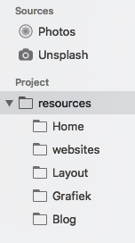
My images are all in Resources, even placed in subfolders per page. I like my stuff to be organised. Never had problems with broken links or missing images this way.
Hans
3 Likes
Okay, I can see why I would want to copy the text to TextEdit. I organized the images on my pages with different folders too. Is there a way to pull those images and their respective folders into the new project? Or do I just re-import all the images as I am remaking the webpages?
Hi @Kip , I’d re-import all the images in the resources of my new RW project. They will ultimately be uploaded in the ‘resources’ folder on the web server.
But you can opt to warehouse the images on the web server yourself and work with links in your project. It’s a choice…
versus
1 Like
I’ll probably re-link everything locally. I don’t know if the site will always be on the same server and I would like the images to back up locally and reside locally. I think before I upload the rewrite I would like to take everything down remotely and do a fresh upload of everything. I have had issues like links will remain to pages which I removed on some of the pages. I’m not sure what could be causing that but I just figure I might as well start completely over and so that none of the old problems come across.
1 Like
@elixirgraphics I’ve been doing a lot of working converting over to Foundry this week and have been pretty happy with how it is going! There are a couple of things I couldn’t figure out though:
-
I put together Mega Menu on one of the pages and just need to figure out how to get it on the other pages as well. The menu will probably be the same on each page except I’ll pick colors which match each page. After watching the video on using this tool I don’t think it explained how to apply the menu from one page to all the others.
-
I see that there is a tool, Alloy, for making blogs. Is there a way move my Mountain Theme blogs over to Alloy? I probably have about 10-15 entries at this point.
I’m providing some very short answers.
- Mega Menu: copy/paste to new pages as you need. If you want the same exact menu (i.e. no color changes, etc.) then it may be useful to put into a partial, and then copy/paste. That way if you make a change to the menu on one page it will be made across all pages where it is also placed in a partial.
- Alloy. There’s no automatic way to transfer posts. The content of an Alloy post is done via markdown. In general you can copy/paste a post that was in Mountain over to a new Alloy post. But things like bold will need to be done via markdown. Inserting images will also be done a bit different. If your blog posts contain all text this should all be very simple. If they have a lot of images, videos, and the such it will take longer. Either way, with 15 posts this should be a relatively painless conversion once you get your Alloy blog up and running.
5 Likes
-
I haven’t used a partial before but my guess to what that does is you can make changes to the menu, like add or subtract links, but keep part of it the same like color choice?
-
It should be fine to move content over manually. Mountain Theme had a limit to how much media you could add, I think, like one piece of media per page. So each entry isn’t that populated anyways. So it’s mostly copying the text, categories, tags and probably five photos.
@Kip Probably the best place to start with understanding partials is in this video:
https://yourhead.com/partials/
It is a video from Stacks 3 (i.e. not 4) but the way partials works is almost exactly the same in Stacks 4.
1 Like
Perhaps you do a video one day, on the different, let’s call it “top level”, stacks, and some best practices? E.g. Container vs. Margins, Jumbotron, Banner, Columns (e.g. placing columns directly on the page vs. in a container). #justthinking
1 Like
There’s not a lot to them honestly.
Container - use to contain content to a max-width of your choosing. This is pretty much it’s sole purpose.
Margins - use to add margins and / or padding around content. Can be adjusted at each breakpoint.
A lot of stacks in Foundry have a simple use case. This is so you can combine them is a variety of ways. It also keeps down the size of the stacks to make things quicker in Edit Mode, and less weighty on your page.
1 Like
Thanks Mitchell, I’ll look into the partials video.
There has been a lot to go over re-writing about ten pages this week! There were a few parts I wasn’t able to figure out. I’ll save the blog conversion for later since I have my hands full with these pages I am currently working on. I think I will most likely split the project up into two or three different phases so to keep things manageable. I imagine soon enough I’ll need to send actual links when trying to fix a page.
I am curious if there is a way to group pages together in the my sidebar when I am working? When I was in Mountain Theme I used an offsite page to group the different sections together. Being able to collapse a section cleaned up the sidebar and made it easier to find pages I was looking for. Is there something like that in Foundry? When I grouped files that way it also made pretty long URLs though (www.name.com/blog/files/Fairlylongpagename.html) It would be nice if there was a way to keep name’s shorter since social sites often have character limits.
Also can I filter out the stacks that are from the default Rapidweaver themes? I accidentally dragged one of them on a page and the photos on all my pages disappeared. It seems like those things are related since when I took it out everything was fine again.
For the “vertical tabs” stack is there a way to make the background area another color other than white? I only see options to to change border color and the space behind the two tabs color. I am currently using vertical tabs on the homepage but it might not be the right solution. The “sections stack” looked really nice when I watched what it could do in the instructional video. I’ll have to try that out as well.
Wow this is a lot of things to do at the same time. I think this week will be easier since about five of the ten pages are pretty well finished. The other five are pretty well along too.
Hi Adam, I was watching your video on the float stack and for some reason I can’t make it work. I was hoping you could catch what I am doing wrong? I kept re-watching the video clip thinking that didn’t enter one of the settings right so I did a screen grab the sidebar. Also another in editing mode showing the image in the normal content area and the body set under floated content. I was hoping the text would wrap around the bottom of the image. (The reason I set the text down a few lines is I want it to go below that intro type in the image.)

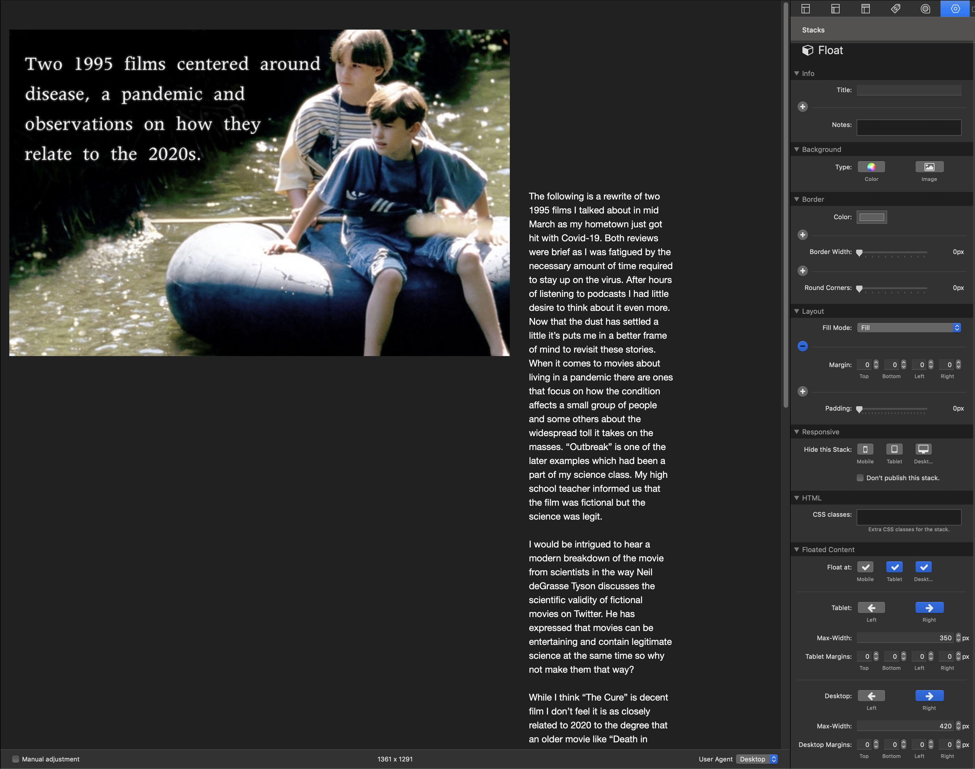
I think you want the Paragraph stack to be the Normal Content and the Image in the Floated Content. That should make the text flow alongside the image (left or right depending on the setting) and then continue below it. By default, the Float stack does not float content for mobile devices, so make sure your window it wide enough to be viewing the tablet or larger breakpoint.