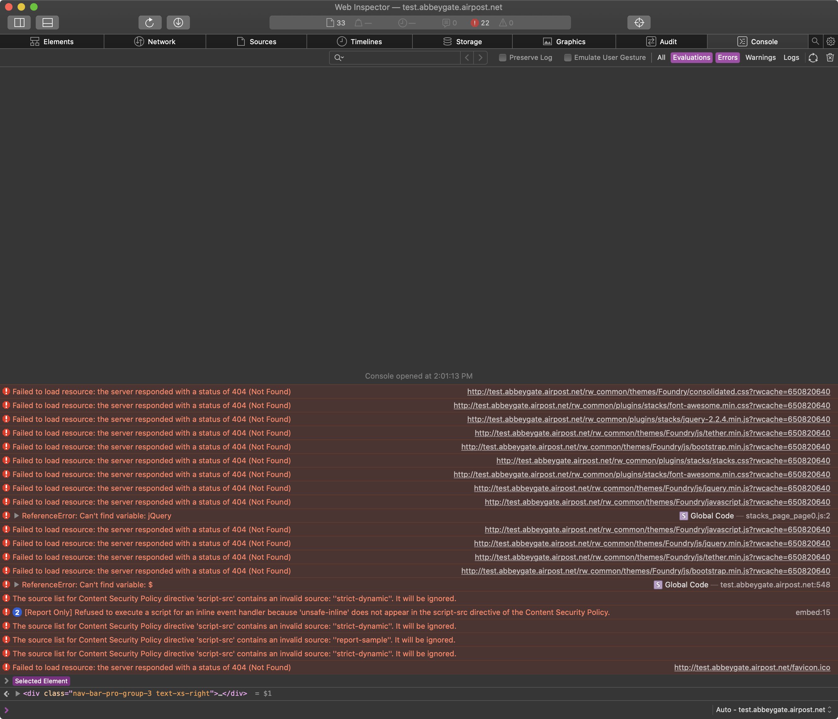
I’m working on a site using RapidWeaver, Foundry 2, Stacks 4. It all works as expected when viewed in simulation in RapidWeaver (for phone/tablet/computer) - eg on a phone zone 2 is hidden and zone 3 has the dropdown toggle menu.
When I publish it and view it - when the screen size reduces to the point the navigation menu should switch from ‘words’ (zone 2) to a drop down/toggle menu (zone 3) nothing is displayed in zone 3 (only zone 1 logo/branding).
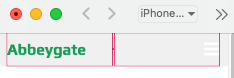
On a phone there’s no menu ever (ie zone 3 is empty), and on a monitor it’s fine until I reduce the window size to the point the menu should switch from displaying zone 2 to zone 3.
I’ve published the site with “show zone borders” and can see zone 3 there! But the menu is not.
Has anyone else had this issue/know why it might be happening?
I’ve attached two screenshots, one showing the 3 zones in a wider winder, the second showing zones 1 and 3 in a narrower window.
Please share your project file with us so we can have a look at how you’ve configured things within the stack.
Create a ZIP file that contains your project file. If you’re not familiar the project file is the file you open to edit your site within RapidWeaver. After creating the ZIP file use WeTransfer, or a similar service to create a download link (this is done because project files are usually quite large). Then share that download URL with us. This will allow us to look and see how you’ve got things setup and where your problem is located.
And yes, yours behaves perfectly on my computer (resizing the window) and my phone.
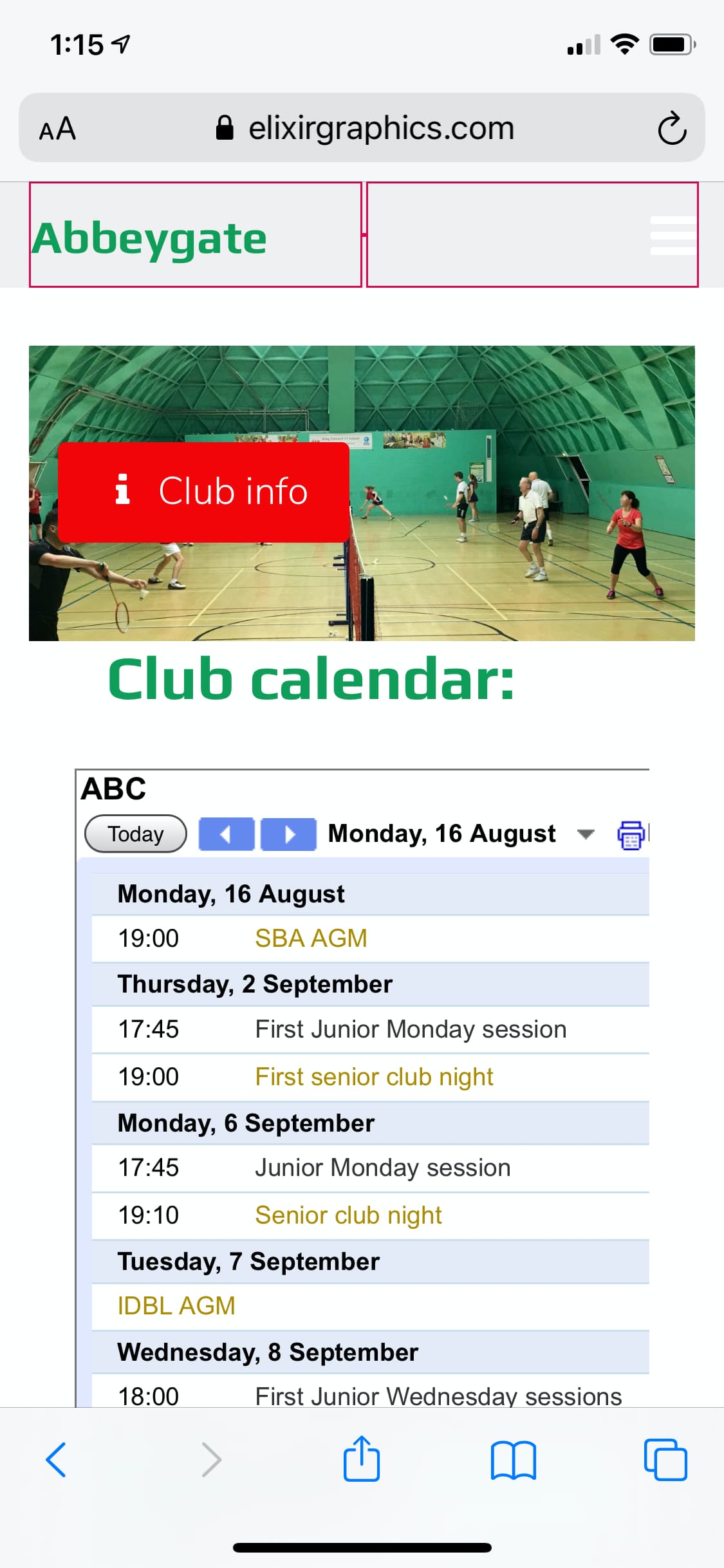
One minor thing (and I was going to live with it if only I could get the menu working!): I’ve made the chosen page toggle menu be green but this doesn’t seem to work when landing on the Club Info page (though does for all the other pages when they’re active). And that’s with your version too. In case you can work your magic on that too But I’m probably the only person who’d notice it so please don’t worry if it’s not obvious.
I’m so sorry, not sure how that happened. And I spent the day trying to fix it but each time hadn’t realised my folder wasn’t complete!
That’s fixed my missing menu thank you!
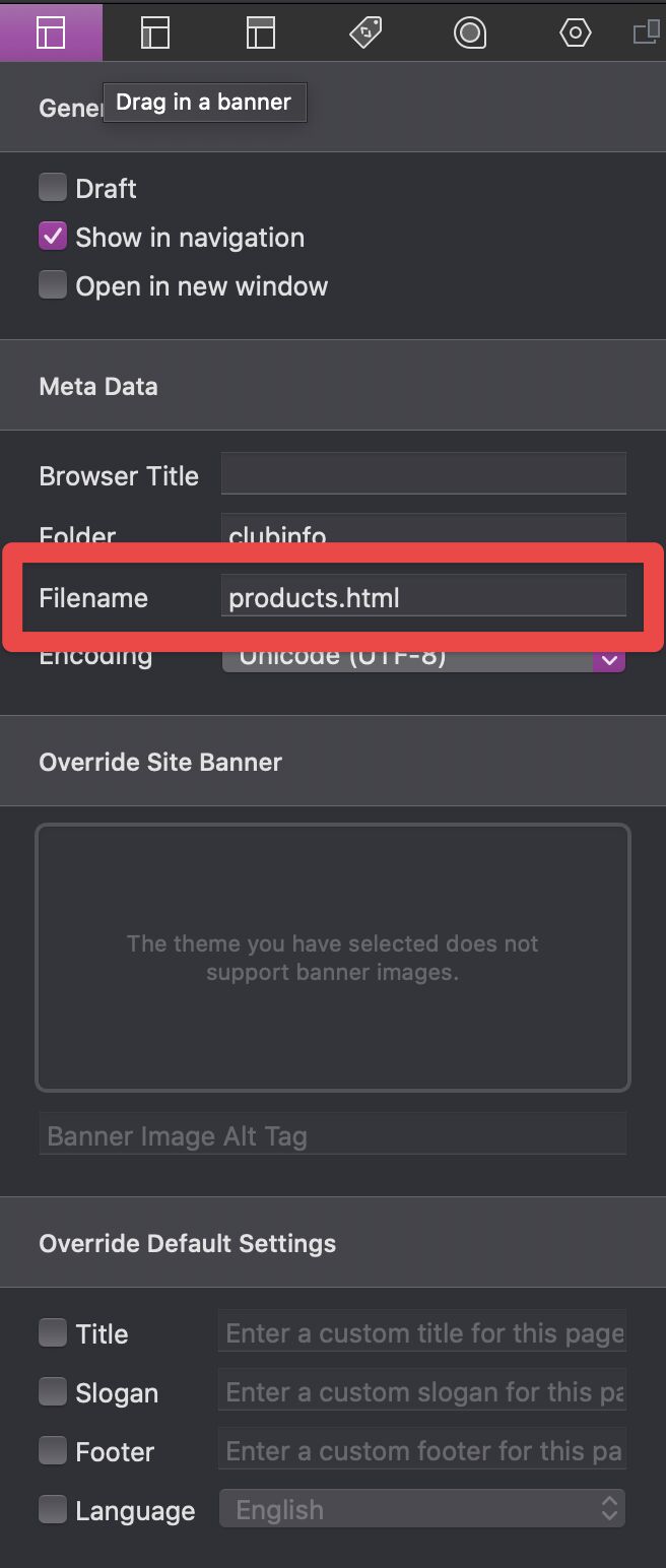
The other question was this setting:
The active menu goes green for all accept the top choice (Club Info). But as I say, it’s not so important. Am so happy the site’s live! Club email wen’t out today
 But I’m probably the only person who’d notice it so please don’t worry if it’s not obvious.