Hi everyone, I have recently used Foundry to build a website. While everything is working great when viewed with a computer, the hero banner at the top is cutting off. It is probably related to margins or settings for how the banner is displayed? (Fill vs fixed width?). I have a global menu that holds the navigation inside the banner if that helps.
Hi Ted – Would is be possible for you to post a link to a ZIP file that includes your project file? I suspect I know the cause but it would be helpful to look at the project file.
I can zip the file and then post it on dropbox and then attach a link to that location.
I have not done that before, and I am wondering if that would be a secure way since it would give access to anyone to my file which probably includes the publishing settings. Just new to this forum. Maybe it is completely safe, but just wondering.
You can send it to me via a private message on the forum, or by email, or recreate the page by itself in a new project that does not contain your server settings.
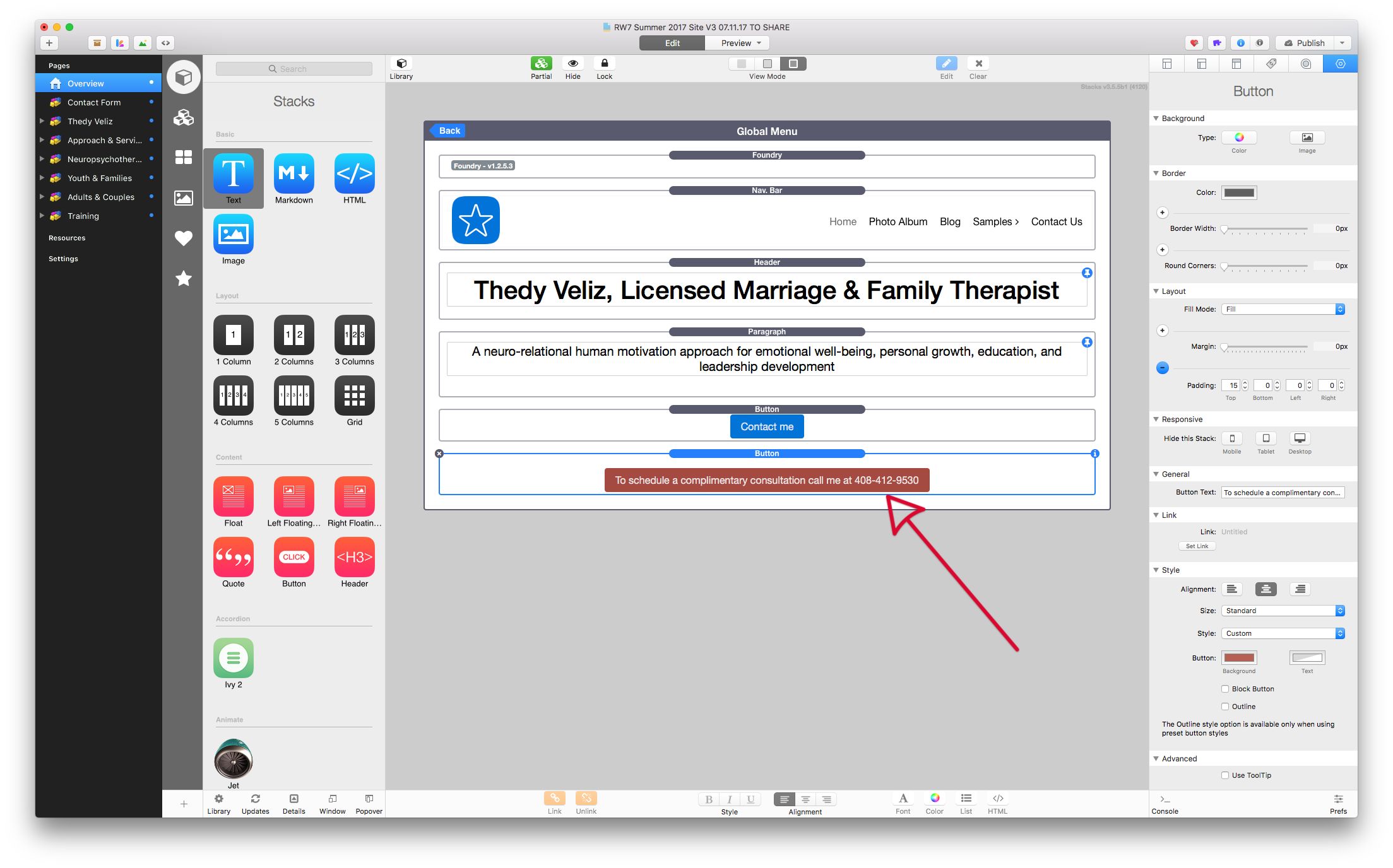
Button contents all remain on one line and don’t wrap around to the next line. This is by design. Since it isn’t wrapping it is pushing out width of the entire page on small screens. To fix this, just create a shorter button label. Generally buttons should have smallish amount of text. You don’t want to overdo it.
You next problem is one you already answered for yourself above, and that is you’re using a fixed width for your Gallery stack, as seen here:
Since you’re working with responsive design you don’t want to set a fully fixed width on anything. By doing so you’re telling that element to always be 600 px wide, at all times. If you change that stack back to Fill instead of Fixed width, you can then drop it into a Foundry Container stack and set its Max-Width to to 600 px. This form of Fixed Width that comes in Foundry uses a Max-Width instead of a constantly fixed width, meaning the contents will be 600 px wide until the Container goes below that threshold. When it does, it will begin to size down responsively.