Responsive Video Embed

In playing around with Foundry, I’m in a quandary. :slight_smile:

Specifically what I want to do is embed a video (easy) so that it has a maximum width (let’s say 800 px) but it responsive when the screen grows smaller.

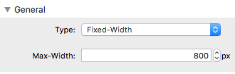
It seems I can set the put the Video Embed in a container, but that container is either fluid (so the video grows larger than I want on most screens) or fixed (so it won’t scale down). Is there a simple way to set a max width for video, but it still be responsive?

I think I get what you’re going for. I’d use a Container stack to achieve that. Here’s a simple project file showing what I mean: http://d.pr/f/1dju5

I’ve set the max-width on the Container stack to 800px and dropped the Video Embed inside of it.

That what you were going for?

Got it! Yes, that does things perfectly. Thanks.

1 Like

Awesome! It’s all about little stacks combining to work together to do their specific task. :+1: