first of all: I am thrilled with the purchase of foundry and really linke the overall experience. I am getting close to finishing my website and was pleased that using third party stacks is not a big deal at all.
but some aspects are a mystery to me … 
if I understand it correctly, hover colors are kind of an automatic process (darker tone of the link color)
in my opinion it would be nice to leave that decision to the user an offer a color swatch in the custom color dropdown for defining hover colors to my needs.
for example: if I have chosen a dark link color which works fine on white background, it gets unreadable - at least least less striking - if the automatic hover effectt (darker tone of the link color) is used on dark backgrounds (e.g. for modals, sideslips, the focus stack etc.)
to sum it up: colors are an essential part of the design process and I simply consider it to be a limitation in means of concept and creativity that the hover color is predefined by the developer 
another effect I noticed is:
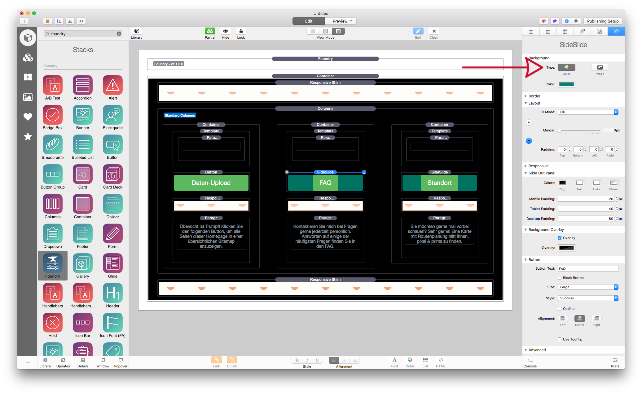
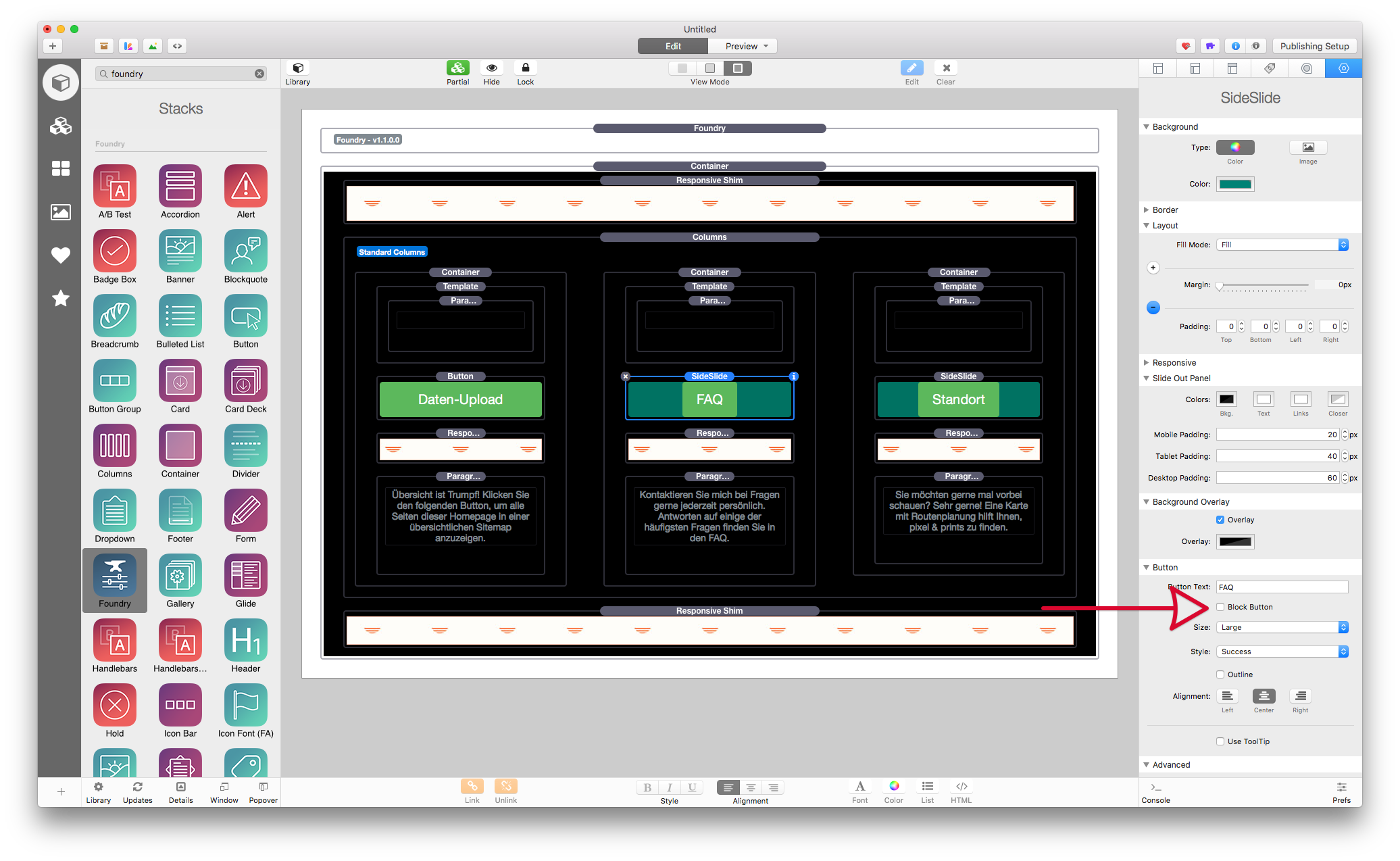
when I choose to make button stacks “block buttons” the hover effect colorizes the entire button (fine)
if I choose to make a sideslide stack button a “block button” the hover effect only colorizes the “button label” area (the text area) these different kind of buttons side by side are looking pretty unprofessional.
what would also be nice: instead of having a strikeout option für text links hover effect (who uses strikeout???) it would be nice to see other options like bold / uppercase, colored background etc.)
last but not least I am getting mad about a “funny” scrolling behavior in edit mode which takes me way to the top every time a make a little change to a stack at the bottom. I ended up to place the layout part I am currently working on to the top and putting it in place after the changes are done.