Cheetahworld
My own site for the photographic work I do!
Really like it, especially the use of Cards. One suggestion? I think it would look more modern if the top banner and menu didn’t have borders and shadows. Just my personal opinion. 
Hi Rob,
Thanks for the feedback. I did think about it recently, but never got round to it, as I had a bunch of other work to do!
I like it but I would not ask the visitors to subscribe so soon. They have hardly time to look at your site and are already distracted by the subscription window.
Thanks Fuellemann, I’ll sort that.
Thank you @Rob @Fuellemann for your feedback. I’ve made changes and appreciate you both taking time to give suggestions.
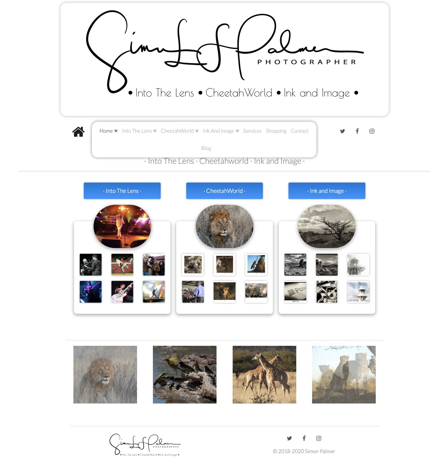
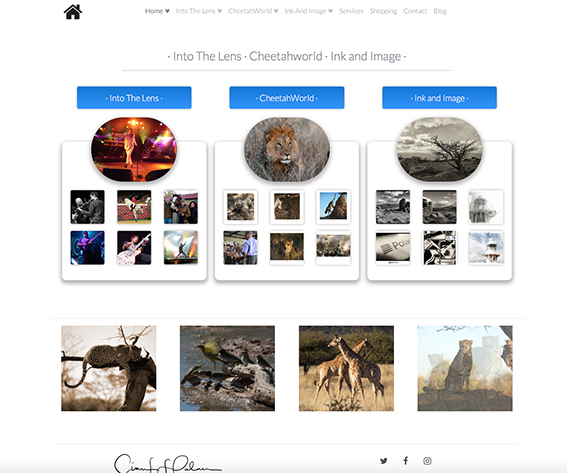
Nice site Simon and a lot of work involved there. My only comment would be to loose the ovals on the homepage and the image shapes on the category page and ovals once again. If you want something different maybe rough cut the photo as you have for the lighthouse images, which work really well. As Rob has already pointed out drop the shadows and the borders.
This page looks SO professional…
This one in comparison, not so professional… (IMHO)
What cart have you used, if you dont mind me asking?
Cheers Jon
Looks like Cartloom from my reading of the Inspector.
Hi Jon, Thanks for the feedback. It is cartloom, and also the Foundry Side Nav stack. In cartloom the products have been grouped, and then the group stack from cartoon is used on the page.
When you saying not professional enough, I’m curious from a learning perspective? If you could expand on that I’d really appreciate it.
Thanks again for your feedback.
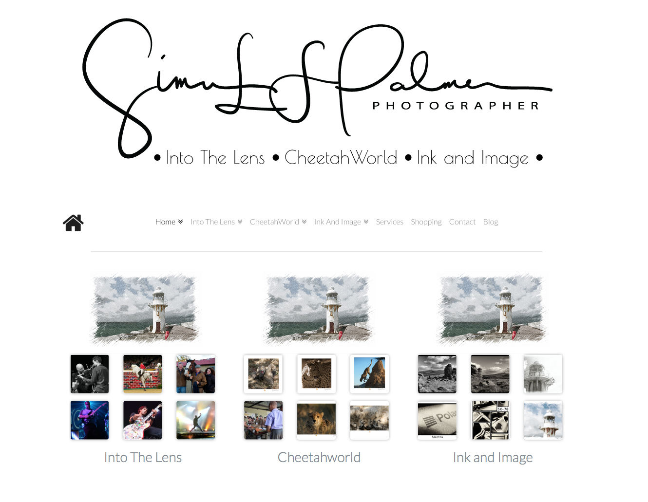
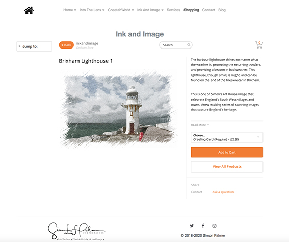
I should say I’ve made some additional changes based on the above. I think I understand a little more!  @Jonline the image you mentioned with the ragged effect is actually the presentation of the image. I see what you mean there, but I need to think about doing a major change like that as there is an impact when someone viewing the image decides they like the particular treatment of the image which is a website layout effect, and not something they can buy! Creates a little confusion in the buyers mind!!
Hi Simon… its the old saying less is more. From a shape point of view, you have ovals, circles, and squares (with round corners) it would be cleaner/look more professional if you kept it to a minimum. So you have a style throughout the site, rather than 3-4 styles. Don’t get me wrong its easy to get drawn into using all the tricks/shapes and everything in your arsenal. I’m struggling with my own site at the moment and having to backtrack and take stuff out, as it has no common structure in places, and I’ve been a graphic designer for the past 35 years
I personally think something like this is cleaner (just my 2p)
I’d drop the blue boxes, and get rid of the duplication of the words “Into the lens, Cheetahwood, Ink and image” etc as you have them 3 times on the home page
Hi Jon, You are right. I’ve had a play and reduced it on those two pages to see what it looks like, and will go through the site to bring consistency to it. I guess with Foundry, and the other stacks there is always a temptation to “show and tell” too much. I personally blame Elixir for my dilemma😂 .
Seriously though I really do appreciate the insights. They are a great help!
Thanks again
 Happy to help (its normally me asking the questions)
Also if you’ve picking a colour up (you have orange on the Add to cart) use the same orange on other pages. (i.e. instead of the blue)