I just uploaded my second Foundry website this month I am glad to say! I started posting about it half a year ago. One of my objectives with this new site was to push the animation features further. Most animations seem to be working but I have an issue with it on mobile.
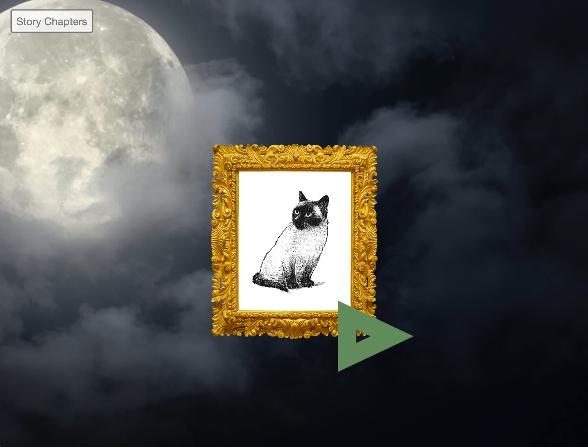
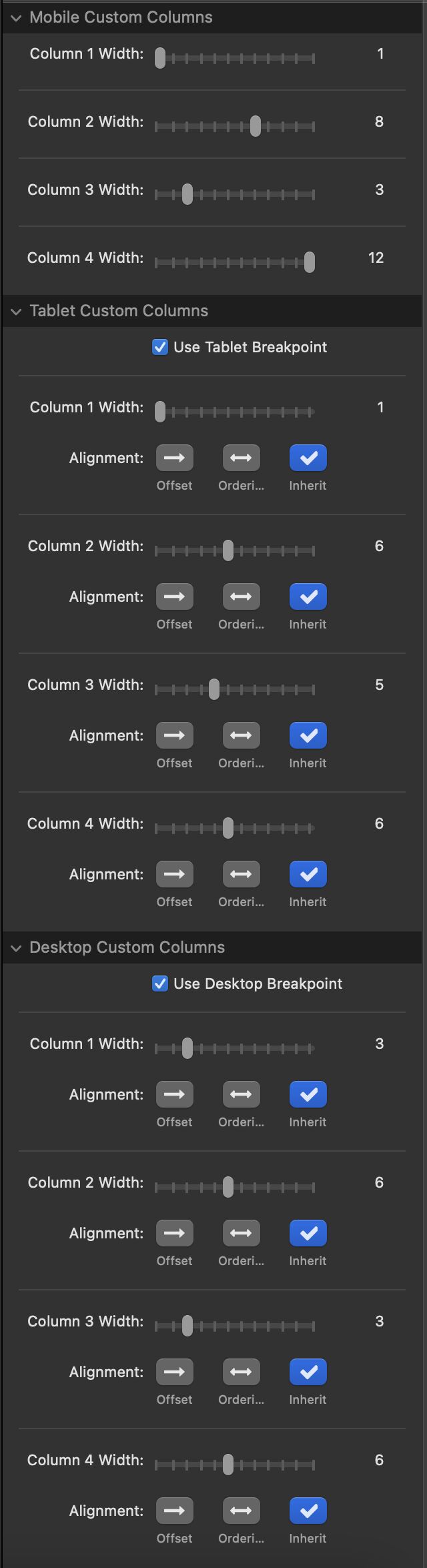
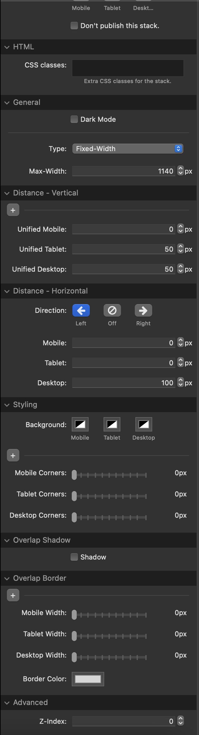
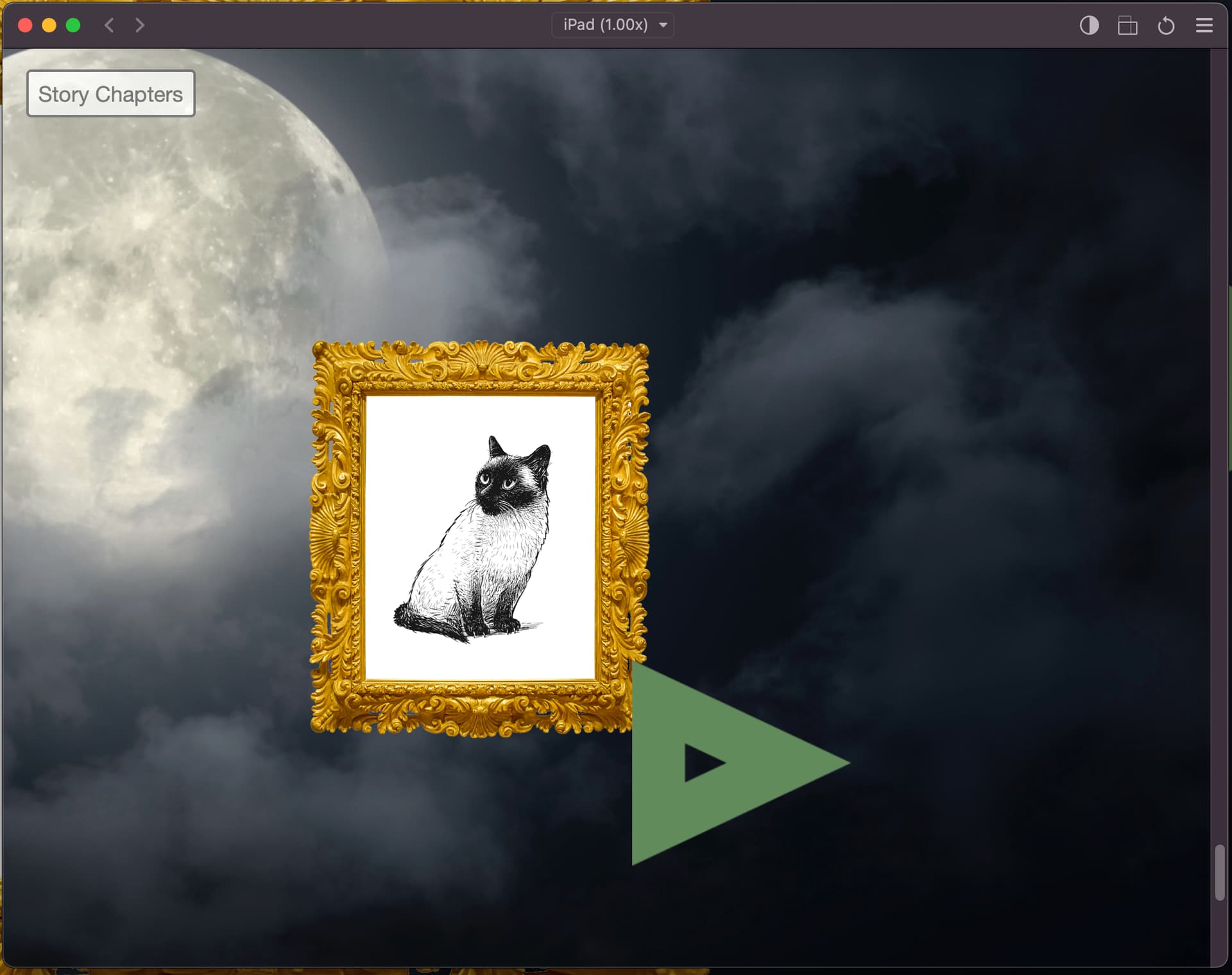
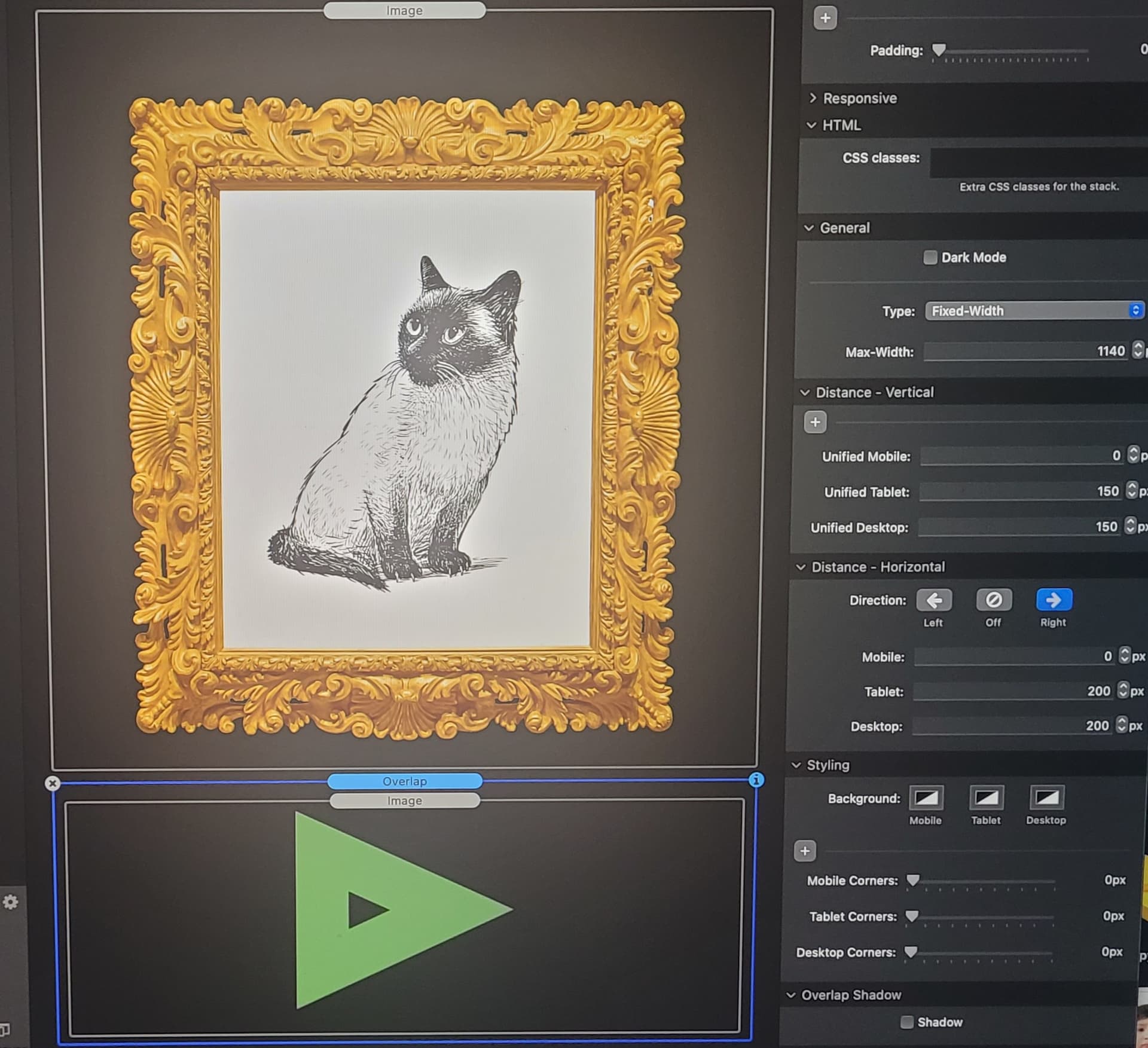
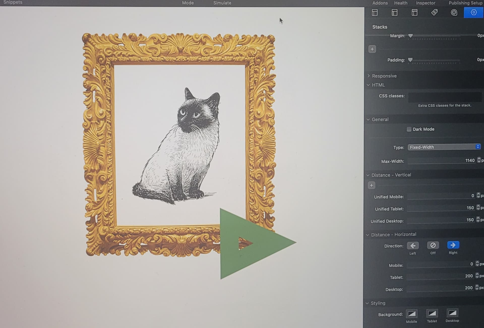
If you scroll to the bottom of this page there is a picture frame that has a next button underneath it (yes, underneath it.) After about a second the button slides out and reveals itself. This works how I expect it on the desktop but I found it will overlap the image if viewed from some small laptops or an iPad in landscape mode. Surprisingly it fares better on a phone with a smaller screen and that confuses me a little. I have a picture of my column settings across devices. I don’t know if I need to upload the RW file anymore as I have the site online now? That should make it easier for everyone I would think.
Also if I could please ask for one small favor for someone, can someone check to see if the text at the very top of the page cuts off on iPad (in either landscape or portrait.) I think this was happening on my Parent’s iPad 7 when I visited them on Christmas but I didn’t take screenshots of every page since there were so many things to alter on mobile I couldn’t have possibility recorded them all. I don’t see this happening in the simulator or on my phone so if that is a problem I’ll need to check that too.
Thanks for all the help in 2022 to get this site online, everyone who helped!
Thanks for looking into that. It must have been that perhaps the type was set to a larger size on that specific iPad or from within the browser? The reason I set the type in those smaller blocks was so I could set it aside the square Bloom picture stacks but it also means I have to be aware of the content potentially getting cut off too.
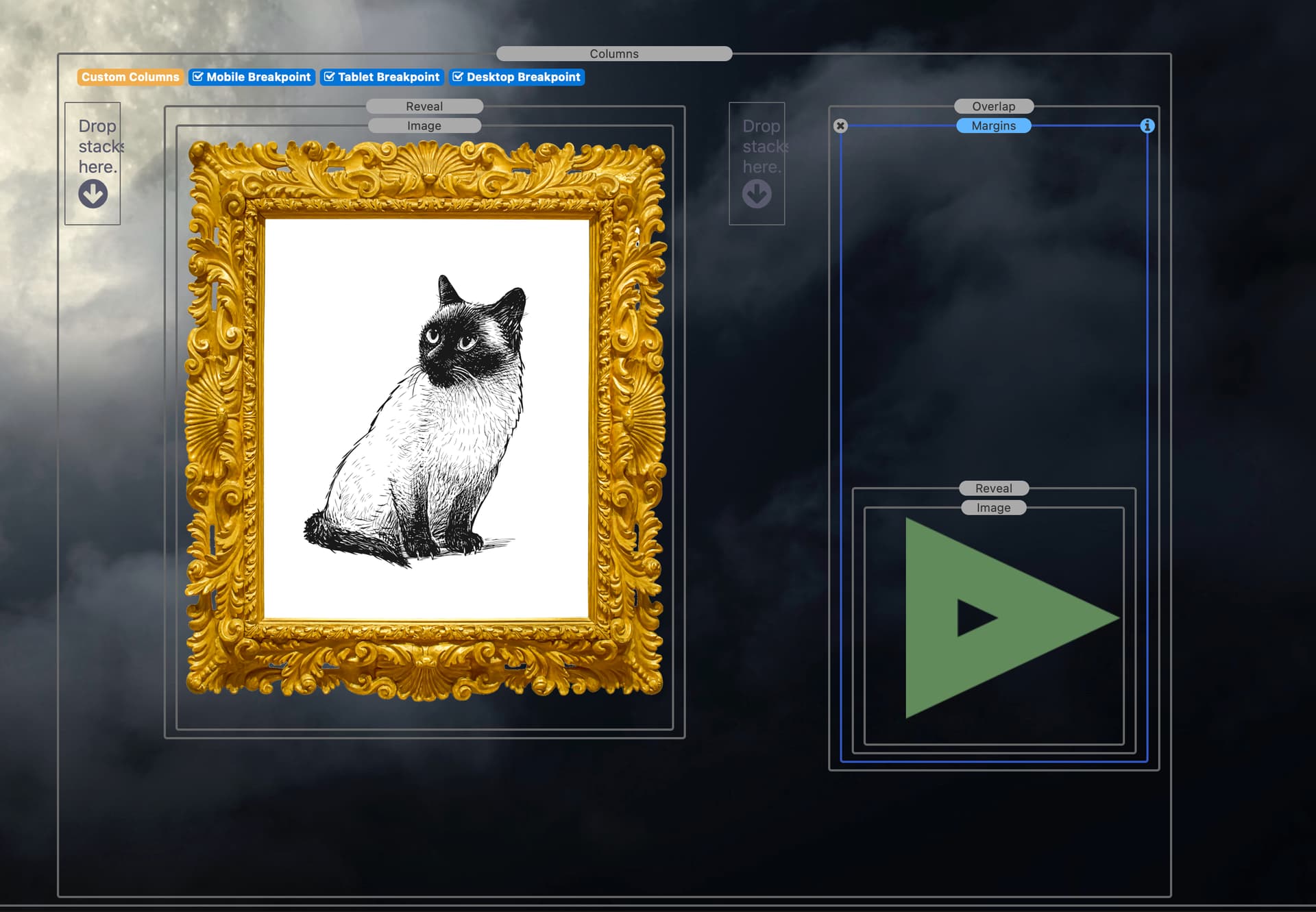
Yes, I was trying to think of some way that I could add blank space to the left of the image. So the first column is blank, picture in column 2 and then next arrow in column 3.
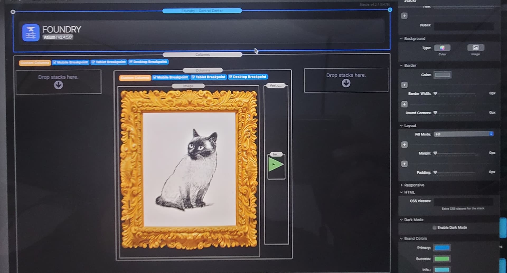
Sorry I fell back to sleep since it was 5 am. I tried nesting a column inside a column. I was wondering did you change the column widths for the different devices or just keep the default numbers? Also the next arrow is inside of a overlap stack. I just realized I should have provided the numbers for that.
I am trying to remember why I picked those numbers. The phone was set at zero since the arrow doesn’t animate there. But why did I set the horizontal at zero? That might be the problem but it seems too basic. Maybe I wasn’t sure if the iPad could animate since it is similar to an iPhone. I think the iPad can animate so maybe this is as simple as putting in a number as close to the desktop? I guess I will have to test those things out again.
Hi
Yes i did change the values for the 3 columns. I tried to give the most space for the second column where the image and arrow is nested. Not sure about the overlap stack though, didn’t you not want the arrow to overlap the frame?
It is really strange, the stack is called overlap so you would expect the item inside to overlap the picture frame, naturally, but somehow I used it to go below the image lol! You will noticed when it starts out the arrow is completely hidden behind the picture frame. You can’t see it at all on a normal big screen desktop, it is not until the reveal stack reveals it.
That seem to make sense to make the middle column stack the biggest. I’ll try that when I get back from my errands.
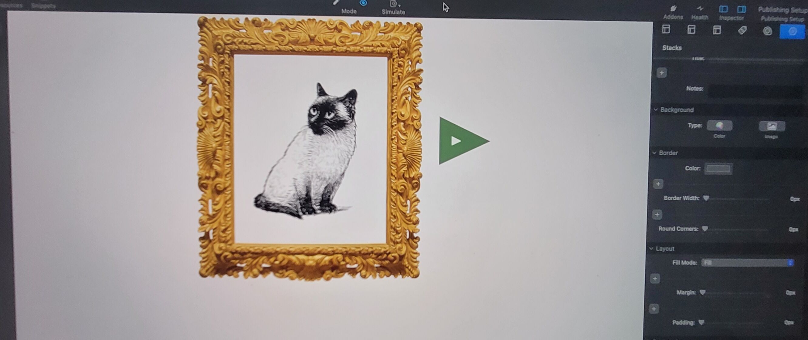
I tried increasing the Z index number to larger one like 50, 100, 500 but I don’t see a lot happening. I am not sure if it is so much that I am trying to change the placement of how images are stacked but just to move the arrow a bit further to the right.
The one thing that got it to move a little (and this is on tablet landscape mode I am specifically referring to) was to put the objects into a column stack set at four columns. I put the cat in frame 2 and the arrow in frame 4. As you can see it almost moved off the frame but not quite! It is so close. All other orientations are fine I think.
Okay that makes sense. I think I found a solution that works well enough.
I got it set up so that the button is mostly over the sky and on mobile is no longer butting up against the side of the screen. That is the other problem I forgot to mention but I think most of the major problem areas mostly seem to be working on mobile devices. Should have the whole site pretty much working on mobile devices now so I am really happy about that.