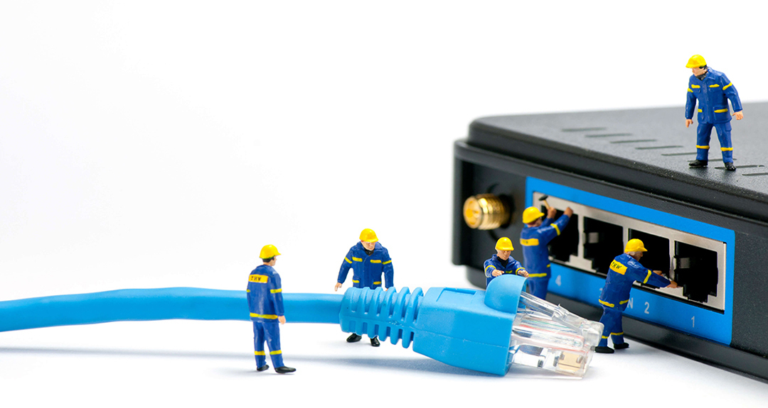
All I have done is changed a couple of font settings. The default theme is pretty much intact. I have no additional stacks even dropped in place. Depending on sizing my browsers (Safari, Firefox, Chrome) it is not scaling up or down as it should. The banner graphic was actually 1080X625 but I modified it a bit in photoshop and used tinypng to compress. IT is 1080X575.
We’ll need a link to the live site to be able to look at what might be the problem to assist.
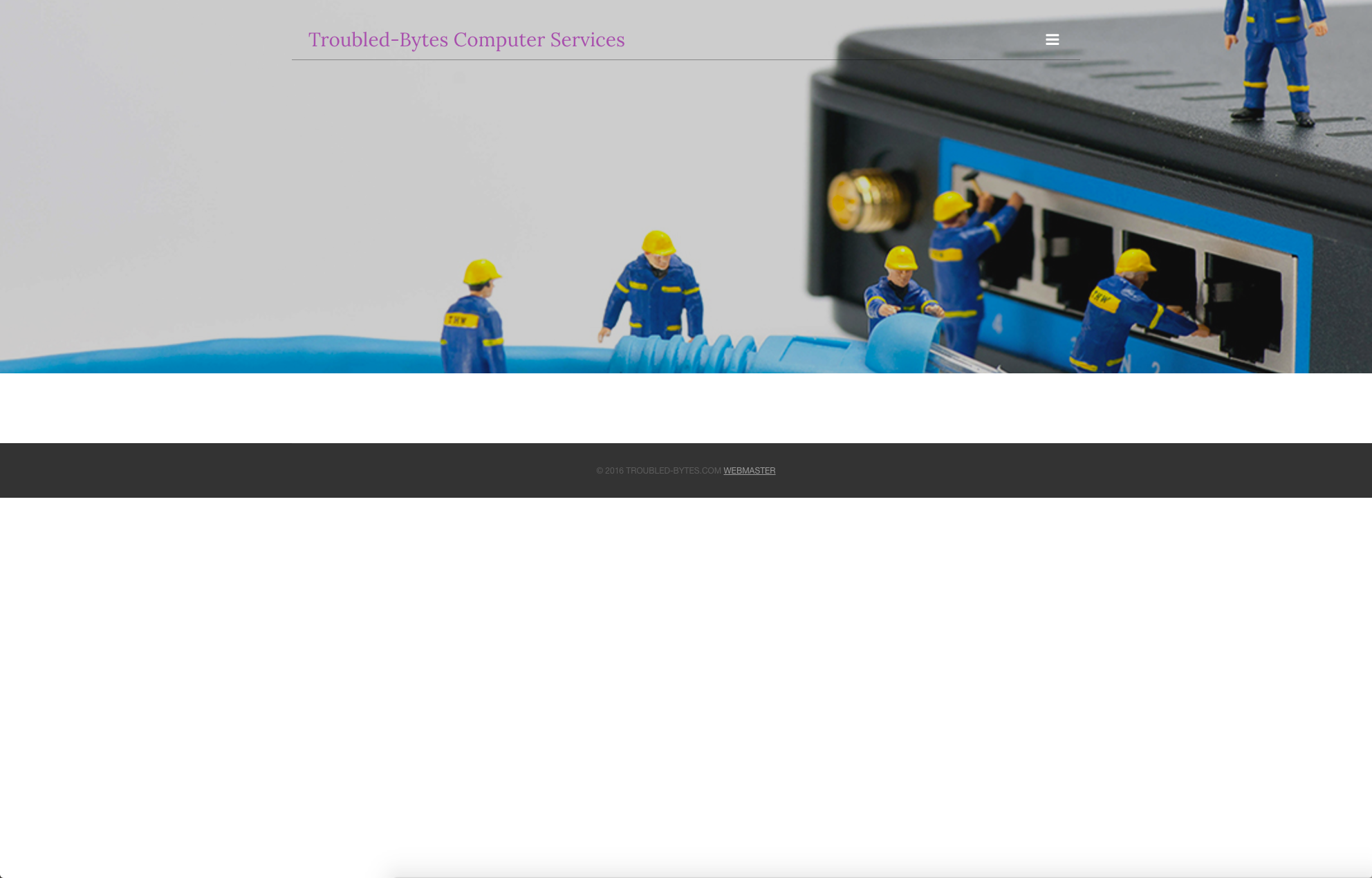
When I visit your site I see no problems. It is acting just as designed:

If you let me know what area it is you’re concerned with that you feel is not acting responsively I can address that for you. But just looking at it here it all seems to be working just fine.
Sorry I should have stated I have not yet toggled mobile or tablet. If you go to the URL you will see the majority of the banner. There is an action figure standing on top of the voip router. It is clipping his head off and as I shrink my browser window it will finally allow the whole graphic to be displayed. Here is a copy of the actual banner that I have added.
So to reiterate depending on the size of the browser window some but not all of the graphic shows depending on the browser window size. I am not maximizing the browsers either. Dragging the lower right hand corner. I realize it gets more involved when talking tablet, or mobile but it * should* show the whole thing regardless of window size on a desktop computer… I’m using my 27" iMac with about 2/3 of the desktop blocked by a given browser.
When the banner area has a fixed height, as is the case with the Voyager Pro theme, the background of the banner, which in this case is your image, will get clipped (also known as being cropped). This is because the banner’s background image is set to always cover the entirety of the banner area. Your banner is operating as it is designed to. If you look at the live preview for the Voyager Pro theme you’ll see the same thing taking place there.
I checked it is set to flexible and also I re-published to make sure there wasn’t a glitch on the FTP transfer. I know in foundry it is necessary to use margin to control the distance from the top. I assumed with the theme it would automatically deal with both to scale with the picture constrained?
Flexible mode in Voyager Pro adjusts the height of the banner area to the content you place inside of it using the ExtraContent area. This can be seen in action on the home page of the Voyager Pro preview site.
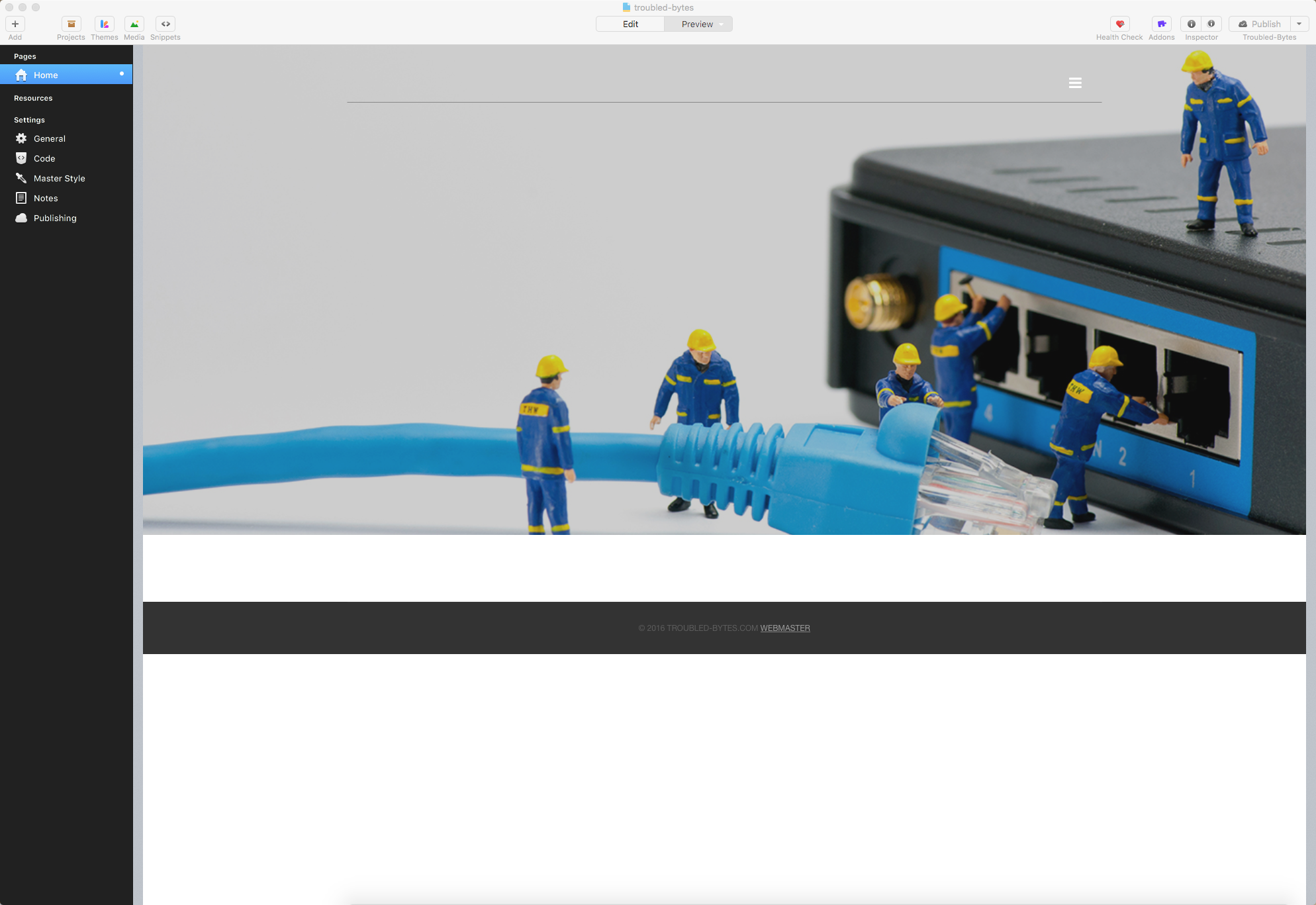
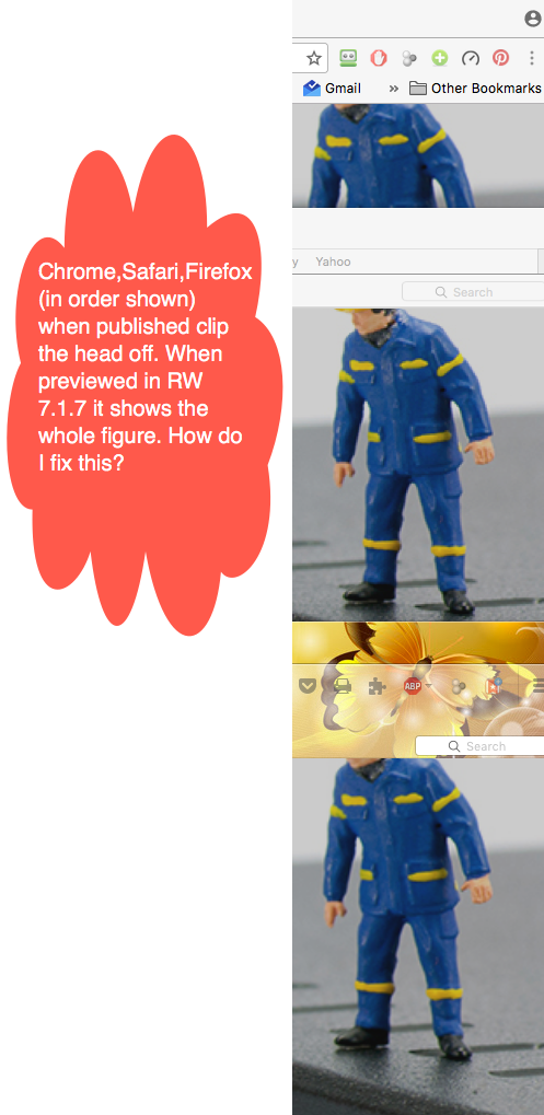
I played with the extra content area but that isn’t what I really want to accomplish. So I have been doing some more video review and the rest. I have found that if I set Banner height to a value of 740 then it shows the whole image. I double checking Chrome, Safari, Firefox they seem to render a bit differently. Chrome and Safari allow most of the image to display when viewing it in a browser on my iMac. My first attachment is just showing what preview shows with “Home” selected. The second is notated and you can see what the browsers are doing to the image. I’m wondering if there is a way to add a bit more padding at top to insure all of the picture is displayed completely? Thank you for all your help so far!
The theme’s banner area is not designed to work the way you’re wanting it to work unfortunately. The banner’s background image is designed to be used as a backdrop for the content that is inside the banner area in this particular theme, for instance the ExtraContent area. You can see this in action on the live preview site for the theme. While I can respect the design you’re going for, the banner background image isn’t meant to show the entire background image at all times for this particular design. It is meant as a backdrop only.
Do you offer a different theme that would work? If so would you be willing to swap out Voyager Pro for the other?
The issue it this I need to get something in place in the short term while I learn all the ins and outs of Foundry.
We use bootstrap.css code so the images that need to change size for desktop/mobile.
adding this to all images: class=“img-responsive”
Hi @krag – Thanks for the input, but that is not going to work in this case as the image is being applied to the background of the banner’s <div></div> and is not a standalone <img /> tag.