I just finished this website with Foundry. It uses Alloy for the Blog + has another Alloy page for their forthcoming Retreats - so it means the client can edit, update and add new events themselves.
If anyone has any constructive feedback or suggestions for improvements, that would be much appreciated.
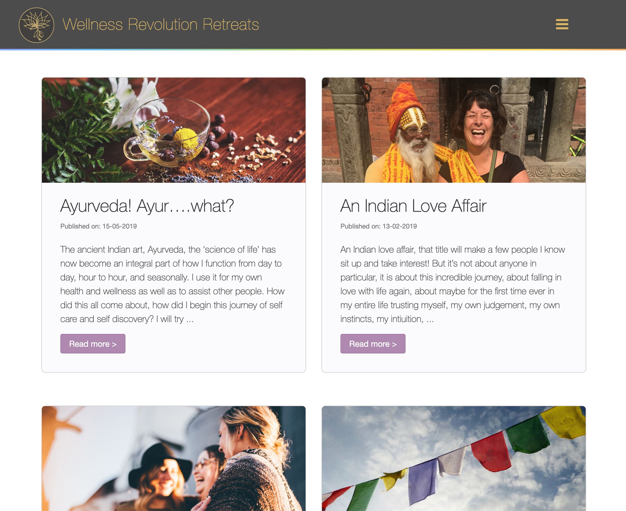
Morning. My only comment would be the use of the topper image stack in the main blog. You’ve processed the blog headers to 806px wide, which fit on the list page, but once in the full entry that image is stretched, and IMO even with the blur overlay it’s still looking very pixely.
Obviously this is one of those times when you have to make a compromise, and of course you have to take into account your users (mostly mobile etc). But personally I’d either size the headers for use in the topper plus stack (full width), or somewhere between the full entry and list view (about 12-1400px etc.).
For what it’s worthI’m sixing all topper images to 1500px wide and as low as 50% quality when I’m using the topper plus stack. I find this a reasonable compromise.
very nice and clean layout. Loads well. TemplateRepo has a point concerning the topper images, you might consider to scale these up but all in all they work for me as they are now. Having worked in advertising and communication for over 3 decades I want to make this remark: the texts in your blog are quite long. There’s nothing wrong with that, but by adding titles and subtitles to break it up a little might increase the readability dramatically.
Thank you - thats a good suggestion with the Blog headers + they do look a bit pixely at full entry view. I’ll have a go at making them 1500px wide intead. I can still keep the same ratio.
Thanks Hans. I see what you mean about the blogs. I’ll feed that back to the client who wrote the blog and suggest we break them up a bit. At the moment, they do all look like really large blocks of text. It would also be more visually interesting with some subtitles etc. Thanks, J
Images between 1200 and 1400 px will work nicely. You shouldn’t make them too large considering loading times. Just to give you an idea, images in the banner and in Jumbotron on this project I did very quickly to show a client some possibilities are 1200 px wide. The human eye is forgiving.