100% width picture with menu overlay

Hi all,

I might miss something, but I fail to build a very basic home page (at least it looks basic to me).

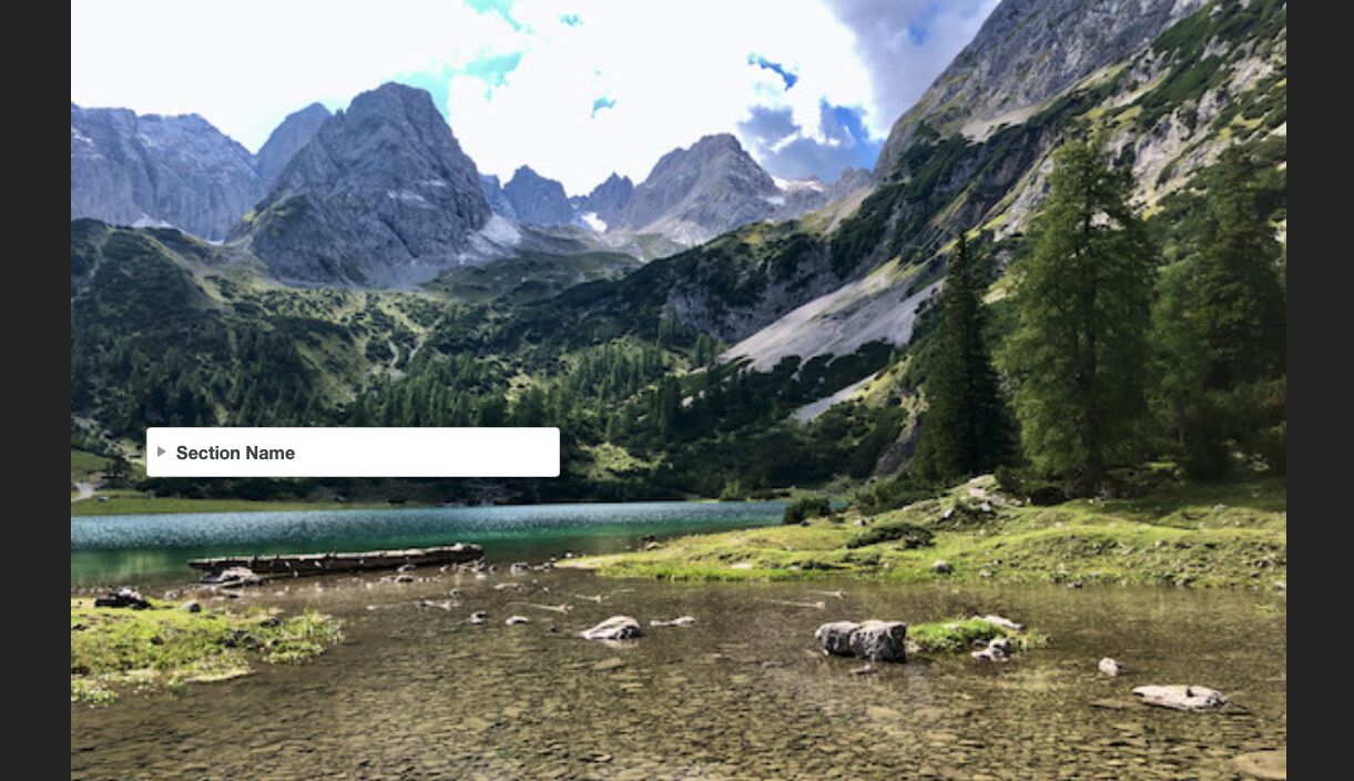
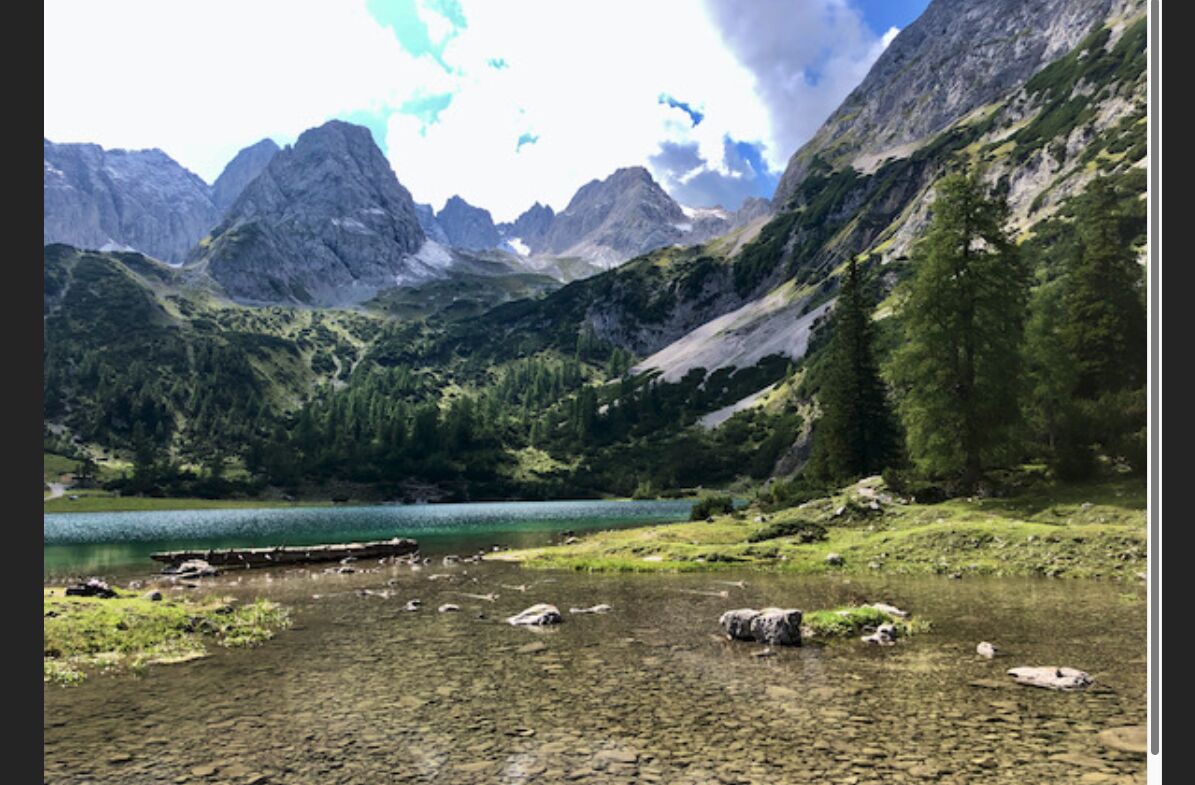
It should have a background picture, which is always the full width of the browser window independent of device or browser. As an example this can be achieved by the Image Stack and selecting “Upscale to 100% Width” for the Image Sizing drop down in the Advanced section of this stack. This image then behaves exactly as I want it to behave.

I now want to put a vertical menu on top of this image (5 items, where one of them has 3 sub items). So my home page has only this graphic and the menu overlaid to this graphic (the Nav Overlay for example doesn’t work because there is no way to have it always open).

And this is where I fail.

I have tried the Overlay Stack, but I cannot make the overlaying part transparent to see the picture shine through. I have tried the List Group as well as the Vertical Nav within the Overlay Stack. The used colors for the individual items don’t even have an opacity slider like the background has.

I have tried the Banner Stack, but there is no banner pairing option like Nav Bar Pro has it, which does allow to overlay AND transparency. So I again I fail to overlay the menu (List Group or Vertical Nav or whatever) over the picture.

I have tried to use a Container Stack and use the my picture as background image, but I can’t figure out, how to configure it in a way, that it always has the full width of the browser window. It jumps at the mobile/tablet/desktop breakpoints and does not always fill the width, no matter whether I use Fit or Fill for it. And the container has another obvious drawback, it is only as large as it’s contents, so if there is only a small menu with three or four items in there, it grows and shrinks with the menu, so I don’t see the full image. I can use a margin stack to just make it large enough, but that has some other strange side effects.

If I give up control of the image size, I can make it happen (using a banner for example. where the image height is cut), but I want to the image to be fully visible (so I might need to scroll up and down to see the full picture based on the width of the browser window), but it should always show the full picture as background. And it needs to have the menu on top of it.

I’m pretty sure I can code this with some effort in HTML/CSS myself, but for manageability I obviously want to do it within Rapidweaver/Foundry and not just put a simple HTML Stack on the page and program everything myself :slight_smile:

Any ideas or pointers?

Thanks
Bogomir

Hi @bogomir

Do you have a visual reference an image for instance of what you are trying to achieve? That would help to provide a better context so that we can present you what options you can use with Foundry to get that effect.

Did you try to use the Foundry > Site Background as an Image instead of the Image Stack first?

Best

Hi @egomade

no I haven’t tried this in the Foundry Control Stack. Let me try. I don’t have a full mockup, but if the menu items in the following image would be transparent, this is what it could look like (taken that the background image scales to the browser width and is not cut off). I will get back with a test with the Foundry Control Stack…

Thanks
Bogomir

Hi @egomade

The Site Background in the Foundry Control Stack has similar challenges to other background options I tried. The image doesn’t scale to the browser width. When the width gets too small, it cuts off the left and right sides of the background image. Instead it should scale down the background image, so that the full image width is seen.

Small Browser window:

Larger Browser window:

You can clearly see, that the picture is wider than what is shown in the small canvas.

With the image stack and upscaling to 100% I get this:

Smaller Browser Window (a lot of white at the bottom, but the full picture is visible):

Bildschirmfoto 2021-02-12 um 17.38.19

Wider Browser Window (scroll bar is seen on the right, so the picture has full width, but the height is not fitting the browser window, but this is the desired behaviour):

So far the Image Stack is the only one behaving as I would like to have it. Unfortunately without an option to place something on top. At least I haven’t discovered it yet…

Other ideas?

Thanks
Bogomir

Hum,

I believe you will need to use some king of absolute position so that you can position your elements on top of the image Stack. Can you try the Position Stack? It may help on this one.

https://foundry.elixirgraphics.com/documentation/position/

Best

3 Likes

The idea by @egomade is a good one.

I’m on phone right now so I can’t help a lot — but look at Banner stack set to Hero mode as an option as well.

1 Like

Hi @elixirgraphics @egomade

I’m playing with the Position Stack right now and it seems to get close. I already have the image behave as expected and I’m working to position the menu now. I have tried Hero Mode and it had some other unwanted effects with the picture, which I can’t remember right now. Thanks so far. I will report back, when I’m done with the Position Stack. It looks promising at this point.

Bogomir

1 Like

I made it work (like 95%+) with the Position Stack, which uses an Image Stack to created the seamless behaviour of the “Background” Image and a Vertical Nav Stack within a Margin Stack with some CSS tweaking to get to the menu background transparent. I will write a separate entry on the “shortcomings” of the Vertical Nav Stack. Thanks Adam (@elixirgraphics) and @egomade :pray:

Current Work in Progress looks like this:

2 Likes

This topic was automatically closed 24 hours after the last reply. New replies are no longer allowed.