@Kip , can I make one more suggestion concerning the general layout? Add like 20 points (padding) below your titles. Again this will create more air on your page and will increase the readability.
Cheers,
Hans
@Kip , can I make one more suggestion concerning the general layout? Add like 20 points (padding) below your titles. Again this will create more air on your page and will increase the readability.
Cheers,
Hans
How do I add this text along with the “foundry-typeface-two” code from before? Do I just fit it inside the brackets?
One reason most of my pages don’t have a type color set is I was trying to find a color which would work okay on both light and dark mode. I experimented with that on the health page at the bottom as label for the videos. I like the color on this page where the background is blue so doesn’t matter if the viewer is it dark or light mode. I also used that image inside of the text stack that has a mid brightness color that works in either mode. I know I brought up some of those pages before I just wanted to point out there has been some experimenting with different type and background colors.
The one issue I would have with the #4f4f4f grey is how it looks in dark mode, it seems like the type would disappear, unless you mean I would pick that color for light mode and a different color for dark mode. I haven’t experimented with designing that way yet and I’m not sure if the typeface stack works that way? Or can I use the Eclipse stack hand in hand with the Typeface stack for color? I might have to watch the Eclipse tutorial again because it probably covers light and dark text.
@Panans Sure I’ll get those headlines spaced out.
Sorry, you seemed like you were familiar with using CSS, so I just posted the CSS you need. You add it in either the page-specific or site-wide CSS area.
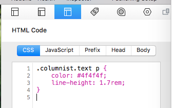
You leave the foundry-typeface-two class in the Columnist Custom Classes area.
Adult the color and line-height to what you like best.
Now that I am so deep into finding a website solution I really should study things like CSS again so that I have full control over how things look. I did look into it a bit at one point but after most of my websites were done my handing mock-ups to someone else I didn’t keep up on that.
Is there a way to also pick a color that works on dark mode which is different from light mode? Each page has a different color scheme so it would be nice if I could be individually changed by page. I hope the only way to effect which text color displays in light and dark mode has to be the same on each page. If that is the case I may have to stick with white and black text.
I have not done much with dark mode. I understand why people enable it for apps and how it could be useful a website’s design to change when dark mode is on. However, it’s really like designing two separate websites. You need to come up with a color palette for both light and dark mode. This can be fairly simple for a straight-forward website, or very involved for a complex website. This can also extend to choosing different images, logos, drop shadows, etc. Most clients like the idea of dark mode until you need to change their logo colors, or you give them an estimate for adding dark mode support to a website.
With that said, Columnist should be using the default paragraph font color. If it does, you can enable “Dark Mode” in the Foundry Control Center and then choose alternate colors for dark mode for any color setting for things like headers, paragraphs, etc. I’d start with that and go from there. If you go this route, remove the “color” setting from the CSS I provided.
It definitely can be a lot more work to design for dark mode, especially with a page like mine where the look of the page changes from one to the next. Okay I will probably change the default color text in Control Center. I already took the color out of the CSS since the dark grey was getting lost in the dark background but it looks like Control Center resolves this.
Also I may end up looking around for different body text like you said. I found that when I bold certain words like @Panans was talking about I can barely see the difference between the text that was made bold and the regular styled type. It was a bit of an experimental page that wasn’t really made very public. I’ll usually tweak things for quite a while before it goes live.
Hi Kip, when it comes to choose the right font, the choice can be overwhelming. In my experience Roboto 300 for your body text may work fine. Roboto 400 can be used as the bold. Or the Lato 300 and 400.
Both fonts are classics in websites for they are very readable fonts.
Hans
I tried with Lato 300 and spaced the heading out from the body text. The bold text still looks pretty close to the regular type which I suppose is fine. I might be better to not stand out too much. I’m still deciding how to deal with the color of the type so I put that off for now as I am trying to get the SEO and sitemap work done.
I am so glad things are fairly wrapping up at this point. I know it’s not perfect but I finally have a website solution that largely does what I want!
Hi Kip,
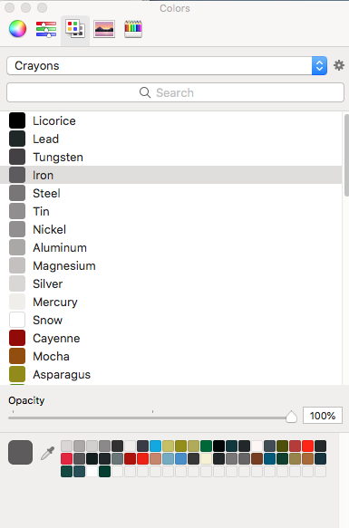
I like it better now. When it comes to color, your body text is fine but I would make the titles greyish. You are using a very heavy handwritten font there, by setting the color to a 80% grey (or Iron) you will create a more balanced look and feel.
Cheers,
Hans
Okay I’ll play around with some other colors like iron. Yeah the heading is a lot heavier then the body.