The Container’s minimum MAX-WIDTH is indeed 320 px. There is not a need for the MAX-WIDTH to be below 320 px because at that point things will already be fluid due to the size of mobile devices.
In PM Adam made a good point, that below 320 you don’t need the responsive features of stacks like Container, so just use the default 1 col stack and save code.
Have to say, it’s never occurred to me like that before, but it does make a lot of sense.
Except that you might want the 3 BP settings in Container and also keep responsiveness. Eg in Grids and multi column layouts. The 1 Col is Width and Container is Max Width. Not an issue for me as I created the PADDYwidth stack just for this but it always seemed to me to be a restriction to make a min value of 320px.
Unless I am mis-understanding your setup (provide me a project file if you like and I’ll look at it), but you would not want to lump a bunch of Container stacks into a grid. That is a lot of unnecessary code for something that I do not believe is needed. The Container stack is to house main sections of content and set the max-width for said content, making a housing for it that is responsive. If you’d like to provide a sample of what you’re referring to and explain its goals I would gladly take a look at it.
Actually I just had a look at Container and realised that it doesn’t have desktop, tablet and mobile settings so was thinking of another stack that does. If Container was designed for main sections then so be it.
@elixirgraphics A good example of allowing Container to go below 320px would be for control of button widths.
The Foundry Button does not have a max width setting so there is no way in Foundry to control the max size of a Button. Eg., if you wanted to have 2 Buttons side by side in a 2 Col layout but set the maximum width of the buttons, you could use a max width stack like Container, to set the Max width to say 300px and set the buttons to Block. This will keep the buttons matched in width when in 2 rows and stacks and never allow the buttons to go beyond 300px. Trying to do this with a stacks fixed width, makes them non responsive. So allowing Container to do this by removing the restriction of a min value of 320px would achieve this.
I can’t post a zip file because Container doesn’t allow it so there is no Foundry solution.
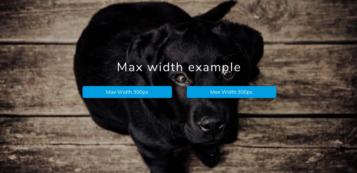
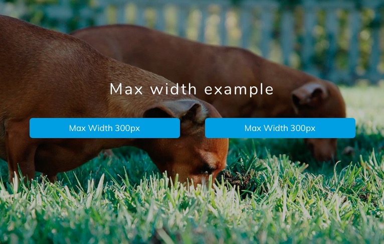
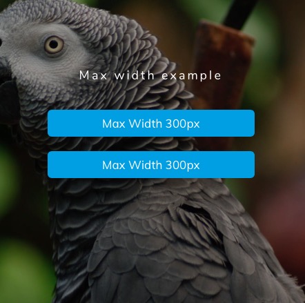
Here are some screenshots using PADDYwidth to set the max with to 300px.
This is a Container set to a Fixed Width of 700px (really it is a Max Width)
Then a standard 2 Col
with a PADDYwidth set to 300px max with in each column
and a button set to block inside each PADDYwidth.
I believe you misunderstood me. I was looking for you to send me a projet file of how you would like for it be setup. Construct it in the way that you’d expect it to be constructed. I obviously know that the Containe stack does not go below 320px as it is not designed for what you’re trying to use it for. It is intended for main content sections on the page.
Thanks! Will have a look next I am back at the computer. My goal is to see your use case in action, see if there’s an existing solution built-in to RW to do what you want, and if not, evaluate if a new stack would be a good solution to your problem, since the Container stack is not designed for that purpose.
Easiest way to limit the width of the Container stack below 320 is to add a margin stack and set the side margins accordingly. A bit of a flaff, but it works. A bonus though is you can adjust the size of the container, so in the example above, the button width, depending on the screen size.
Whilst on the subject of the Container stack… One thing I did notice recently which surprised me was that when setting the max width the container is always centre aligned. For a while I searched for the left/right align options, but couldn’t see them, then I realised they don’t exist.
Now, in the context of Containers intended use, I understand why. But, having a max width stack that you can choose how the content area is aligned would be handy.
To get the effect I want, as in, say a content area of 500px aligned to the left, I just set a two column stack and only use the left-hand side. However, this always feels wrong! Dunno why, just does. Maybe though this is exactly how it’s meant to be done?