hello,
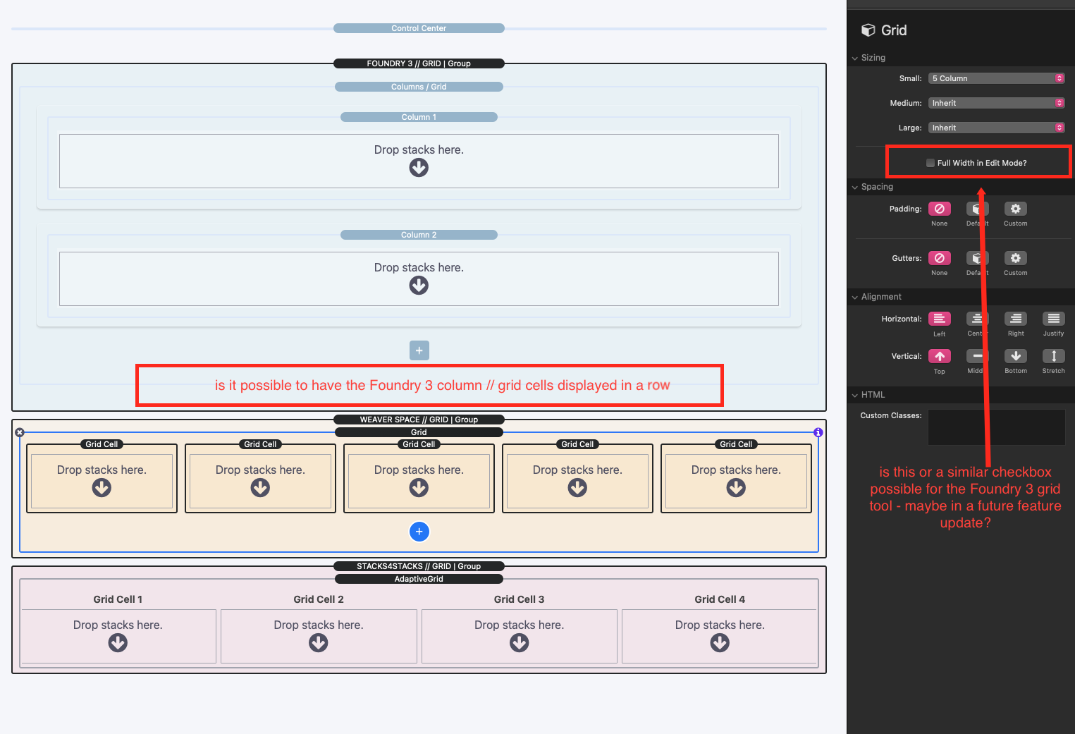
is it possible to have the Foundry 3 Columns/Grid-Tool cells displayed in a row?
for some work it is sometimes quite useful especially if you only work on one notebook. so you don’t have to scroll up and down all the time.
it would be a nice thing for a future feature update!? 
1 Like
I think it was that way in an earlier Version of Foundry 2. It became very crowded and confusing when you added more stacks in, so that’s probably why it got changed.
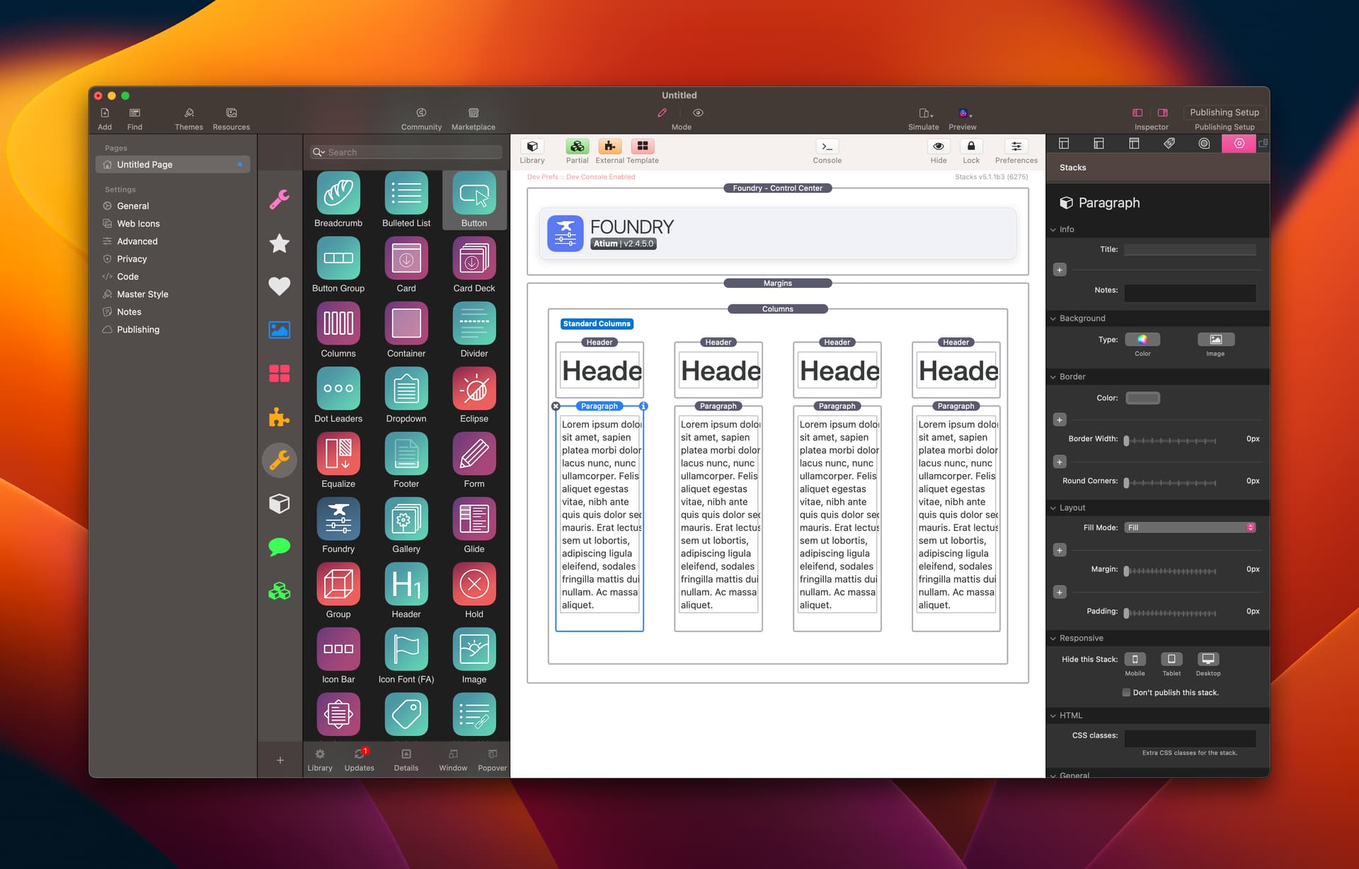
The horizontal, columnized layout of Foundry 2 in Edit Mode is much more limiting than than stacked layout found in Foundry 3. Especially on a laptops. It becomes even more apparent when you start nesting columns, too.
Stacks’ Edit Mode isn’t really great for this sort of layout with content that varies so dramatically from one use case to another. I know both myself, and other often ended up with columns like this, and this is a simple 4 column layout:
Those are just one the default, one-word headers from Foundry 2. 
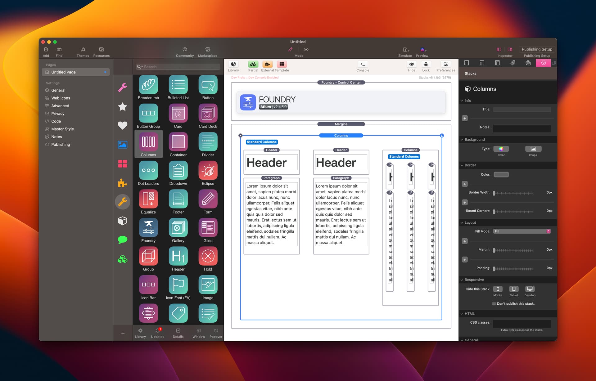
If you start doing anything more complex it all goes to pieces:
Yikes.
1 Like
yeah… of course you are both totally right … for big things the new edit mode is of course much better!
but sometimes - for little things the old version is also very useful.
as a small example:
in the yellow version i have faster access to the three buttons - in the blue version you have to scroll much more
pls, do not misunderstand: the Foundry 3 Columns/Grid-Tool its great! but it would be a nice option - to use the tool optimally 
I can appreciate the request. IMHO I’m not sure that it is worth adding the extra overhead to the Edit Mode code for these more limited corner cases though. If you feel passionately about it feel free to file a feature request in the github repo (Foundry Feature Requests) and it’ll be kept in consideration.
2 Likes