What might be the best way to add file sharing content with
icon + tile (link to file or webpage), where the icon represents the file/content type
indented description below, which gives a brief description of content, etc.
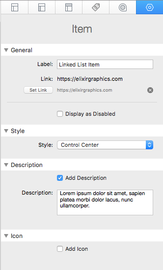
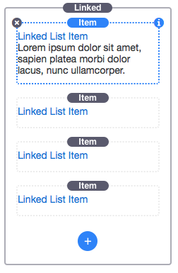
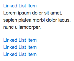
I like the linked list, though having trouble spacing the items and adding descriptions (multi row).
I don’t see a way to incorporate the Rapidweaver “File Sharing” option, is there any?
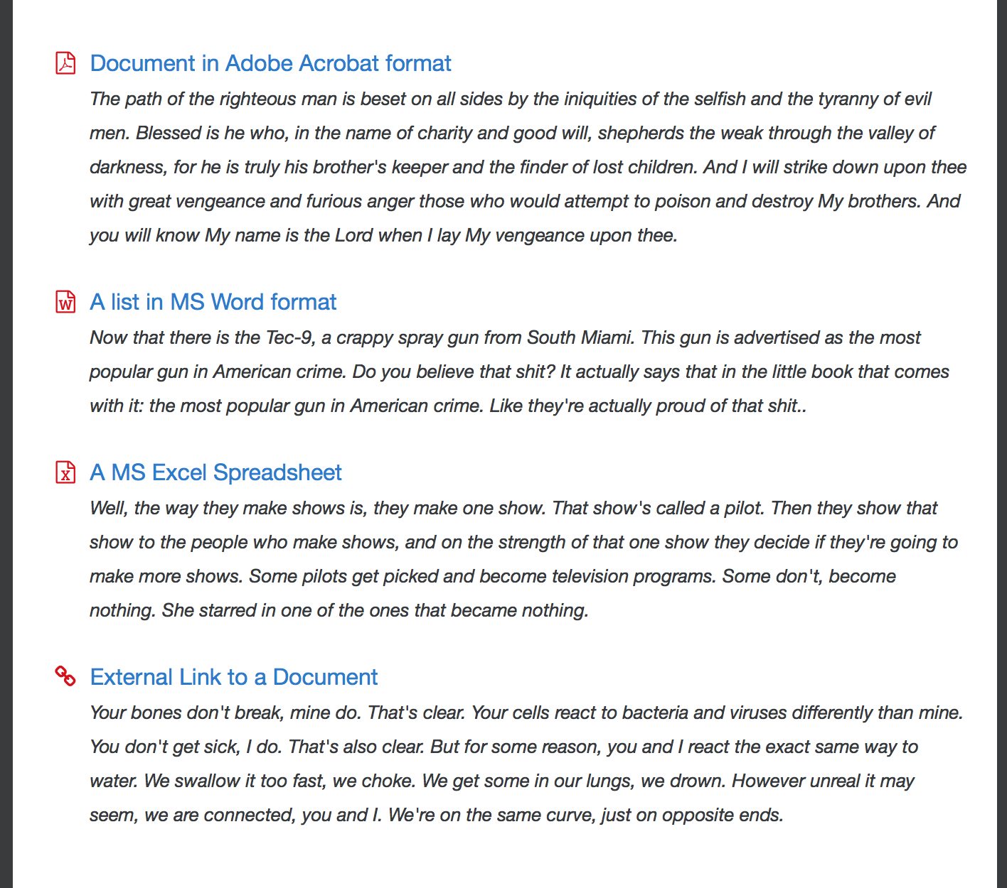
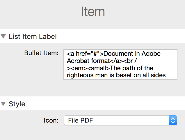
I tediously managed to get more or less what I am looking for with the Bullet List:
Currently what you’re wanting to do isn’t a feature of the Bulleted List or Linked List stack. It is an interesting idea. I will have a look at it and see if it isn’t something that could be incorporated.
I have also struggled to offer downloads (mainly pdfs) the easypeasy way by using one of the build in foundry stacks. but everything I tried ended with the conclusion that „downloads" haven´t been the core purpose of these stacks.
so any solution that adam could add within foundry would be really, really great!!
I ended up using the “image list” stack by doobox. but unfortunately the stack isn´t on the doobox homepage anymore. I do not know if there is any substitute from doobox.
I would love to see an easy way to use a kind of linked list to share files. The size of the icon should be able to be customized from small to XXL and multiple rows of text or just one line/header possible.
My snapshot above sums up what i’d like to see, which would not be specific for download management, but rather, an extended ability added to an already existing list option (or an entirely new one).
The main reason I am saying this is because - in my case - i would like to offer either downloadables, links (internal/external) or just text in the same format.
regarding the icon I would love to be able to define scaling, vertical alignment and spacing between icon and text. the icon could be a font awesome icon choose from a dropdown or an individual image dragged into a drop zone in the hud
regarding the text (the link / the headline) I would love to be able to define the link and hover color*
regarding the description I would love to be able to add additional links to the text, fine-tune the spacing between headline and description
in fact I would like to have more control over link and hover colors and link styling within all foundry stacks because the predefined link colors (from foundry control center) do not work very well in every situation; It seems to me that sometimes there is a “custom color" option available in certain stacks, sometimes this option is missing… but that is probably a off-topic here
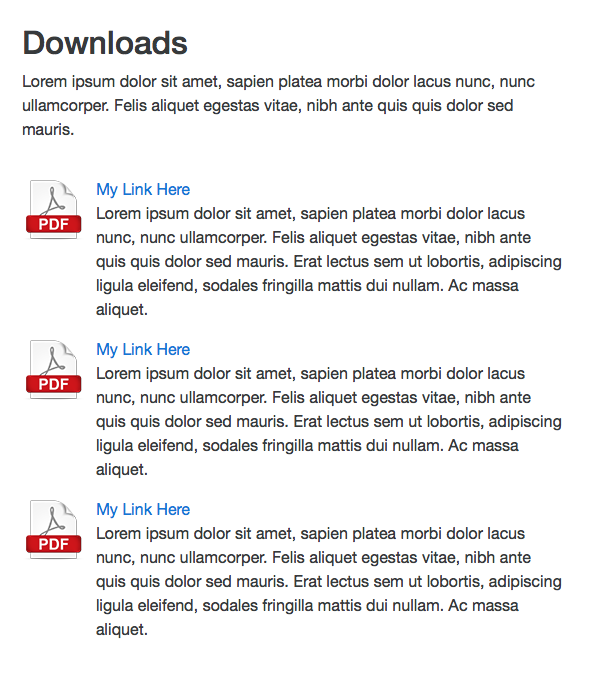
i guess what Andreas is looking for (maybe?) is something similar to what can be seen in the attached screenshot (made with the doobox image list stack)
regarding the icon I would love to be able to define scaling, vertical alignment and spacing between icon and text
This probably won’t be something that makes it into the Linked List stack. The alignment of the icon to the text is handled by the Font Awesome icons. If you wish to do as @papart is showing in his screenshot I would encourage you to checkout the Media Group stack in Foundry.
In fact I think the Media Group stack would do well for most use cases in this thread, IMO.
in fact I would like to have more control over link and hover colors and link styling within all foundry stacks because the predefined link colors (from foundry control center) do not work very well in every situation; It seems to me that sometimes there is a “custom color" option available in certain stacks, sometimes this option is missing… but that is probably a off-topic here
It is a bit off topic for this thread. That being said though – links are something that are generally set page-wide. I try not to introduce a lot of overrides unless necessary as it eats away at the main purpose of using a framework. It isn’t out of the question that things like this can be added, but like I said I try to offer it only where it is absolutely needed.
I edited my previous post in the “icon wish list“ section… I am not sure if you have noticed that prior to your response (?) just to make sure I got the point: in addition to what you wrote – there will be no option for dragged images instead of FA icons? And there will be no option to add a link directly to the icon?
There is no denying in the similarities as far as the layout is concerned, but there is a decided difference here and I truly believe that the doctored up List will do good. As their names suggest they serve a very different purpose, and they do them well.
The media group puts emphasis on the image, it’s always there (except if switched off for mobiles) as a defining part of the items that are destined to be more substantial than a mere ‘list item’. For this reason, each item is its own unit.
The Linked List is for smaller items, and the sorely missed (optional!) description field extends it. The icon is there as a bonus, with a much less significant presence, for a slight emphasis or added graphical relief. And one stack holds all the items, as they are meant to be strongly related.
In a way, the custom bullet list and link list are getting rolled into one, with the added benefit of a description field.
I don’t, not for a minute think that a Linked List like this and the Media Group step on each other’s toes!
I edited my previous post in the “icon wish list“ section… I am not sure if you have noticed that prior to your response (?)
Notifications aren’t sent for edited posts, so I would have no way to know you’ve edited a post. Sorry.
just to make sure I got the point: in addition to what you wrote – there will be no option for dragged images instead of FA icons?
If you’re referring to the Linked List stack, then no, it does not support images. The icons are based off of FontAwesome now and would continue to be. The Media Group stack would be better suited for that.
And there will be no option to add a link directly to the icon?
The Icon is already a part of the link in the Linked List stack currently, and would remain so.
This sample was built using the Media Group stack, which also allows a separate link for the image (icon in this case). The text is done using a Paragraph stack:
There is no denying in the similarities as far as the layout is concerned, but there is a decided difference here and I truly believe that the doctored up List will do good. As their names suggest they serve a very different purpose, and they do them well.
The name of a stack doesn’t really always matter. In this case the Media Group stack would do very well for that has been described. It will probably allow you more flexibility than what would be added to the Linked Listed stack (see above example). It isn’t to say that a description addition to the Linked List stack would be bad, but that I think for what you’re wanting the Media Group stack is indeed more flexible.
The media group puts emphasis on the image, it’s always there (except if switched off for mobiles) as a defining part of the items that are destined to be more substantial than a mere ‘list item’. For this reason, each item is its own unit.
It only puts as much emphasis on the image as you allow. Use a large image and it will draw more attention to the image. Use a smaller one and it draws less attention, like so:
And one stack holds all the items, as they are meant to be strongly related.
While I see what you mean, that is only for you as the designer. You’re seeing that the Linked List is a cohesive group of items. But the visitor to the site doesn’t see that – they see the Media Group, as in the the above example, as a group of items.
If you want a list with descriptions without an icon or image, then perhaps the Linked List with an added description would be good. But every example I was given was one containing an icon or image of some type, so in that case I think the Media Group is a better fit.