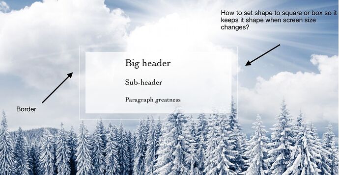
I have tried several different setups with different stacks but somehow I can’t get the result that is good enough. Typically square changes to a rectangle or vice versa when simulating various platforms.
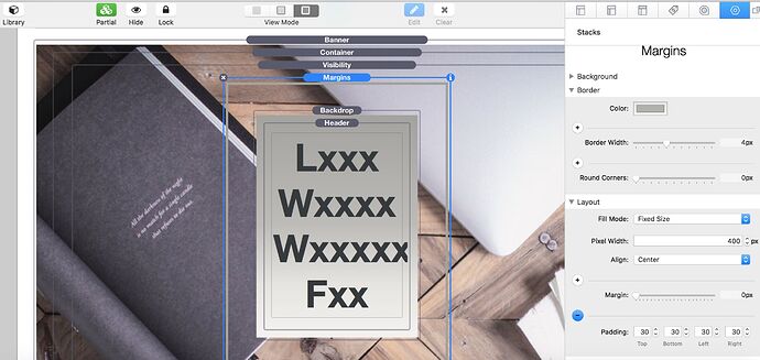
The setup that I tried:
Question: Is Visibility needed if so is two enough (desktop/tablet+mobile)?
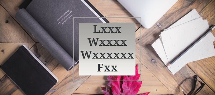
Desktop result
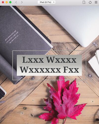
Tablet result
Bonus question
When creating the responsive design, are you designing for the mobile in portrait and for the tablet in landscape mode? What is an industry standard? I am looking for guidelines for RW 8 simulator is giving me a headache with all new devices. Ps. Yes, I am aware that Safari’s responsive mode is more accurate.
You can create this in a number of ways. Essentially you will need to set a width and height, using stacks that allow this. So start off with say 600 high and 600 wide and centre content. As the screen size gets smaller, the text contents will grow in length. If there is too much text so that the length of text exceeds the fixed height of the box, then you need to do something such as:
- Making the box longer (so no longer square) or make the text smaller or remove some of the content with a visibility stack.
- Reducing the size of the text font so that it occupies less space and therefore less length.
This is a balancing act of text size, legibility, length of total text, etc.
A good way to approach this would be to start at a 320px wide window and reduce everything so it fits and works well in this screen width. If not, then rethink what you want to do, and then increase the screen width and establish when you can make the box a square by setting the height and width being equal.
Checkout BWD SectionsPro and BluePrintOne for this type of design solution and also ParagraphPro which has 4 text sizes, if you are struggling to make it all fit.
Also, as you mentioned RW8, be aware that the Simulate pixel dimensions are double the actual px logical dimension. So to see a 320px wide device you will need to select the iPhone SE labelled as 640x1136. Confusingly, the Custom setting is the true local resolution - so 320 is 320px.
3 Likes


