I’ve watched the Columns video several times and there’s something just not clicking for me, so I wonder if any kind soul can help me out.
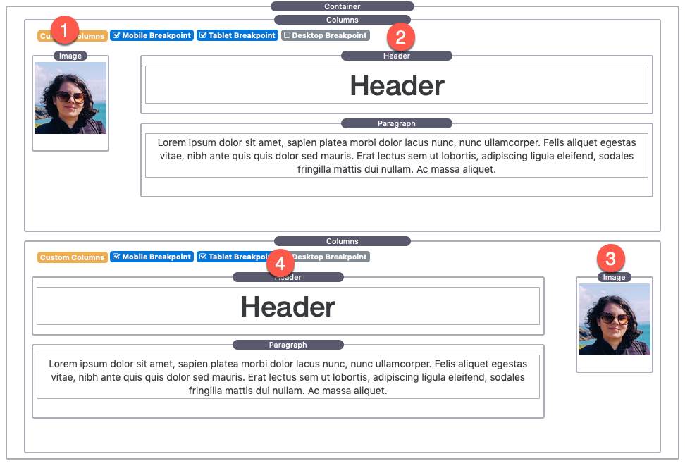
I’m attaching a screenshot of my desktop layout together with numbers indicating how I’d like these columns to stack on mobile.
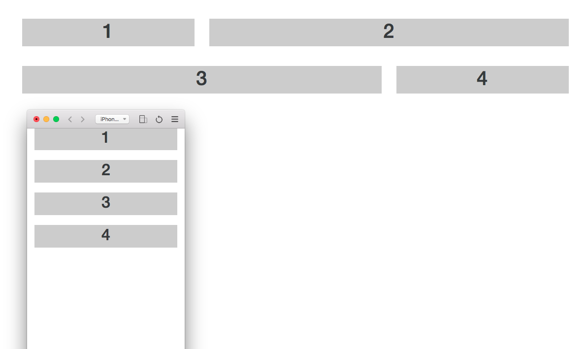
Essentially on tablet and desktop it goes 1-2-4-3 (with two columns of unequal width)
And on mobile it needs to go - 1-2-3-4 (with single columns of the same width)
I understand this is probably me being very slow on the uptake but I can’t work out how to design this so that the order re-arranges.
I’m guessing Rob wants to use Ordering to make sure that the mobile outcome is photo, text, photo, text.
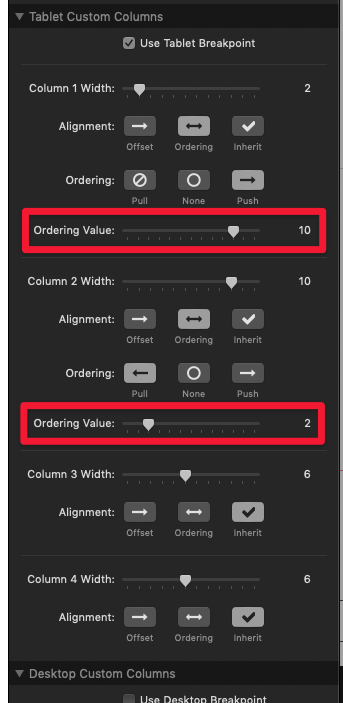
I would do this with two column stacks on top of one another. The first column stack will be normal, nor ordering needed. The second columns stack will have ordering applied, like so:
Right, so I set up both sets of two columns with the small image on the left and the longer text on the right (even though I want them to alternate on the page on tablet and above). And THEN I use the Ordering feature to push and pull the alternate column stacks into the correct position.
Nope, it’s not the mobile first thing that threw me. It’s the building the second two column stack ‘wrong’ and then using pull and push to make it ‘right’.
Anyway, that’s enough developer-bothering for one night…
50 minutes more and I can have a Shepherd Neame Master Brew!
That’s what I meant by mobile first. Designing the content for mobile breakpoint first, photos on the left, text on the right, and then setup the push and I pull for tablet and desktop to swap them for those breakpoints. Sorry if that wasn’t clear in what I said.