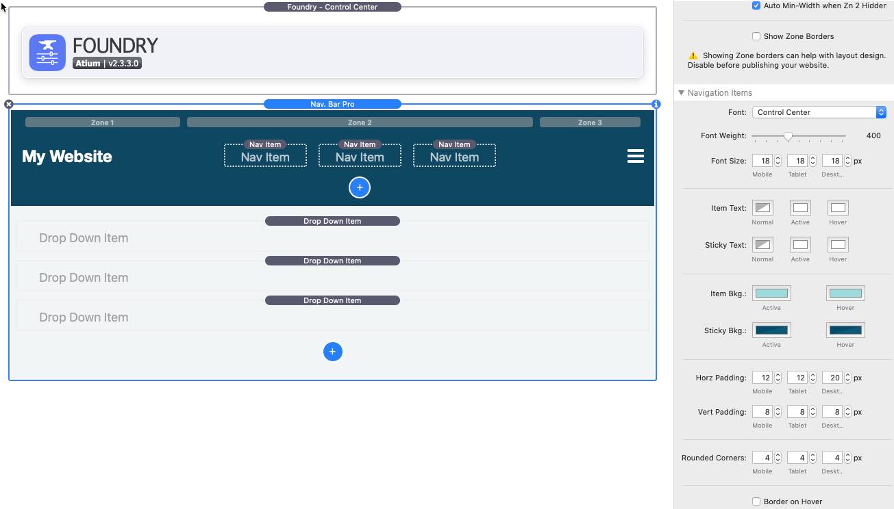
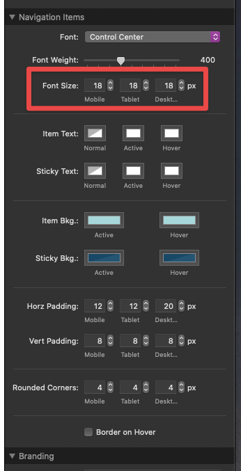
I am not able to make the Nav Bar Pro responsive. When I check my website with a 15" and a 21" monitor the Nav Bar Pro items stay the same size. Which means, that the size of the letters are too small for a 21" monitor. Can I change that ???
Tank you very much for your answer. So as far as I understand I can only set one font size for desktop. What I was looking for was the possibility to automatically increase the font within a desktop environment, so that with a 15 " laptop monitor the size might be 18 and with a 27" desktop monitor the font size would be 27. I use the Flexi Font stack, which allows scaling, for paragraphs etc. and it works fine, but with the Nav Bar Pro it does not work.
I’m pretty sure it won’t work with Nav Bar Pro. All I can suggest is that you increase the size of the desktop font to find a balance between its size at 21" and 15".