I have a website for a summer club. I went to update something today and noticed that there is a gray bar to the side. It is not adjusting as I adjust the size of the browser window as it normally does. When I test different sizes in Rapidweaver, all the iPhone ones are normal but once I start testing iPad or Mac sizes the gray section appears in varying sizes. Any ideas on how to fix this? I’ve never had this issue in the past. Any help is much appreciated!
Here is the website: valleyswimandtennisclub.com
We’d need to see how you’ve designed your page(s) in order to assist you.
Provide us a copy of your project file please
Create a ZIP file containing your project file. This is the file you open in RapidWeaver to edit your site. After creating the ZIP file, upload it using a service like Dropbox, WeTransfer, Droplr, or a similar service to create download link for us. Paste that download link in your reply.
Thank you so much for responding! Hopefully this link works and is what you need.
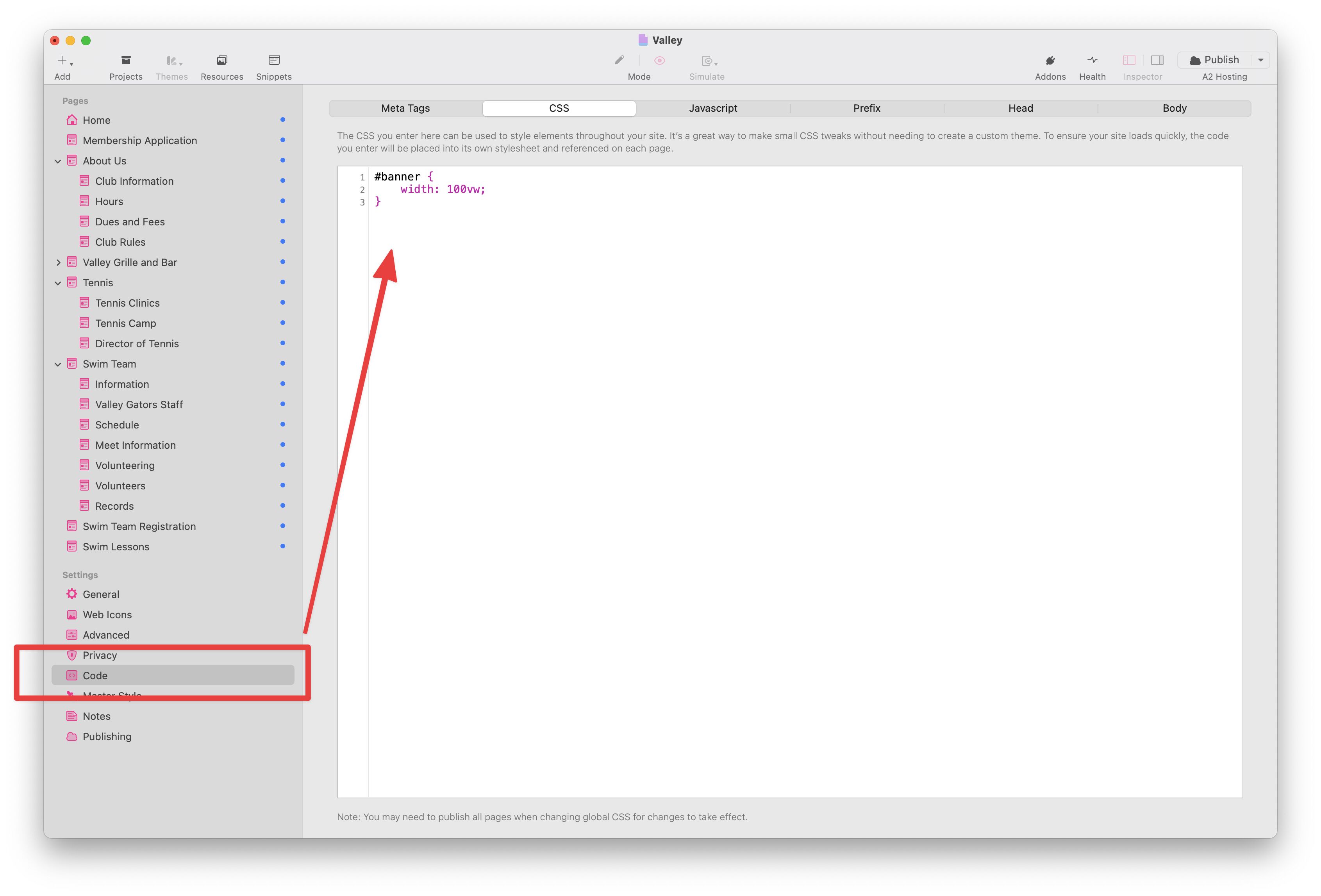
This seems to be related to the width of your banner images. Can you do this for me? Add the following code to your Custom CSS in the General Settings in RW:
#banner {
  width: 100vw;
}
You can add it here:
That fixed the issue! Thank you so much, I really appreciate your help!