Just finished this one. Its a fairly simple no-frills site, I’m happy with it though and it loads super quick. Waiting for the client to update their blog content - which is still incomplete but out of my hands now. As always, its helpful to get your constructive feedback. Thanks , J
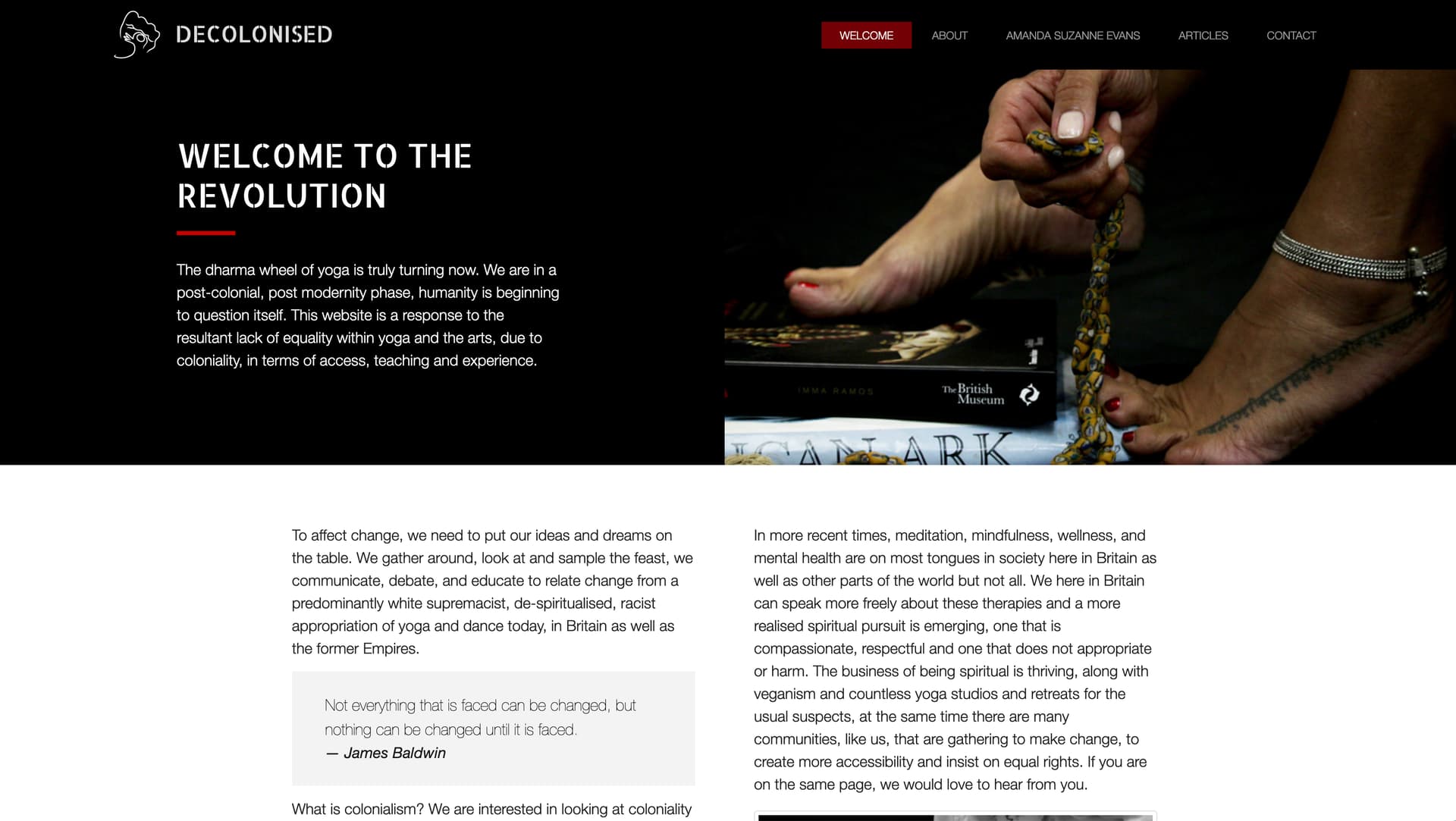
Very nicely styled. I love simple and clean layouts, you don’t often need a lot of eye candy to make a layout work. My only remark (after a career in advertising and communication): add some small headers to your homepage. People don’t want to go trough all of the text before they get to know what the site is about. Adding a few subheaders that give the reader key information can work miracles at this point.
But otherwise, very nice work.
Seconded. And I think if it were my site I’d replace ‘Welcome to the revolution’ with ‘Whose yoga is it anyway?’ - it’s a much stronger tagline and gives visitors much more of an insight into what the site is about.
I totally agree with Rob on this one. You could still use ‘Welcome to the revolution’ as a baseline or sub header. In terms of SEO, it’s also good to open a website with a header or title that matches the content.
But this is all advise around communication, the style of the site is clear and open. Nicely done James.
thanks guys - I can suggest it to the client - but its her call. I don’t usually get too involved with the text content they want to put up - unless they ask me to (and want to pay me to do this!) I don’t have time.
@James249 you’re absolutely right, a designer is bound to the content provided by the client. But in my experience it’s often appreciated to give this kind of feedback.