I’ve built a site which is currently a mirror of an old wordpress site. The new test site is here: www.m0nyy.co.uk
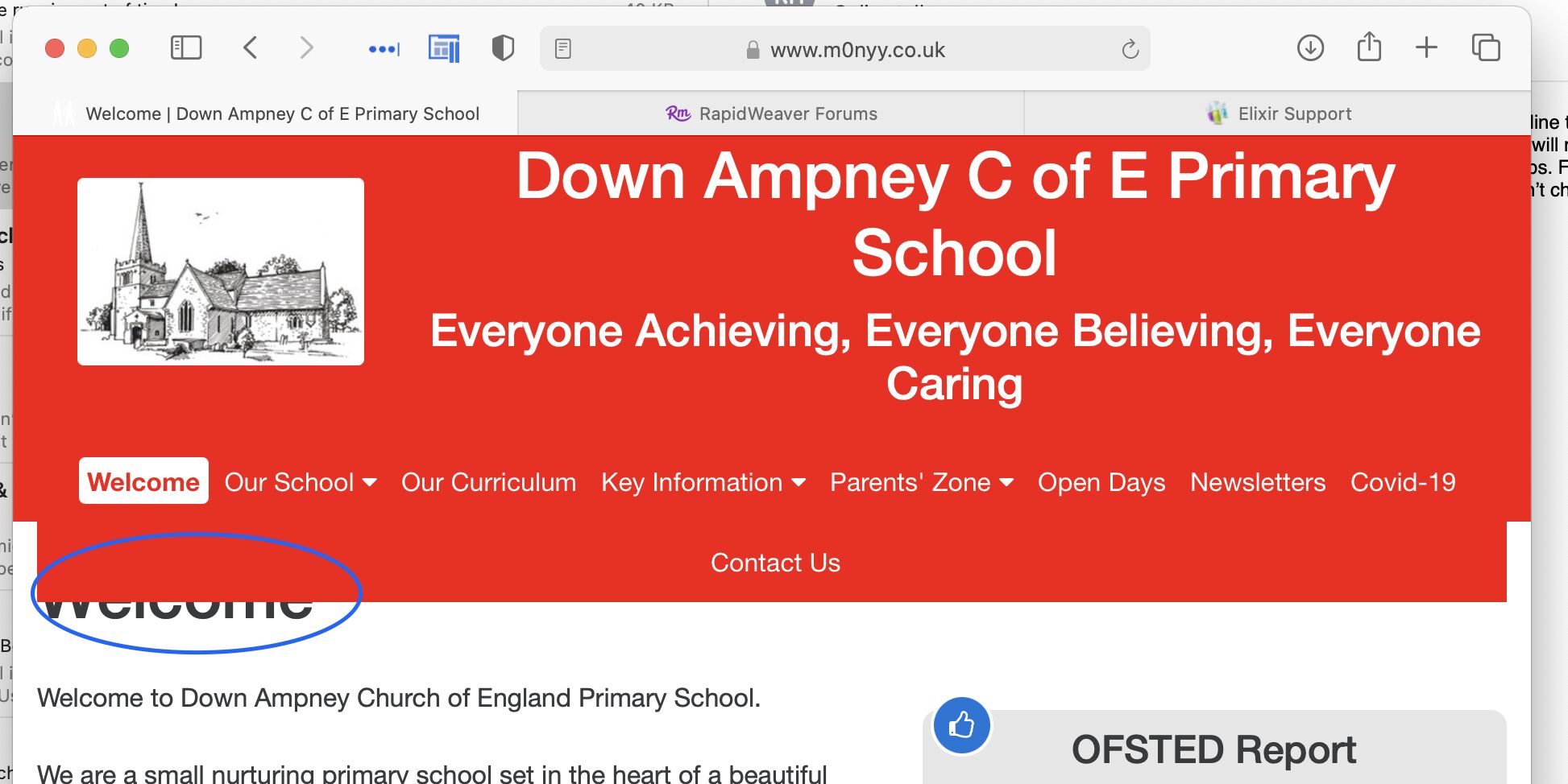
The question I have is about the Foundry Nav Bar and what happens to it when I reduce the width of the browser window. Quite expectedly the nav bar moves to two lines as the browser window narrows but in so doing, it covers up a piece of the page. See screenshot.
What method could I use to keep the Nav Bar in the banner and stop it from encroaching on the page?
regards
Nick.W
Take a look at Nav Bar Pro. You can set what’s displayed at each breakpoint. There’s a great video explaining how it works on the Elixir Graphics Youtube channel.
From a design perspective, that’s a busy menu bar, even on a Desktop screen - you should look to consolidate some of those Nav Items into drop-downs, ideally.
2 Likes
You’ve got far too much content I. That navigation to fit at smaller widths. They just can’t physically fit there. It would be like putting 20 pounds of potatoes in a 5 pound bag.
2 Likes
Point taken.
The layout and grouping of the pages is not how I would have done it and it certainly requires a makeover.
Cheers for the input.