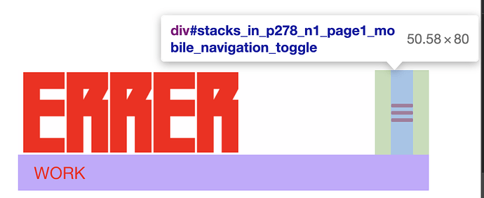
Hi I am trying to remove the padding on the mobile navigation. Currently the preset is 15px. Was trying to overide it with custome code in the css but nothing has worked. Any insight would be helpful.
If you post a link to a test page, I’ll take a look. What are you trying to achieve? That extra padding makes the click-target larger. If you remove the padding, it will be harder to tap the menu button on smaller devices. Google actually penalizes websites in search results for having click-targets that are too small.
https://errer404.com/
There is the link. Sorry for the screen grab. I want to align the icon container to to the far right image container on the page. Not to worried about search results since this is a personal website I would be directly forwarding. Hey thanks for any help. I can only think of downloading the style sheet and making the change and reuploading to server, but I am sure I can just overide it via the css section.
Try this CSS. Paste into the page or site-wide CSS area in RW.
.navigation_container > div {
    padding-right: 0 !important;
}Perfect. Awesome. Thank you so much!
