Can I hide the traditional nav bar links and have a mobile menu instead in desktop mode? just want the branding and the mobile nav icon, thanks
@Trump2016 There are two other types of navigation stacks availabel in Foundry. The Nav Overlay and the Slide Nav, Slide out, vertical navigation. Is this what you are looking for? The overlay is like the Navigator Theme from Elixir and the slide out is like the Majestic Theme from Elixir..
I hope this helps.
1 Like
Have you tried the other navigation stack options like Slide Navigation or Nav. Overlay instead of Nav. Bar? These have a discrete toggle menu option even in desktop mode.
1 Like
Oh lol u got in just ahead of me, both saying the same thing
1 Like
hi, what happens is i lose the branding option that the nav bar stack has, when i use the other stacks you mentioned. In another framework im able to set the when i see the mobile toggle icon, I can have it show on mobile, tablet and desktop. Attached is what I would like it to look.
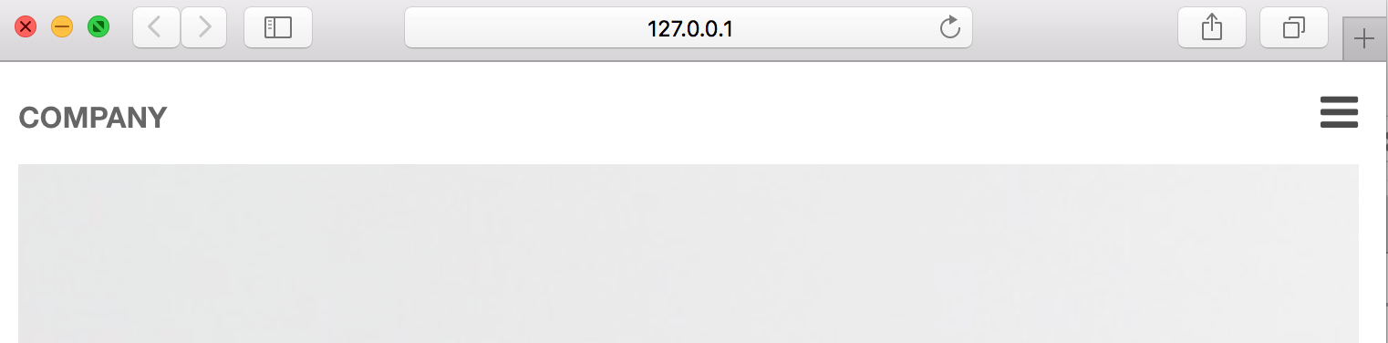
You could try using the columns stack set it to two columns and place the nav on the right and a Page Header stack to the left. The Page Header stack lets you select the site branding from the built in RW set up for the site title. Site Title is the default setting when you drag it onto your page. I do not know how it will look on mobile though. Play around with that to see if it works for you.
Adam may have a better solution than this or at least add it to his list of feature request.
I will try that, thanks
Good ideas by @Steve_J and @webinjection! I too would probably use a two-column layout using one of those other navigation stacks. Are you wanting the navigation and / or branding to be stuck in place, or scroll with the rest of the page as the user scrolls down the page?
hi, most of time it will be fixed/sticky. The issue is that by trying the other method I’m introducing either an off canvas menu or the overlay to the layout which is fine but, I was just looking for it show the Menu toggle with a dropdown…a Minimalist look .
I can work up an example using one of the others but the Navigation Bar is not going to be able to do that.
That would be great…Thanks!
What you’re looking to do isn’t going to be possible with a drop down like the Navigation Bar has. Here’s a real quick substitute using the Columns, Margin, Page Header and Slide Navigation stacks though: http://d.pr/f/xTRX
1 Like
Thanks for this, will try it out. On mobile can the Branding and Toggle icon be aligned?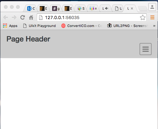
You could use custom columns and set Column 1 and Column 2 to 6 units for all three breakpoints.
2 Likes