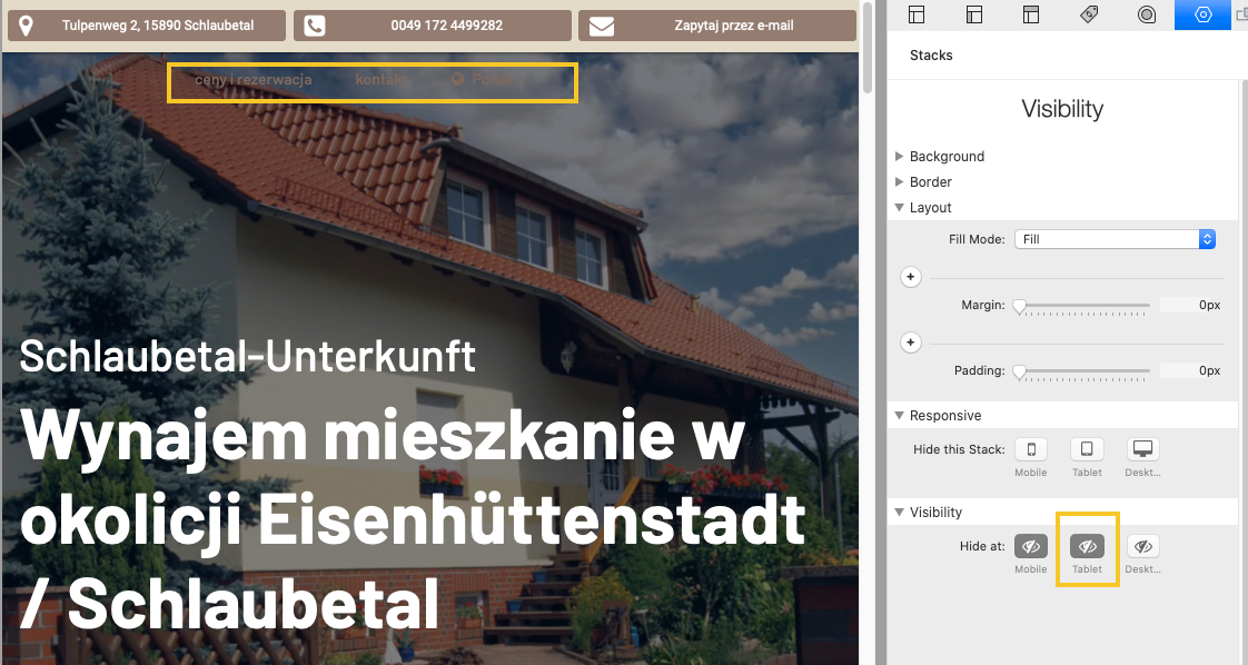
Hello. I am using Foundry v2. I built my page with the mega menu stack and placed it into Foundry’s visibility stack. There are too many items on the menu to display them nicely across a tablet device. So I decided to built a custom nav bar for tablet only.
When tablet visibility is disabled the mega menu still shows on a the tablet and I am wondering how I can fix it. Thank you.
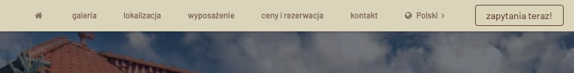
My guess is you have Sticky Navigation enabled for your Mega Menu correct? If so that is why you’re unable to hide it. Sticky Navigation moves the navigation outside of its parent stack to make it sticky. In doing so this means it circumvents the hiding. The hiding done by the Visibility stack, or any other such stack, occurs on the parent stack. It would probably be best to simply make one navigation bar that fits everything at all of the breakpoints instead of trying to hide / show multiples honestly.
Thanks for responding Adam. Yes, sticky is enabled in the mega menu settings. I removed the page title and only left a ‘home’ symbol instead to save space and reduced the font size down to 12 for tablet only. I also removed the custom menu built for tablet. It’s seems to work now. Although the font size in the menu is a little small, but its only on tablet and only if the tablet is kept in portrait mode. We should be fine.  Thanks again Adam!
I thought that Sticky Navigation probably had a hand in it. Glad you got it sorted out.
When it comes to navigation less is more sometimes. Not every page of the site needs to be in the top level of the navigation. I think sometimes as designers we all get petrified that people won’t find all of the awesome stuff we’ve built for them and try to put a link to all of it in the most prominent place on the page – the navigation. We as designers have to prioritize things for them. Sidebar, drop downs, footers, etc, etc can all be great ways of adding more links to our content.
1 Like