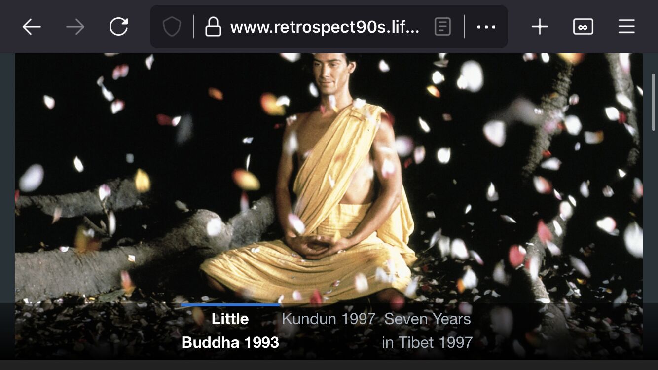
This week I have continued in my quest to get my site working on mobile. I wanted to give the Shift stack a try on one of my pages since I liked how it split the image, title, and description up into those sections. I was expecting the text to be tight in portrait mode on a small phone but I was a little surprised when it was just as tight in landscape with so much blank space on the side. It’s probably about half blank and on a large phone screen I would guess it would be two-thirds blank.
As far as I can tell there is no way to read the descriptions other than when you are on the desktop? (and some iPad Pro models) Even though I haven’t thoroughly test this on an iPad at all when I run it though the simulator it looks like even some iPad models pack that text together. It looks like mainly the older, lower resolution models. My first thought was to shorten the title by removing the year for an example, but then it seems like the way it is working is to not add any spacing between the items no matter how much text is taken out.
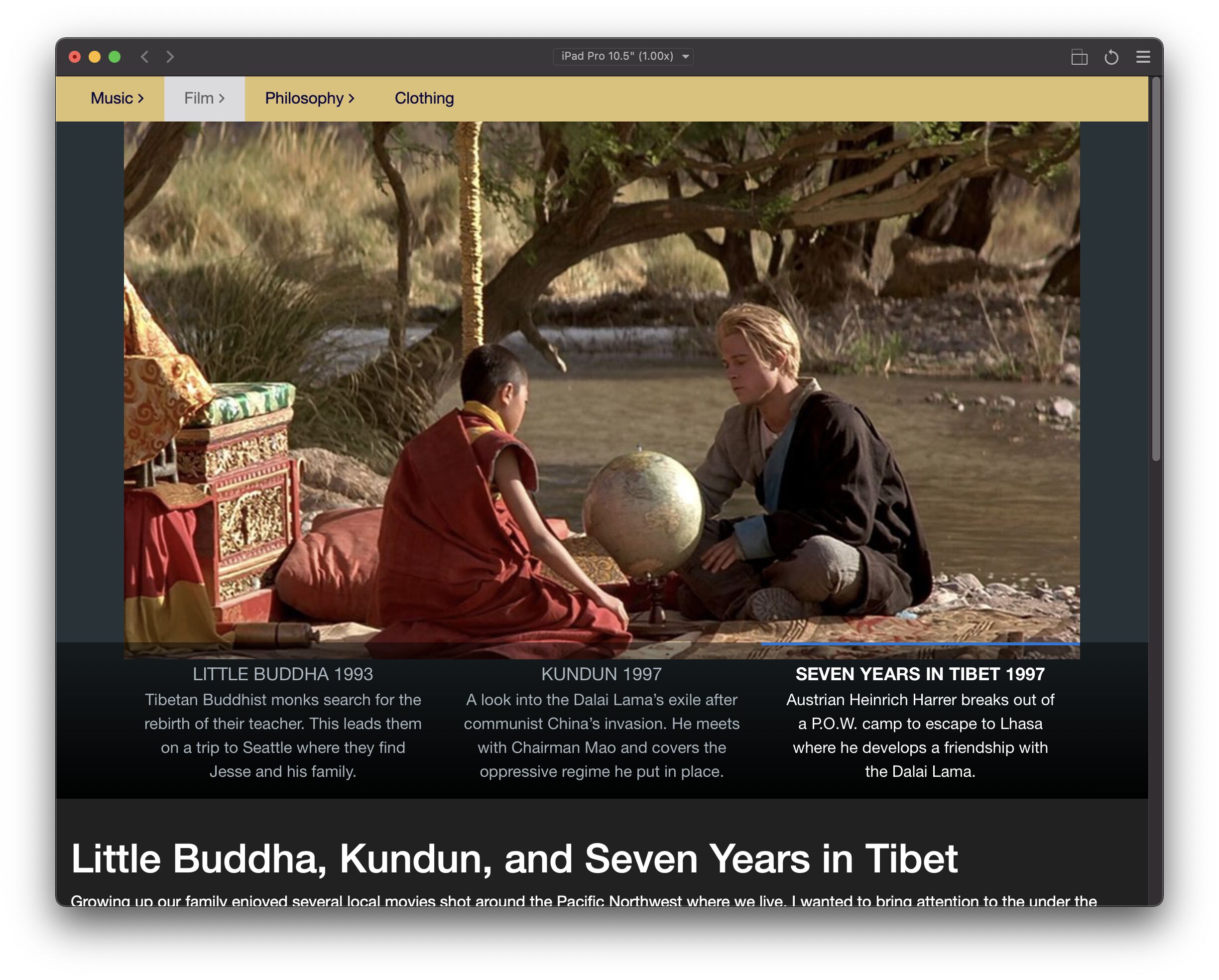
The main thing I am trying to avoid right now is the inactive shift items look they are one big item. The type style and spacing between “Kundun 1997” and “Seven Years…” don’t look like two different things the way they are now. There is an option to “remove left and right padding” but that doesn’t seem to change much that I can see.
In your example, the longer description would probably be suited more toward being the content in the slide itself. You can’t put a novel in a the small description. Heck that even applies to the slide content. Shift is, at its root, a stylized slider stack.
Right now the description is about two sentences. I probably made it that long to test the limits of what the tool is capable of. I’m glad I did because it gives me an idea what it will look like on an iPad where apparently a 10" model can hold the two sentence descriptions (even in portrait.) I’ll most likely slim all descriptions down to one sentence in the end.
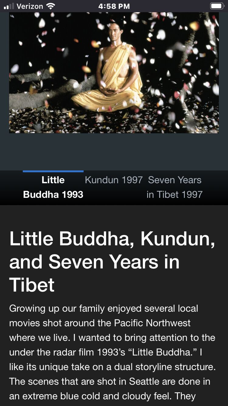
I guess what I was expecting for the phone view would have been to at least have the description of the current slide that is being shown. Especially if it’s a short description like a sentence. The bigger issue is the title area. If the title of a subject is four words long like in this case (Seven Years in Tibet) I can’t make it much shorter because that is what the film is called.
Maybe, I keep experimenting with different stacks when I make a page and found on iPad, when I tested for the first time today, it works better then most of the pages. If other people have examples of this stack I’d be curious to see how it is used. Does anyone use more then three shift items? How long are the titles, etc.