Font (linotype) & margins questions

Hi, I am a new Foundry user so please forgive me if my questions should be obvious :slight_smile: I am re-writing an old rapidweaver site using Foundry and have a few questions:

  1. How do I get a non-google font to show up on other computers, ipads,phones, etc? I am using Revue (linotype) and it shows on my mac (where the font is loaded in my system) but it does not show on other systems
  2. How can I shrink the vertical spacing between rows of collumns?
  3. Can I center a two column bulleted list on the desktop and also make it appear centered on ipad/iiphone too (currently the bulleted list stacks the columns on a phone/pad)
  4. Can I place captions on photos/banners (preferably lower right) without embedding them into the photos?
  5. Overall, do you have any suggestions for optimization and best practices — so site will load quicker
    Thanks!

Hey there @Shanti!

I got your email as well, but wanted to reply here on the forum so others can also benefit from the answers to your questions. So, let us dive in and see if we can’t answer these for you…

(1) How do I get a non-google font to show up on other computers, ipads,phones, etc? I am using Revue (linotype) and it shows on my mac (where the font is loaded in my system) but it does not show on other systems

The web is a tricky place for fonts. There are some options when it comes to setting up fonts for a site. You can use a web-safe font, which is one that is generally supported on many platforms and browsers because they’re basic fonts that are installed across those various platforms. Using web-safe fonts also includes using fallback fonts like serif and sans-serif which are the most basic settings.

The font you’re choosing – Revue – isn’t a web-safe font so while it displays for you because you have it installed on your computer, it is only ever going to display properly for people who have that exact font installed on their computer. This isn’t ideal, of course, so the options would be to opt for a different font, or to see if the font in question is available on a service like Google Fonts (it is not, I have checked for you). Since it is not available on Google Fonts you could check to see if the font author has a version you can purchase for web embeds. This last option, while doable, is going to be more tricky if you’re not familiar with setting up your own font embedding. If you’re not familiar with doing so I might suggest going the route of picking a different web-safe font or opting for one of the many free fonts available through Google Fonts.

(2) How can I shrink the vertical spacing between rows of collumns?

I suspect you mean the base margin below each column in the Columns stack. If so, that would be done here in the Columns stack. The feature is toward the bottom of the settings in the Columns stack:

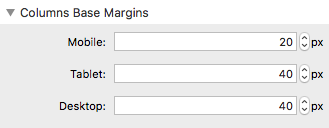
You can read about all of the Columns stack’s features here on the Documentation page for Columns.

(3) Can I center a two column bulleted list on the desktop and also make it appear centered on ipad/iiphone too

If you’re referring to catering the text within the Bulleted List stack, then no, that can’t be done. It is not an option of the stack.

(currently the bulleted list stacks the columns on a phone/pad)

Not sure I’m following. If you’d like to provide an example though I’m happy to take a look.

(4) Can I place captions on photos/banners (preferably lower right) without embedding them into the photos?

Do you mean on top of the image or just below it? If just below it, you might try using a Note stack below your Photo or Banner stack and right align the Note stack, like so:

(5) Overall, do you have any suggestions for optimization and best practices — so site will load quicker

This is a super general question unfortunately. General rule of thumb – keep things as simple as possible. Use small image sizes. Optimize your images using something like TinyPng. Honestly, it will come down to your site design and the elements you’re using on your pages as to what would need to be done.

Adam

Hi Adam,

Thanks for the quick reply! I replied via email yesterday, but since you replied here I figured I’d reply here too :slight_smile: Here’s some followup…

  1. I’m not familiar with font embedding but I’m totally willing to learn and any and all guidance would be most appreciated :slight_smile: In my searches I found some code snippets and I will post as a separate question :slight_smile:

Revue has been part of the company logo for many years so I must use it on the site. In the past I’ve created a graphic version of the company name, but I was hoping to not have to go this route this time :slight_smile: And, at least now I know I didn’t mess-up Foundry-wise :slight_smile:

  1. AWESOME! I had already zeroed the base margins on the parent columns, but not the nested child columns… thanks!

  2. I’ve attached a screen shot (Music page.jpeg) of the two bulleted lists that appear in two columns on the top of the “music” page. I used margins to shift the right column in towards the center of the page but I’m thinking there must be a better way to truly center the columns on the page…perhaps from margins (which holds the 2-column stack/bullet lists)?

  3. Sorry I wasn’t clear :slight_smile: I actually meant on top of the image… which I’d still like to do if possible. However your idea for below is awesome and I will use that too!

  4. I’ll check into TinyPng… been using photoshop :slight_smile:

Perhaps I should post this as a separate question as well

… can I adjust the size of images one they are placed in image stacks or so I need to do the image sizing before they are placed (ie in photoshop, etc). For example I’d like the larger awards to be a little less large on the home page… didn’t know if it could/how to do this on the page…

Thanks in advance!
Shanti

You’ll have to research and see if there is a version of your Revue font that is licensed for use as an embeddable web font. The code you mention on your other post is just the code side of things. You’d also need the embeddable version of the font and you’d have to add it to your site / page in some way (Resources section of RapidWeaver, direct upload to your server, etc.) and then reference that location in your code from your other post.

Not to be a downer with all that, but it is not entry-level stuff. Even experienced developers have a tough time with this stuff.

Creating a graphic version isn’t a bad idea. It will save you from needing to license the web version of the font (if there is one) as well as working out all of the embedding details. Which route you go though is up to you.

I’ve attached a screen shot (Music page.jpeg) of the two bulleted lists that appear in two columns on the top of the “music” page. I used margins to shift the right column in towards the center of the page but I’m thinking there must be a better way to truly center the columns on the page…perhaps from margins (which holds the 2-column stack/bullet lists)?

Without seeing your project file I’d be hard pressed to give you specifics, but I will say this – you can use the Container stack or Margins stack, or both even, to adjust the layout of your content.

Experiment with things. That for me is half the fun of web design. Try things out. See what you come up with. You won’t break anything and you may come up with something you fall in love with.

Sorry I wasn’t clear :slight_smile: I actually meant on top of the image… which I’d still like to do if possible. However your idea for below is awesome and I will use that too!

That isn’t an option of any of the stacks in the suite. Sorry.

I’ll check into TinyPng… been using photoshop

I do both. I export using Photoshop’s Save for Web feature and then run it through TinyPNG.

can I adjust the size of images one they are placed in image stacks or so I need to do the image sizing before they are placed (ie in photoshop, etc). For example I’d like the larger awards to be a little less large on the home page… didn’t know if it could/how to do this on the page…

You really want to adjust image before you place them in RapidWeaver. You’ll get better results overall this way.

Thanks!= so much for the response! Here’s the update:

  • I created a graphic version of the logo font, and hope to re-visit font embedding in the future
    -I ended up just centering the list on the page, but would love to use a 2 column bullet list for shorter page/easier viewing on mobile in the future. i could not get the two columns to stay centered. Any suggestions are most welcome :smile: 
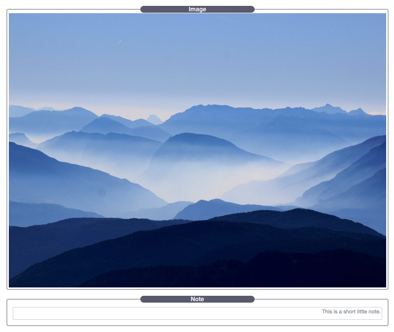
ttp://newyorkedge.com/menu/
    -I adjusted sizes and used tinypng… helped out a ton on load time!

A post was split to a new topic: Additional labels in Form stack