I have two main problems with the site which I think can be fixed by moving entirely over to Foundry from a regular Rapidweaver theme.
First the links are broken on mobile for a couple of the pages. I am hopping when I move everything over to Foundry this will simultaneously get the links to work again? I just assumed that may have been a side affect of not picking one foundation to build the site on. I just needed a way to test what the different foundations did since I was confused by what the full capabilities of each were.
The default typeface when setting up a Foundry page isn’t what I am looking for (that thin san serif typeface.) I want to use the Typeface stack to change that but was wondering is the a difference between using the Google Fonts service and other services out there? I’ve never set type by uploading a specialized font before.
I brought this up in the Rapidweaver forum but the thread on the RW forum ended up being entirely about image optimization. I never really got around to converting the project to Foundry because of that divergence. Thanks for your help as I gradually go through this transition of moving everything to a single more capable foundation!
I can’t see anything on your site that would be impossible in Foundry - it’s certainly much easier to get to grips with than some other frameworks I might mention. Take a look at the add-on packs, and you may well benefit from using Alloy, too.
The key is to read the very well-written documentation, and the videos are especially useful - I can heartily recommend the Typeface videos - I’m now self-hosting Google Fonts as a result of the Self-Hosting video!
In my experience, this tends to be a more focused forum, and everyone here is extremely helpful - just make sure you give plenty of background info, and someone knowledgeable will be along to assist.
Can you tell us which links are broken on mobile? That may be nothing to do with the theme.
I’d second @jacksona’s comment. The docs are really good and you’ll find that using Google fonts or hosting your own is well explained and pretty easy to do.
The self hosting fonts options looks just like what I need! While I haven’t used Google fonts or Typekit I think I’ll probably use some specialized typefaces that go beyond what they supply. It seems like this year Adobe was discontinuing certain fonts or doing something with Typekit that made me uninterested in trying that service (also I am not on the Adobe Cloud service.)
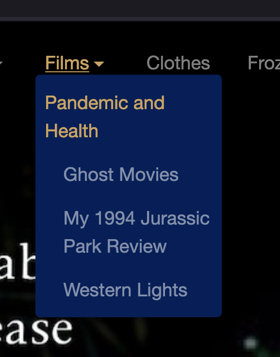
@Rob This movie review page is one example My Jr. High Jurassic Park Book Report I haven’t worked on the site in depth for a couple months so I can’t remember every page where the navigation is broken. I know with that Jurassic Park page the heading appears to be covering the hamburger menu. When I switch to Foundry I will remove a lot of those big images at top (like this page with it’s generic image.) I may get rid of half of of those big images because I feel some don’t work with the design and can also take a long time to load because of their enormous size.
Also the menus have this weird little step indent in them which was probably caused by my not doing the CSS right. I think when I switch to Foundry it also changes the way menus are done? I am hoping to get that fixed at the same time. I know there are additional tools you can get for making advanced menus. Perhaps would be a better way to go about making them.
I am just tapping around the site on my phone and noticed what the other menu problems are. I can navigate to the pages that are under the drop down menu such as the sub menus in “Films” and “Music” but the menu items which are not in drop down menus like that often don’t seem to be working. I don’t think this is a desktop problem. It’s very strange.
All the top level menus work for me on an iPhone. The issue with the Jurassic Park headline is that it doesn’t scale down for smaller devices so it obscures the hamburger menu and - for me anyway - stops it from working.
The Mountains theme is OK but you’re trying to bend it quite a lot. If you go with Foundry you’ll discover that it’s much easier to get the look and feel that you want because you’ll be able to make those design decisions from scratch. When you use a pre-designed theme like Mountains, those decisions have been made for you and every time you try and break free from the constraints of the theme using custom CSS, there’s a danger you’ll break something else.
Oh I didn’t realize CSS didn’t get along with the default Rapidweaver themes. I’ll be curious how that changes when I switch to Foundry. It seems like RW would warn users about the default themes not being able to play nice with CSS and other code? I am kind of curious about products like Megamenu but don’t know how deep that gets into the coding. Another thread on Megamenu I skimmed was talking a lot about code but maybe he was just trying to do something more advanced with it then I need to do.
Now that I’ve learned quite a bit about Foundry it will be great to now have the tools and some of the knowledge to make what I was originally going for! I liked some of the “Mountain” effects and esthetics but it is far to rigid. It seems like nearly all themes are that way. It’s hard to go far beyond the most simple of site but I guess there is a market for that as well. Some only need a very basic site.
Don’t get me wrong. You can use custom CSS with standard themes like Mountains but my point is that doing so can create other issues which in turn can create other issues. It all depends on the level of customisation you’re going for. There’s a difference between increasing the font size by a tiny bit or changing a colour here and there and trying to remove or re-position the entire sidebar or reduce the height of a banner. The bigger the change you make the more you open the possibility of breaking something somewhere else.
That’s where things like Foundry are so useful - they’re a set of building blocks that are designed to work together and can be arranged in any way you want.
That helps. With my CSS menu I changed both the color of the text and the color of the background behind it. Possibly some other change as well. It would be great if that alignment issue went away with the switch to Foundry. Even if there was a way to make the menu a little longer so that more of the titles could fit on one line instead of two the menus may read a little better.
Probably the main reason I haven’t switched to Foundry yet is when I start a page by not using Mountain it doesn’t have that nice typography and animation when a page opens. I now know that the animation can be done manually in it’s own stack called “Reveal” which I haven’t worked with yet. And the self-hosted type that @jacksona talked about should solve the second problem I am having with making the switch. I think I will move over this week.
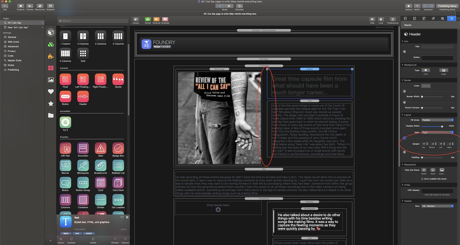
Hello again, I got a chance to start transitioning the site today from Mountain Theme to Foundry and had one question. Mountain Theme gave me a lot of open space on each side of the content area and I was wondering how to do that with Foundry?
I can get a blank space to come up in a row of a column stack (like there is below the second paragraph in my example.) Was hoping it would be just as simple to add space on the sides of the all the content. It doesn’t seem like it can be done by adding a row column row and leaving column 1 and 4 blank. Is there a particular stack for this? I’ll most likely do a similar technique to all the other pages.
UPDATE: I just noticed the margins stack. So there are two ways to change the margins which would be the margin slider in the sidebar and the margin stack.
I just remembered the video link you sent me I while ago that looks like it will answer a lot of these questions. I forgot about that, sorry. I’ll go watch through all of those right now.
Would you use both the container and margins together on the same page at least some of the time? Or generally pick between one or the other? This page is pretty straight forward but I plan on doing more with the other pages. This is one reason I wanted to start with a page that is pretty basic. Get some of the core features down first.
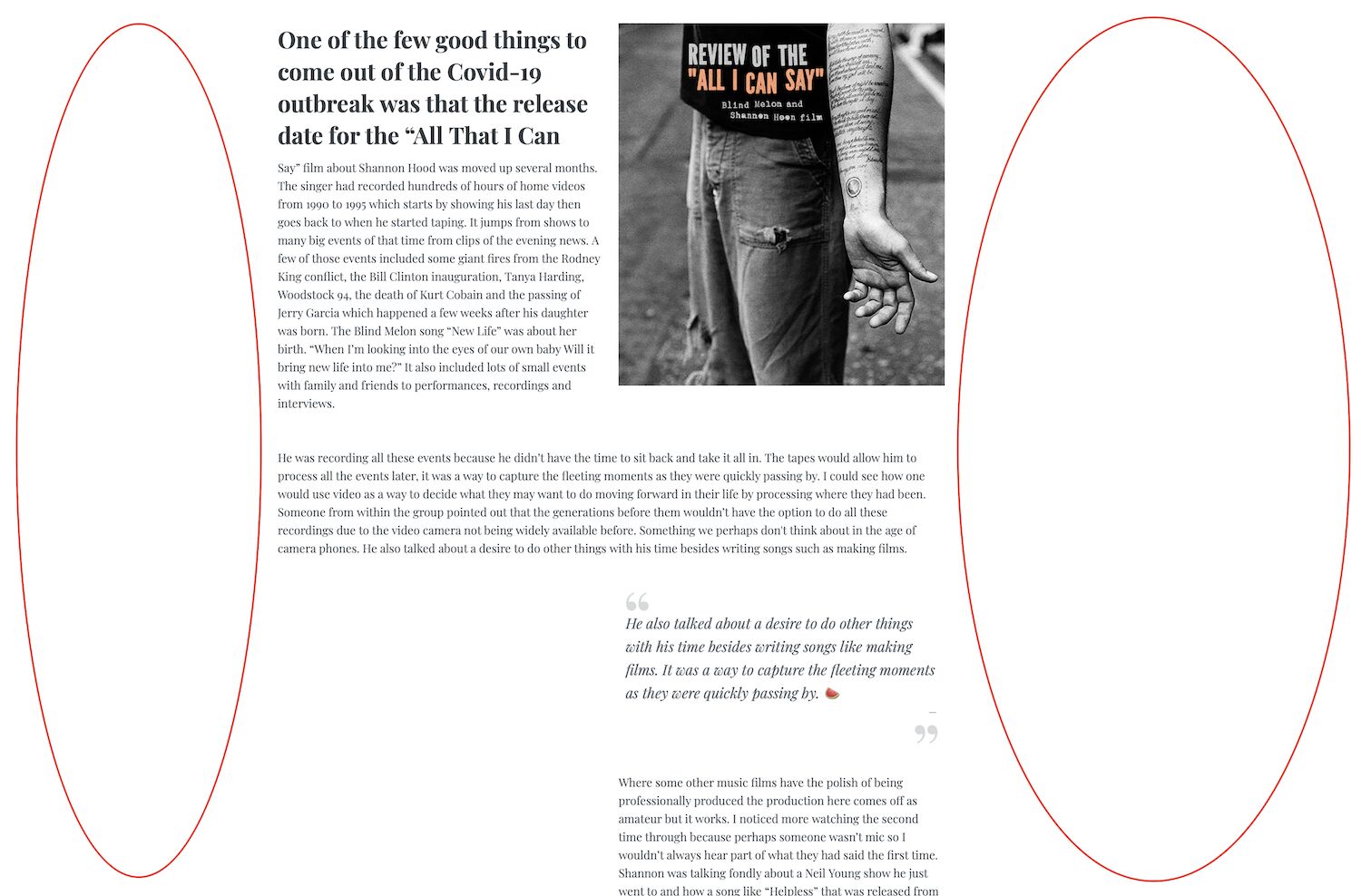
I might test out some of the typography features too. I’m curious for that quote near the middle of the page is there a way to get rid of that dash at the end? It was intended for listing the name of the person making the quote but it this cause it is just a call-out of my own text so that line and dash doesn’t really need to be there.
You can mix and match a lot of things. That said, for what you described, it is probably (99% chance I’d guess) going to be the Container stack that you need. There’s videos on most of the tutorial pages, including on the Container page and the Margins page, which may give you a better idea of how to use them.
Like the two stacks I mentioned above, the Blockquote stack also has a documentation page. Head on over there and checkout the Cite Person and Cite Source options. If you turn those off then I suspect that will get you to where you’re wanting to go.
It’s interesting there is a card block-quote too. I was thinking about using that outer area for some other pages. I can see that the container stack be probably be all I need for the spacing here. When I click on the text block I get all the margin options I need enabling me to space the text so it doesn’t run right across the top of the page and down the side of the image.
I can see I also need to add a section for links as that doesn’t get included when I add pages (like the default RW themes do.) Thought about doing something like Megamenu but I hope that solution isn’t a lot of work. Might temporally start with a simpler linking solution but I love the way menus can add some description text and section areas!
I wondered why some of my icons didn’t have images while other peoples didn’t look like that! As long as all the options are under the parent stack I can understand turning that off.
When you click a text block there is that area in the sidebar called “layout.” Under “layout” I click the plus sign to get the options for “top, bottom, left, right.” I’m using that instead of a margin stack. Seems to do everything I need.
Also question on the best way to convert files over. Right now I have two RW projects open at the same time. One with the old site and one with the Foundry re-write. Is it a good approach to drag text blocks and images from that site over to the re-write? I can’t think of any reason to not do this. It’s just a lot easier then having to hunt down all the original source files.
I converted some old template based sites to Foundry as well. In my experience it’s not a bad idea to copy texts from the ‘old’ site into a TextEdit document (Format Make Plain Text) to get rid of all the formatting and links and start over in a clean way. I then copy/paste these texts in my ‘new’ site. It’s a bit more time consuming but I don’t want to mix classic RW Text stacks with Foundry Text stacks.
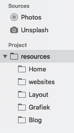
My images are all in Resources, even placed in subfolders per page. I like my stuff to be organised. Never had problems with broken links or missing images this way.
Okay, I can see why I would want to copy the text to TextEdit. I organized the images on my pages with different folders too. Is there a way to pull those images and their respective folders into the new project? Or do I just re-import all the images as I am remaking the webpages?