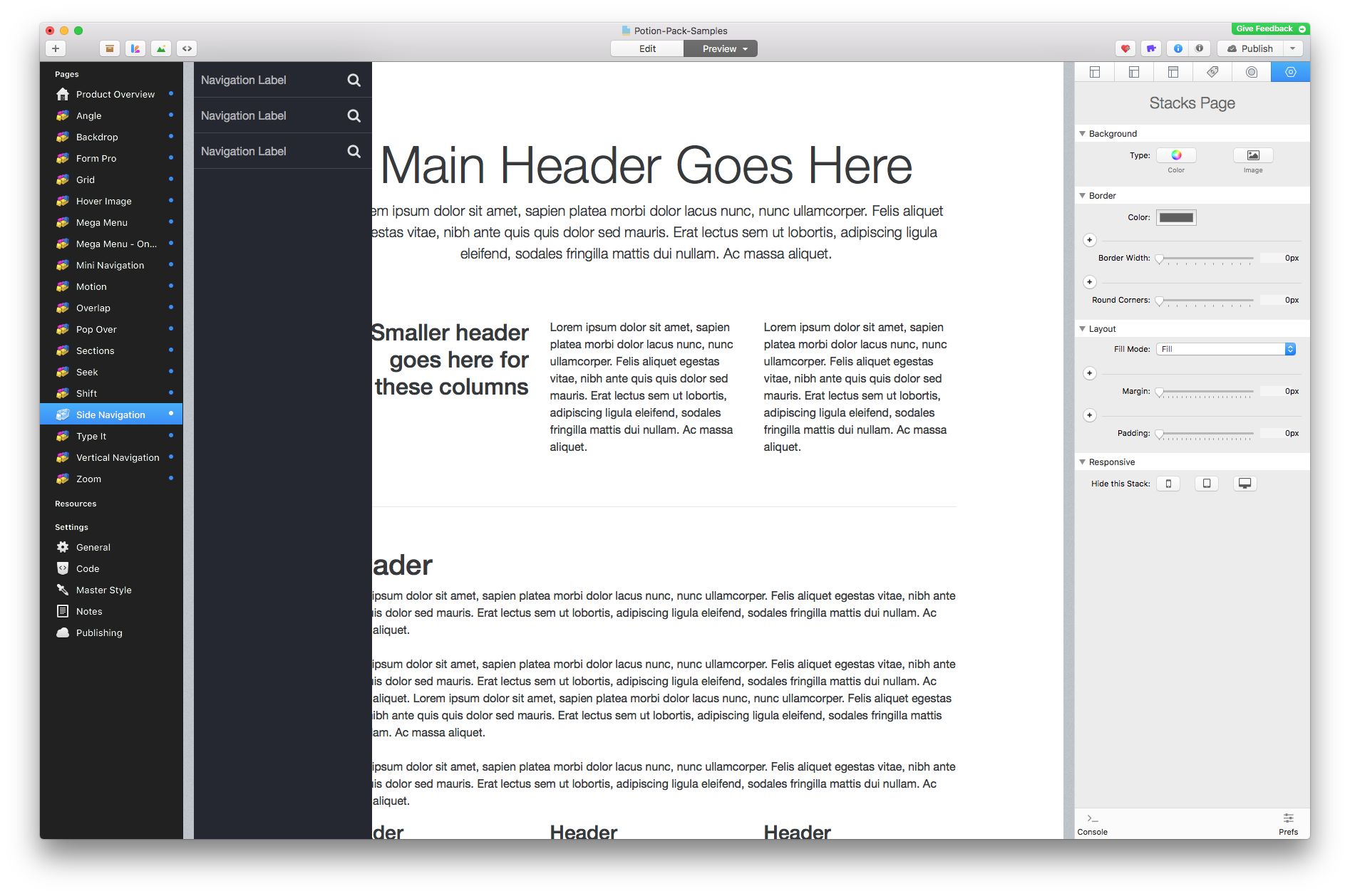
My apologies if this should be a separate thread, but this appears to be a tiny, aesthetic bug.
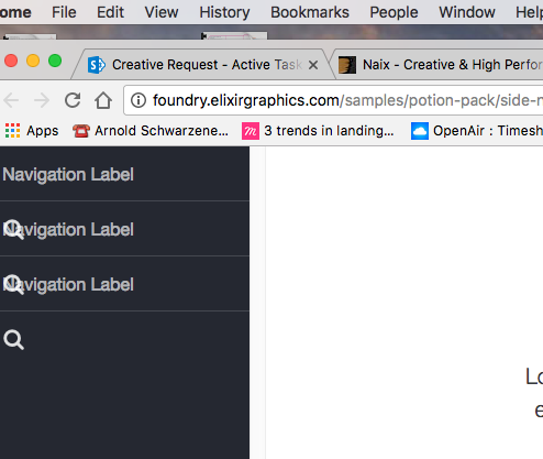
In the ‘Side Navigation’ stack it looks like the FA icon and text are overlapping. This is within Preview mode of RW using the ‘Potion-Pack-Samples.rw’ file that comes with the purchase.
Not seeing that here, myself (see below). Have you modified any settings in the stack or added any other stacks to the page that may have caused the bug to crop up? So far I’m not able to recreate that bug.
Well that sure is odd. To make sure I hadn’t modified the file in some way I went back to the Potion pack disk image and opened the Potion-Pack-Samples.rw from there directly. Still seeing the overlap.
RW appears to be up to date at 7.4.1 and I noticed there was a Stacks update this morning (now at 3.5.4) when I installed the Potion Pack.
Trying my darnedest, but I’m not able to replicate it here. If you make a new project file and drop the Foundry and Side Navigation stacks onto a new page do you get the same results?
I will confess I’m on the RapidWeaver 7.5 beta, for testing reasons right now. But I don’t think that should honestly have any impact on this situation.
I am having zero luck replicating this bug here. I’ve even tried some odd things, too.
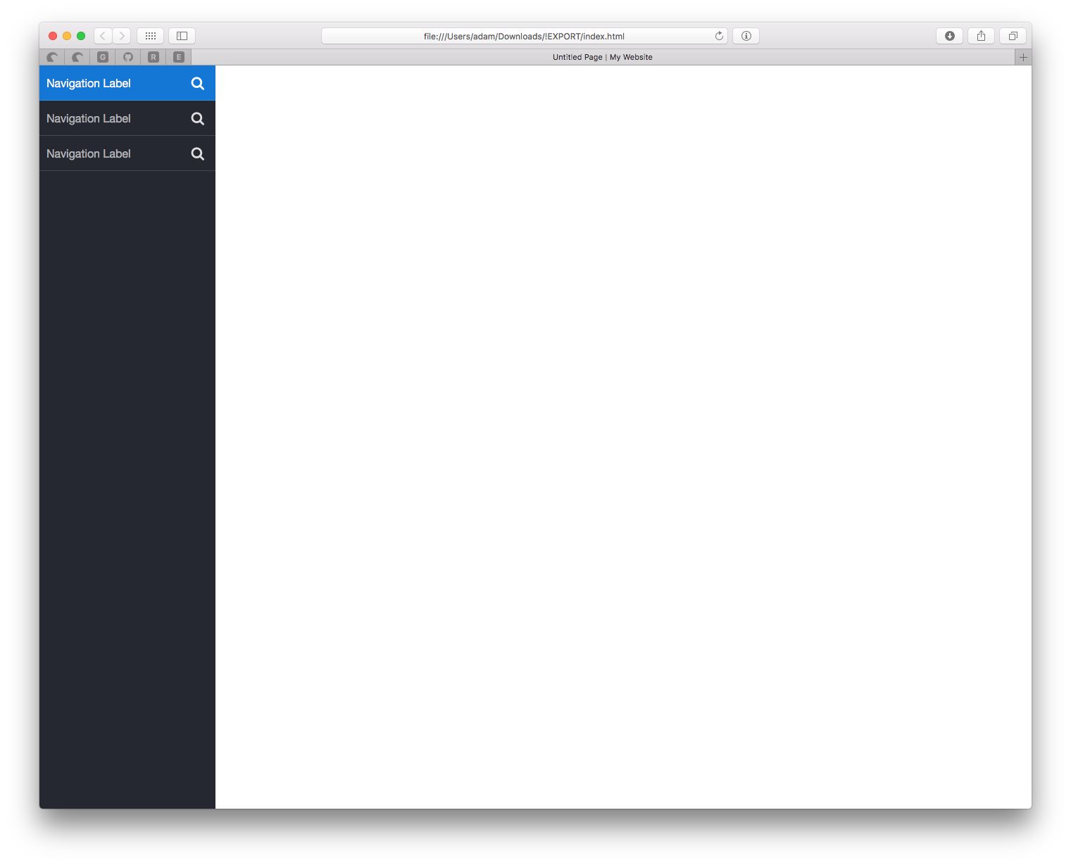
Can you use the Preview Page In... feature found in the File Menu in RapidWeaver for me? Open it in Safari or Chrome or something and let me know if it continues there. Just trying to figure out the origin of this one.
As brought up by my wonderful beta testers @vmcosta and @Steve_J – Is there a chance you don’t have the Foundry theme selected somehow? Perhaps you’ve got a different theme selected or have not installed the Foundry theme yet?
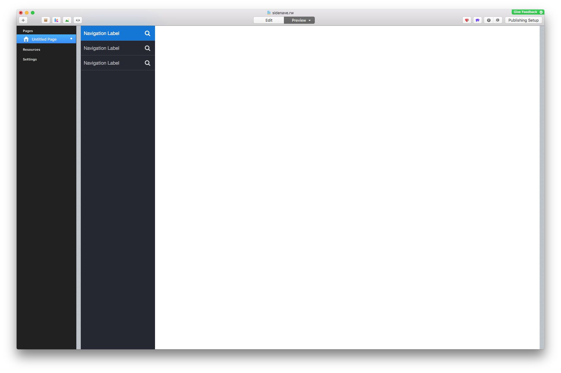
Hi, was looking at the elixir potion demo page for the side nav and the page renders with overlapping icons when the menu slides out also it does not show any icons when the page loads.
I… don’t think so. Definitely not intentionally. I opened Font Book and don’t see anything, but since I don’t ever install fonts (I know some applications do) directly I’m not sure I’m looking in the correct place.
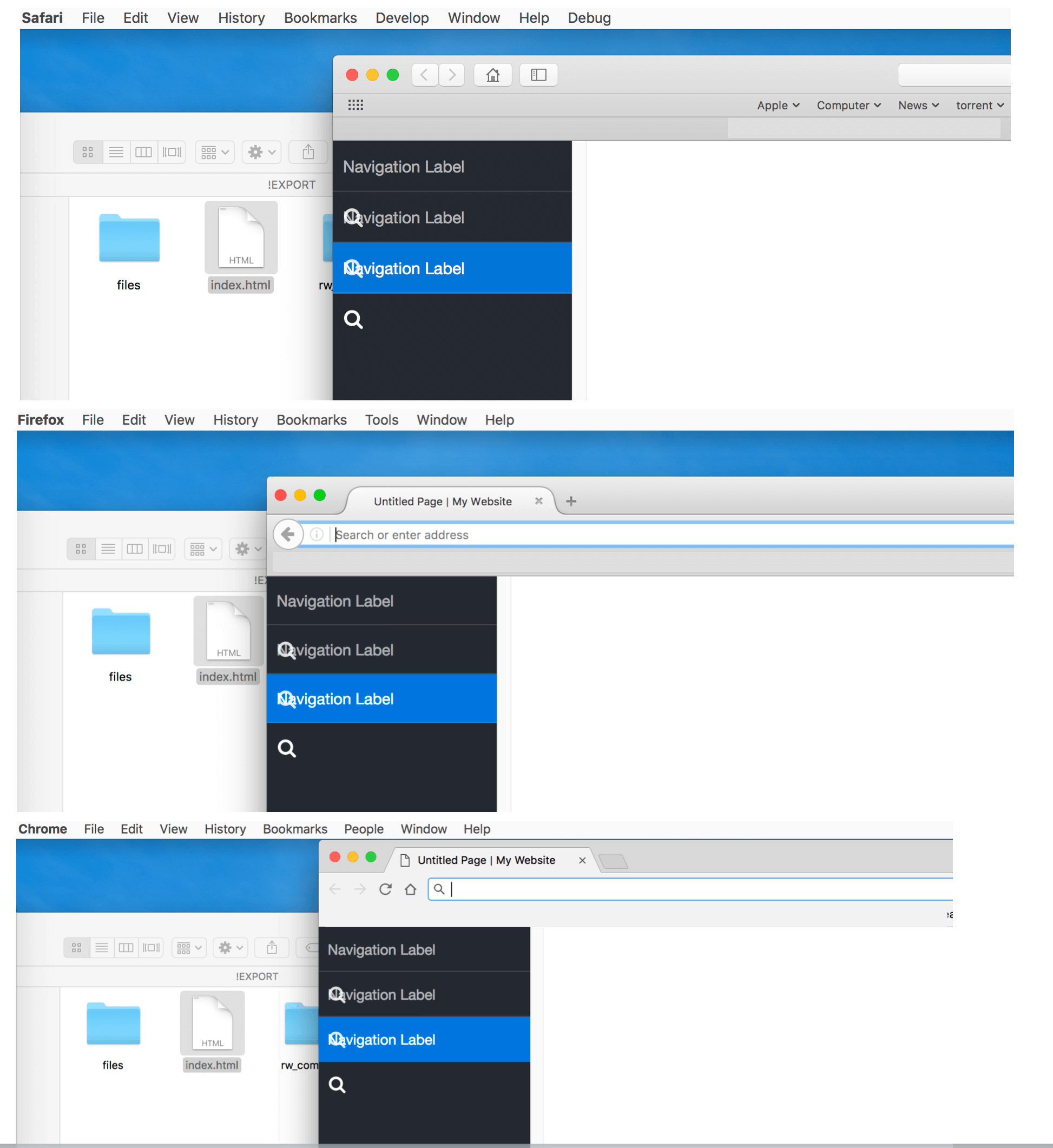
EDIT: Ok, I didn’t expect this. I took that export folder, uploaded to Dropbox and then downloaded it onto one of the terrible Lenovo PCs we have at the college. Opened up the .html in Chrome and… still overlapping for me.
@Trump2016 Few things – what version of RapidWeaver are you currently using? What version of Stacks? What version of OS X? Do you have the Foundry theme selected in the theme drawer?
I do not know if it will be important, but in the examples of Trump2016 and Bioguy the FA icons are aligned to the left of the text “Navigation Label”. While in "Potion-Pack-Samples"are on the right.
I do not know if it will be important, but in the examples of Trump2016 and Bioguy the FA icons are aligned to the left of the text “Navigation Label”. While in "Potion-Pack-Samples"are on the right.
@peppermint: This is because they’re getting wrapped around to the next line. The top icon is wrapped around to the second line, and so on. Just looks as though they’re aligned left. I suspect both gentlemen are using the default settings in that project file.


